Managing Complexity in Responsive Navigation Systems

One difficult aspect about responsive development is how to manage complexity in navigation systems. For simple headers and navigation structures, it’s typically straightforward to just use a single HTML structure. Then write some clever styles which re-adjusts the navigation system from a small-screen format, to one that takes advantage of the increased real-estate of larger screens. Finally, write a small bit of JavaScript for opening and closing a menu on small screens and you’re done. The amount of overhead for delivering two presentation options to all screens in these cases is fairly low.
However, for cases where more complex navigation patterns are used, and where interactions are vastly different across screen sizes, this approach can be rather bloated, as unnecessary markup, styles and assets are downloaded for devices that don’t end up using them.
On one recent project, we were faced with such a problem. The mobile header was simple and the navigation trigger was the common hamburger icon. The navigation system itself employed a fairly complicated multi-level nested push menu which revealed itself from the left side of the screen. The desktop header and navigation system was arranged differently and implemented a full-screen mega-menu in place of the push menu previously mentioned. Due to the differences and overall complexity of each approach, different sets of markup and styles were required for presentation, and different JavaScript assets were required for each interaction pattern.


View Animated GIF: Mobile | Desktop
Mobile First to the Rescue
In order to have the small-screen experience be as streamlined as possible, we employed a mobile-first approach by using a combination of RequireJS, enquire.js & Handlebars. Here’s how it’s setup:
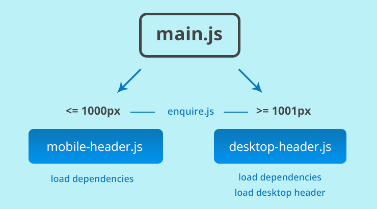
// main.js
require(['enquire'], function(enquire) {
  enquire.register('screen and (max-width: 1000px)', {
    match: function() {
      require(['mobile-header']);
    }
  });
  enquire.register('screen and (min-width: 1001px)', {
    match: function() {
      require(['desktop-header']);
    }
  });
});
In the above code, we’re using enquire’s register method to check the viewport size, and load the bundled set of JavaScript assets for the appropriate screen size.
Handle the Small Screen Version
// mobile-header.js
require([
  'enquire',
  'dependency1',
  'dependency2'
], function(enquire, Dependency1, Dependency2) {
  enquire.register('screen and (max-width: 1000px)', {
    setup: function() {
      // initialize mobile header/nav
    },
    match: function() {
      // show mobile header/nav
    },
    unmatch: function() {
      // hide mobile header/nav
    }
  });
});
Here, mobile-header.js loads the necessary script dependencies for the mobile header and navigation, and sets up another enquire block for initializing, showing and hiding.
Handle the Large Screen Version
// desktop-header.js
requirejs.config({
  paths: {
    handlebars: 'handlebars.runtime'
  },
  shim: {
    handlebars: {
      exports: 'Handlebars'
    }
  }
});

require([
  'enquire',
  'handlebars.runtime',
  'dependency3',
  'dependency4'
], function(enquire, Handlebars, Dependency3, Dependency4) {
  enquire.register('screen and (min-width: 1001px)', {
    setup: function() {
      // get template and insert markup
      require(['../templates/desktop-header'], function() {
        var markup = JST['desktop-header']();
        $('#mobile-header').after(markup);
      });
    },
    match: function() {
      // show desktop header/nav
    },
    unmatch: function() {
      // hide desktop header/nav
    }
  });
});
* The handlebars runtime is being used for faster render times. It requires that the desktop header template (referenced on line 22 above) be a pre-compiled handlebar template. It looks like this and can be auto-generated using grunt-contrib-handlebars.
Finally, desktop-header.js loads the necessary script dependencies for the desktop header and navigation. Another enquire block is set up for fetching and rendering the template, and showing and hiding.
Pros & Cons
The code examples above are heavily stripped down from the original implementation, and it’s also important to note that the RequireJS Optimizer was used to combine related scripts together into a few key modules (main, mobile and desktop), in order to keep http requests to a minimum.
Which brings me to a downside: splitting the JS into small and large modules does add one extra http request as opposed to simply bundling ALL THE THINGS into one JS file. For your specific implementation, the bandwidth and memory savings would have to be weighed against the slight penalty of an extra http request. That penalty may or may not be worth it. There is also an ever so slight flash of the mobile header on desktop before it is replaced with the desktop header. We mitigated this with css, by simply hiding the mobile header at the large breakpoint.
On the plus side, the advantage here is that the desktop header and associated assets are only loaded when the viewport size is large enough to accommodate it. Also, the JavaScript assets for the mobile multi-level push menu are only loaded for small screens. Bandwidth is more efficiently utilized in that mobile users’ data plans aren’t taxed with downloading unnecessary assets. The browser also has less work to do overall. Everyone rejoices!
Taking it Further
Several ways this could be taken to the next level would be to modularize the styles required for rendering the mobile and desktop header and navigation, and bundle those within their respective modules. Another completely different approach for managing this type of complexity would be to implement a RESS solution with something like Detector. If you have any other clever ways of managing complexity in responsive navigation patterns, or any responsive components for that matter, let me know in the comments below.