Making, Using, & Bulletproofing Icon Fonts
Doug Avery, Former Senior Developer
Article Category:
Posted on
Icons have always been a web design staple, but mobile interfaces have changed how we think about them - icons are no longer decorations; they're powerful cues that tie interfaces together.
Unfortunately, the demands placed on icons can make them difficult to use on large projects. The variations required (size, color, pixel density, texture) can bloat your icon pool to an unmanageable size pretty quickly, requiring extra bandwidth and front-end development time.
The best fix at the moment? Chris Coyier's Icon Font method. If you haven't seen this going around, it suggests using the @font-face at-rule to serve vector icons to your users. Advantages:
- Widely supported (@font-face works on a huge number of platforms and browsers)
- Scaleable
- Colorable
- Animateable(!)
- Works with effects like text-shadow and background-clip: text
- Easy to serve in retina and standard pixel density
- Competitive filesize, especially when compared to icon sets with lots of variations
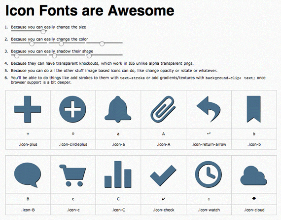
Icon playground from CSS-tricks.com
Acquiring a font
Many icon designers are already selling icon fonts as part of their packages. Some great examples:
There are also excellent free sets out there:
Rolling your own icon fonts is another option. You can use font creation software like FontLab or Glyphs, or for a free alternative, try the Inkscape method or Hieroglyph, a script I wrote for generating SVG fonts from a single folder of icons.
Before you generate your own font, make sure the icon license doesn't disallow embedding. Serving your icons as a font makes vector paths available to web-savvy users, so be careful that you're not accidentally redistributing someone else's work.
Implementing
There are a few competing methods for actually placing your icons on the page once you have a font:
- Chris's original proposal uses pseudo-elements.
- Jon Hicks suggests combining pseudo-elements with a data-icon property.
- You can also just place your icons on-page as an element like a <span>. At the moment, this is the only way you'll be able to apply animations to them in Webkit browsers.
- BONUS: Check out Patrick Haney's "best of both worlds" idea, which uses Jon Hicks' approach on spans to create animateable icons.
With all of these methods, you need to worry about accessibility: sprinkling random letters through your document can be confusing to users with screenreaders.
- If you're using pseudo-elements, you can use glyphs that are mapped to supplementary private use areas, which won't be read to screen-readers — the downside being that these characters are harder to remember and type, and you have to find a font that uses them.
- According to Hicks, the "data-icon" method will read your icon names to screenreaders, but the convenience of the method might outweigh the accessibility issues.
- Finally, if you include icons onpage as spans, you'll need to go out of your way to treat them for screenreaders. One suggestion:
 <span class="icon" aria-role="presentation">
 <b>Icon:</b> F
</span>
This method hides the icon from most screenreaders, but leaves a cue as to the element's purpose when a page is viewed without CSS.
Hieroglyph
A quick plug for the Hieroglyph ruby gem:
Easy to install — on many systems, 'gem install hieroglyph' is enough
Repeatable — unlike the Inkscape method, Hieroglyph works from a dir of icons and doesn't require tedious pasting into additional files.
Flexible — Supports private use unicode chars and special characters
Helpful — Generates a character sheet PNG
If you want to test it out on a system with ruby installed, just run:
gem install hieroglyph && hieroglyph -e && hieroglyph
This sequence installs Hieroglyph, creates a folder of example glyphs (including two 'bad' glyphs for comparison), and finally generates an SVG font from the folder.
Hieroglyph can't generate a full set of fonts on its own - for that, you'll need to upload your font to a service like FontSquirrel or FreeFontConverter. If you try out Hieroglyph and run into any problems, make sure to let me know on GitHub.
Wrap Up
Have you seen any great icon font resources I should include in this post? Have any new info about this technique? Let me know over Twitter or in the comments.