Should You Use a Custom Scroll Indicator? A Study with Eye-Tracking
Curt Arledge, Former Director of UX Strategy
Article Categories:
Posted on
What effect do custom scroll indicators have on users' reading behavior?
In recent years, I’ve noticed more and more websites using custom UI elements to indicate how far the user has scrolled down a page. Custom scroll position indicators come in many forms: variations on the traditional vertical scrollbar, horizontal elements at the top or bottom of the page, and other unique styles. Custom scroll indicators can offer the benefit of visual consistency across operating systems and provide needed feedback when the native scrollbar gets hijacked by infinite scroll.
What effect do custom scroll indicators have on users' reading behavior?
Our research suggests that the answer is not much. Although more research is needed, custom scroll indicators don't seem to improve the reading experience enough to justify their own development effort and page weight.
Test Design
Earlier this year, the UX team at Viget made the exciting discovery that we shared an office park with Tobii Pro, an international leader in eye-tracking technology. Together, Viget and Tobii Pro designed a collaborative research study to answer some questions about custom scroll indicators:
- Are people more likely to notice them than the native scrollbar?
- Are they more useful for assessing one's position on a page than the native scrollbar?
- Do they change scrolling behavior in a meaningful way?
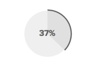
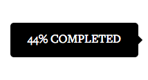
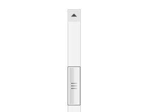
We conducted eye-tracking tests with 24 friends, coworkers, and willing coffee shop patrons. Participants were asked to read a long article while a Tobii Pro X2-30 Eye Tracker recorded the movement of their eyes on the screen. We built a simple prototype to show participants one of three custom scroll position indicators, as shown below. One control group saw only the native Windows 8 scrollbar.
| Custom indicator: Dots See example | Custom indicator: Pie See example | Custom indicator: Flag See example |
|---|---|---|
 |  |  |
After five minutes of reading, we asked the participants to stop reading and then asked them how much longer they thought it would take to finish the article. We weren't interested in their accuracy, but in where they looked to answer this question. We concluded each test by showing each participant all four variations and interviewing them about their preferences.
Eye-tracking test participants were an almost equal mix of male, female, Mac users, and Windows users. Ages ranged from 18 to 40, with a mean age of 27. The testing computer used was an HP Elitebook laptop running Windows 8 and Internet Explorer 11 with a scrollwheel mouse attached.
Results
How people scrolled
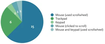
We deliberately didn't instruct participants how to scroll, and observed which method they used. Two-thirds of participants used the mouse scrollwheel.
Did people notice the scroll indicators?
In short: not often. During five minutes of uninterrupted reading, only four of 18 participants fixated on the custom scroll indicator they were shown. Four other participants fixated on the native scrollbar instead of or in addition to the custom indicator. No one fixated more than once on any type of scroll indicator.
Table 1. Natural fixations during the 5-Minute reading exercise
 |  |  |  | |
| Custom indicator: Dots | Custom indicator: Pie | Custom indicator: Flag | Native scrollbar only | |
|---|---|---|---|---|
| Participants who noticed the custom indicator | 0 of 6 | 2 of 6 | 2 of 6 | N/A |
| Participants who noticed the native scrollbar | 0 of 6 | 1 of 6 | 1 of 6 | 2 of 6 |
Why did so few participants notice the custom indicators?
We presented participants with a very long article and instructed them to read the entire thing (although we stopped them after five minutes). We hoped that this would cause participants to demonstrate some curiosity about how long it would take them to finish, either by scrolling ahead, looking at a scroll indicator, or both. In reality, almost no one did. Participants may have also been extra diligent in their focus on the text because they knew they were being observed. They also likely remembered being invited to take "a 15-minute test:" a tricky methodological flaw.

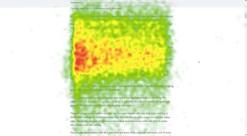
The heat map graphic below shows the visual attention of all 24 participants during the 5-minute reading exercise in relation to the viewport. While reading, participants generally maintained focus in the vertical top-center of the screen and continuously scrolled the content to this region, rather than reading from the top to the bottom of the screen and then scrolling. Items outside of this top-center region were rarely noticed, even on a page where they weren’t competing for attention with ads, navigation, and any other visual noise.
Where did people look to estimate remaining reading time?
After five minutes of reading, we interrupted participants to ask how long they thought it would take to finish the article. When prompted with that question, many more participants noticed the custom indicators.
Table 2. Fixations when asked to estimate remaining reading time
 |  |  |  | |
| Custom indicator: Dots | Custom indicator: Pie | Custom indicator: Flag | Native scrollbar only | |
|---|---|---|---|---|
| Participants who noticed the custom indicator | 4 of 6 | 6 of 6 | 3 of 6 | N/A |
| Participants who noticed the native scrollbar | 2 of 6 | 3 of 6 | 4 of 6 | 5 of 6 |
Interestingly, exactly half of participants answered the question without scrolling, using elements on the static page to make their estimates. I hypothesize that more participants would have chosen to scroll if they had been using a newer version of Mac OS, which hides the native scrollbar when stationary. At any rate, although most non-scrollers who were shown a custom indicator looked at it, four of ten looked at the native scrollbar in addition to or instead of the custom indicator. (Note: Non-scrollers didn't notice the flag indicator, which only appears during scrolling.)
The half of participants who did scroll to assess the remaining length of the article scanned the column of text (not individual words) and scrolled all the way or most of the way to the bottom of the page. Most glanced back and forth to the scroll indicator as they scrolled, but three participants ignored the indicator completely. Users seemed to rely on the spatial dimensions of the page to get a visceral "feel" for its length, even with scroll indicators present. I call the resulting behavior "scroll-scanning:" when users quickly scroll to get a sense of the physical length of a page.
Speaking only for myself, I do this all the time. Reading on the web is less a linear process than a series of scroll-scans, which help me evaluate whether to keep reading. I'm constantly asking, "How long and dense does this look?" "Are there any pictures that break up the text?" "Do I have time to read one more section before lunch?" Today's custom scroll indicators are too "dumb" to answer these questions.

How common is scroll-scanning?
We confirmed users’ reliance on scroll-scanning with a follow-up study. We showed the same four UI variations to a larger sample of 100 participants in a remote test conducted through Mechanical Turk (a testing method we’ve experimented with in the past). In this test, we logged how long it took each participant to read the article and looked for cues that participants scrolled rapidly down the page at any point.
We did not observe any statistically significant effects of indicator style on how long it took participants to finish the article or on their likelihood to scroll quickly down the page. However, fully 53% (±10%) of participants showed evidence of scroll-scanning, which we defined as scrolling at least 25% of the page length in under 5 seconds.
Conclusion
Our evidence suggests that custom scroll indicators may not be worth the development effort and page weight, for a few reasons:
- Some users will not notice a custom indicator
- Some users rely on the native scrollbar even if a custom one is also present
- Users often scroll-scan to get a spatial sense of the page even when indicators are present
Finally, this study pointed to several unresolved questions about scroll position indicators that are ripe for follow-up research:
- Does explicit feedback about the remaining length of a text encourage or discourage users from continuing? In our post-test conversations with participants, some said that knowing upfront that an article is very long might cause them to stop reading. Others mentioned that the progress meters on their Kindles serve as a motivator to keep reading one more page. The length of the text and reading context should be factored into any decision to use a custom scroll indicator.
- What style of indicator is most useful, usable, and appealing? Participants were divided on opinions of style. Some liked seeing percentages; some preferred the subtler visual cues of the dot indicator. Some liked that the flag indicator only appeared while scrolling; others preferred ever-present indicators. Of course, these are just opinions, but more variations could be tested and compared: a static indicator vs. one that scrolls; a persistent indicator vs. one that fades in and out; showing length remaining vs. length completed; showing a percentage vs. a word count vs. estimated time, etc.
- How does familiarity change behavior? This study focused on first-time users, but people who frequently visit sites with custom scroll indicators may come to develop unique usage patterns.
- Do custom indicators need to be noticed to be useful? Could scroll position indicators play a helpful orienting role for users even if they are only perceived subconsciously through peripheral vision?
Hopefully, these and other questions related to scrolling behavior can be addressed in future research studies.
Thanks to co-investigator Ben Travis for assistance with study design, moderation, and analysis, and to Jeremy Fields for developing the testing prototype.
Thanks to Tobii Pro for providing technology and guidance for this collaborative study. We had a great experience working with Tobii Pro and hope to continue our collaboration into the future.