Shades of Gray — Yes, Really
Tom Osborne, Former VP, Design
Article Categories:
Posted on

Get your head out of the gutter, this is about real colors, y’all—not that racy stuff you watch on the big screen. In my last post, I shared a method for creating a full range of colors using color mixing. Here, I’ll share a similar process for grays or neutral colors.
Quarters & Thirds
It used to be that I would separate my grays into quarters and thirds as a way of covering a good range with memorable increments; but, it always bothered me that the gaps weren’t equal. In other words, you end up with shades that gather closer to the middle of the range than on the ends. When this happens, you miss some good contrasts on the lighter and darker sides of the range.

Fixing the In-betweens
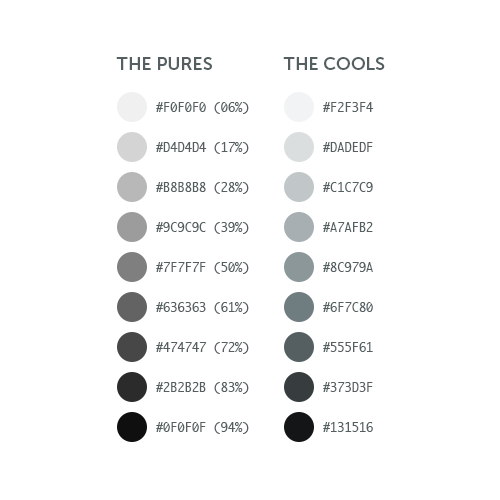
More recently, I’ve worked to fix this imbalance by moving outward from a 50% middle with increments of 11%. This does a couple of nice things. Not only does it retain a perfect middle at 50% -- it goes further to create perfect middles at each gap in-between. I also get two additional grays (17% and 83%) closer to each end of the spectrum for more options using lighter lights and darker darks. An added bonus is that it eliminates the pure blacks and whites which are nice to keep reserved for limited use, if any.

Warming & Cooling
Of course I could stop there -- but that would be boring. I usually like to add a hint of color for further interest and distinction. The first step is to decide whether or not to warm or cool the set. In this example, I’m cooling things down with a bright blue from the Viget color palette. I’ll simply overlay the blue and create an opacity of 10% so that the grays are still visible and dominant through the transparent blue. It’s hardly noticeable, but doing so nicely cools our grays with a subtle hint of blue as seen here:


The Full Range
Voila! That’s it. Now we have a full range of cool neutrals to use alongside a full range of bright colors. Here’s what they look like together in an extended Viget color palette.

See also:
- Add Colors To Your Palette With Color Mixing
- Giving Colors More Colorful Names
- From Darkness to Light: Color Versatility Using Tints, Tones, and Shades
- Using Word Association to Select Brand Colors
- Equating Color and Transparency
- Using HSB Inputs in Photoshop’s Color Picker
- Color Contrast for Better Readability