Using Word Association to Select Brand Colors
Tom Osborne, Former VP, Design
Article Categories:
Posted on

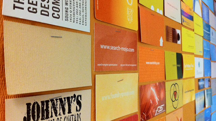
A mural of business cards at Viget headquarters in Falls Church, VA.
A Discovery News article states that we “like colors that are tied to things that are healthy and promote survival”. In other words, we’re drawn to certain colors because of the positive feelings they give us, and we develop color biases as we experience life. Conversely, we tend to shy away from colors that evoke negative feelings.
This might explain why I’m drawn to oranges and blues (the colors of my alma mater University of Florida), and why I sometimes have trouble with bulldog red and black.
But what if you could divorce your mind from selecting brand colors based on personal feelings? What if you could put your intuition aside for just a moment, even if in the end you only validate what you always suspected? Heck, you might even discover some new possibilities—I might find a good reason to use red and black.
Now, you may be wondering where research fits into this experiment. I’m not saying proper competitive analysis shouldn’t be a part of brand color selection. But for now, let’s try and pick colors based on brand attributes or words. We’ve known for some time that colors can have innate meaning. And, we know that colors can have different meaning across cultural boundaries. Let’s start by applying some words to a brand, and linking those words to their associated colors to find a match (keeping in mind my decidedly western cultural perspective).
Color Associations
Coincidentally, I’m currently in the market to purchase a new phone. To make this relatable, what if we use Apple’s new line of iPhone options to decide which color I should pick to best match my personal brand?
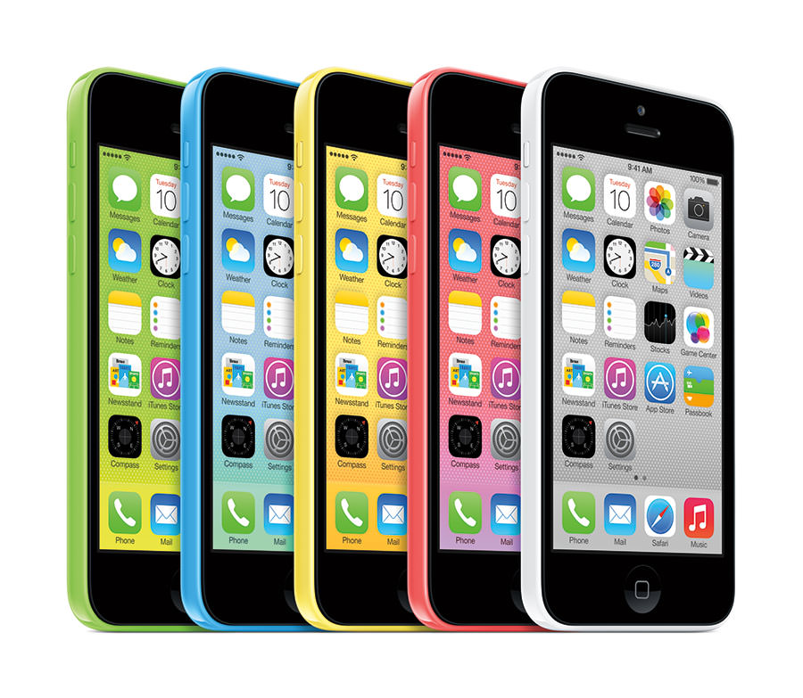
There are five iPhone 5c colors available: green, blue, yellow, pink, and white. Now, I might simply follow my personal bias and pick blue—but is blue really ‘me’? A true representation of my personal brand? Let’s find out.

Apple’s iPhone 5c includes green, blue, yellow, pink, and white options.
Using a variety of sources, I’ve chosen five words for each of the five colors, for a total of 25 words. In alphabetical order, they are: balanced, calm, clean, compassionate, confident, dependable, energetic, exciting, fresh, happy, harmonious, healthy, honorable, hopeful, intelligent, joyful, optimistic, peaceful, playful, pure, safe, soothing, stable, sweet, and trustworthy. It’s worth noting that I didn’t use any negative color associations for this exercise, but it’s fair to say that eliminating colors based on negatives could also be a useful exercise.
Let’s say I ask my wife to pick the three words in the list that she would use to best describe me to someone else. Remember, your brand is how others describe you—not how you describe yourself. Once the list is narrowed to three words, we can begin to identify our base color. If all three words are associated with the same color, then this exercise is easy—that’s my base color. If there’s a two to one split, then I might have my base and a primary accent (assuming they don’t clash). If I end up with three different colors, I may need to do a follow up exercise to prioritize the list.
She chose calm, dependable, and playful for my personal brand attributes. Each has a different color association according to my list, so we need to prioritize them. One way to do this is to put the words into their respective color groupings and then sort them in priority order based on the additional word associations.
Here are my brand descriptive words, grouped with their final rankings. You’ll see that calm moves to the top of the list because my wife felt the additional associations balanced, clean, pure, and safe, were more representative of me than the others. Therefore, white becomes my base color.
My Top 3
- balanced, calm, clean, pure, safe (white)
- confident, dependable, peaceful, stable, trustworthy (blue)
- compassionate, energetic, exciting, playful, sweet (pink—whoa!)
The Others
- fresh, harmonious, healthy, hopeful, soothing (green)
- happy, honorable, intelligent, joyful, optimistic (yellow)
Seeing the words together, it will hopefully become clearer which attribute grouping is the most closely associated with my personal brand. Now that I know that balanced, calm, clean, pure, and safe is the closest, boom...I have a better idea that my personal brand color is white, and I know which color phone I should choose.
You might ask if there’s something we can do with the other colors? Why yes, there is. Now that I know that our secondary grouping is confident, dependable, peaceful, stable, trustworthy I can add the blue case to accent my white phone. Not only do the kind words of my wife help boost my self-esteem, now I’m on-brand AND stylin’!

The case actually becomes the dominate color rather than an accent. It might be worth switching the approach to adjust properly.
Taking It Further
So there you have it: a method to help pick your brand colors that isn’t exclusively based on your (or someone else’s) inherent color biases. But isn’t this oversimplifying things? Yes, of course it is. Look at this as just a simple way to illustrate a point. I recommend you do your own research to create your list of color associations, since some words can vary or be shared by multiple colors. Check out this sample color association exercise I created in 2012, to help you get started.
If anything, using words to pick colors forces a conversation to compare and contrast your competitive research to your brand attributes. Once you have your base and secondary colors, you can then explore hues, tints, and shades to extend the methodology further.
I hope this helps you better serve your clients and discover new color combinations to add to your repertoire.