The Big Argument for Responsive Design
Jason Sperling, Former Senior Digital Strategist
Article Category:
Posted on
At our last TTT, Viget’s company-wide quarterly event in April, Mitch Daniels, digital analyst, shared some thoughts on the state of the mobile web. He’s posted about The Rise of The Second Screens previously; but, it was a great reminder of what, to me, is the big argument for responsive design:
The number of unique screen resolutions being used to access web sites is increasingly varied and growing at a rapid pace.
Responsive design is not the answer to supporting every user that wields a mobile or tablet device. However, it has emerged as the best strategy for reaching the largest variety of devices with the least fragmentation of assets.
How Many Unique Screen Resolutions Hit My Web Site?
To find out, we looked at data from a handful of sites that we’ve worked on over the last four years. Some of the top resolutions included 1920x1080, 1600x900, 1440x900,1366x768, 1280x1024, 1280x900,1280x800, 1024x768, 768x1024, and 320x480.
Notice how similar some of these screen resolutions are? Today, there are no longer any gaps between screen sizes.
But, the other change that’s astounding is how many total screen resolutions, on average, hit web sites beyond these top resolutions. In Q1, 2013, the average unique screen resolutions was 232. Two hundred and thirty-two. While there’s some browser, device, and reporting artifacts* influencing this number, it is interesting to see the trend across the years:
Unique Screen Resolutions (Average) from 2010 to 2013
Q1 2010 - 97
Q1 2011 - 129
Q1 2012 - 229
Q1 2013 - 232
Within a three-year time span from Q1 2010 through Q1 2013, we’ve seen 139% growth.
We then filtered the results by the number of unique screen resolutions related to 80% of the visits to the sites. This helps give a sense of how unique screen resolutions correspond to the majority of traffic to web sites.
Unique Screen Resolutions - 80% of Visits (Average)
Q1 2010 - 7
Q1 2011 - 9
Q1 2012 - 13
Q1 2013 - 15
So ... If we want our content and functionality to be optimized for 80% of our users, we cannot design for a single screen resolution. This data clearly indicates that designing for a single screen resolution is a thing of the past.
Mobile devices, like electronic music, texting, and cars that drive themselves, are here to stay. Consider that Adweek recently reported that by 2017, mobile devices will account for one-fourth of online sales in the U.S. Here’s even more data on screensize.
In the past six months alone, we have seen the share of mobile traffic to various client sites grow by up to 75%. While device usage varies widely by individual site, some clients now see a large majority of their traffic visiting on devices of various sizes. Here’s how the mobile share of traffic has grown, on average, over the years:
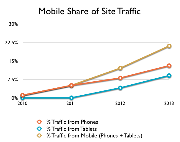
Based on average data from random sampling of client sites Q1 for 2010 - 2013.
Some Important Changes In Mobile Device User Behavior
Back in the days when there were fewer mobile devices and, thus, fewer screen resolutions to consider, we could somewhat reasonably intuit users’ needs and intent based solely on the device they were using. This is increasingly misleading. According to Mobile Search Moments Study, nearly 80% of all mobile searches take place from home or work, locations in which a desktop computer is often readily available. No longer are mobile devices used because there is no alternative. Worldwide, calling mobile devices a “second screen” may also be a misnomer as lack of infrastructure or hardware costs drive increased use of mobile devices as the primary device.
We also see an increasing trend toward multi-channel access. Users who start their experience on one device will move to another when necessary. They’re growing more accustomed to expecting parity across devices, not simply stripped-down versions of the desktop site when accessing from a mobile device. This is an important consideration as responsive design assumes Universal Access to content. Read more: Google Report on Multi-channel Use.
Why Can’t I Just Do Responsive Later?
You can. But, it costs more. We’ve found from current projects that it’s very hard to retrofit a site to be responsive. Responsive design isn’t just thinking about the “mobile design” or “tablet design”; but, instead, about “how does this look at 400, 500, 600, 700 ... 1,200px?”. Getting from a fixed-width desktop design to responsive design requires, at a minimum, the CSS, HTML, and JavaScript rewritten to account for flexibility. Oftentimes, the delivery and management of content needs to be adjusted as well.
Over the last year, we’ve had several clients who have come to us with sites designed years ago for desktop whom we’ve worked with to retrofit their sites to be responsive. Retrofit isn’t really the right word for it, though. We often need to rebuild the front-end architecture to achieve the necessary site performance (speed), which is much more important for a responsive site that is consumed on mobile. In addition, we also usually need to redesign UI elements and update the backend application or content management system. This level of effort represents a significant additional cost that can be avoided if responsiveness is planned from the onset.
Four Arguments Against Responsive Design
Not everyone is a responsive design champion; but, there is a sense that it’s becoming the price of entry for web design. Here are four arguments we hear against responsive design, along with a bit of Viget-y perspective:
- Costs more upfront, harder to do. - This is true; but, it evens out over time.
- Levies heavy technical requirements, especially on asset delivery. - Same as 1.
- Non-technical web editors don't know how to produce things that won't muck up the responsive design. - Project-dependent, but largely false.
- Can't / don't want to migrate old content. - Very true and very problematic. There are strategies around this though.
Learn More
Responsive design is an important strategy for addressing mobile and tablet users. Here are some posts where we talk about different aspects of responsive design:
- Responsive Design, An Overview (includes a handful of examples)
- 10 Astounding Mobile Stats and The 3 Mobile Trends To Watch
- Managing JavaScript on Responsive Websites
- Building a Nested Responsive Grid with Sass & Compass
- Front-End Developments: A Year in Review
- SXSW, Part of the Process for Getting Enlightened and Energized
… browser, device, and reporting artifacts* and other notes.
Some issues that impact unique resolution reporting include:
- Some browsers calculate screen resolutions differently.
- There are long-tail visits that represent a pixel difference and are not something you would design differently for ... This is why we’re interested in knowing the number of unique screen resolutions that make up 80% of visits. It’s also interesting to note that, when we looked at broad ranges, we discovered that, in some instances, resolutions with at least one dimension > 1600 account for 16% of visits, and resolutions with at least one dimension < 500 account for 11% of all visits. These resolutions represent the more extreme ends of the spectrum, and a vast majority of visits fall somewhere in the middle, as explained here.
- Giant monitors (like the ones we use) have large screen resolutions; but, we often browse on 1/2 or even 1/4 of the screen. GA only reports the actual monitor resolution, not the browser size.
- Screen resolution is not always a great indicator of device size or browser size. High-density display devices have relatively high pixel counts, but are still small view-ports. It is important not to confuse screen resolution and view-port size. For instance, the Samsung Galaxy S4 has a resolution of 1920x1080, which we might confuse for a large desktop monitor, but it isn’t.
- While the number of unique screen resolutions is a useful statistic, the % mobile visits also illustrates the range of devices that we're seeing hitting web sites these days.
Data from Google Analytics and a handful of sites we’ve worked on over the years. We’ve excluded any resolutions that accounted for fewer than 1/10,000 visits.
Special thanks to Mitch Daniels, Paul Koch, Todd Moy, Jeremy Fields, and Oliver K McGinnis for their contributions and assistance on this post.