-
-
Challenge
Relaunch the classic Armstrong Tires brand after 20 years of market dormancy.
-
Solution
What makes a tire brand relevant to consumers today? We dug in via extensive company, audience, and market research.
-
Results
A revitalized brand, mascot, communication strategy, and flagship website to herald the reintroduction of an iconic name in tires. As a result, organic traffic increased 26% and pageviews of the Passenger index page increased 223%.
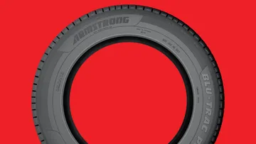
Getting back on the road. Once the 5th largest tire manufacturer in the world, Armstrong Tires was purchased by Pirelli in 1988 and by 2012 was close to being phased out completely. That’s when ZAFCO — a global tire manufacturer and distributor — stepped in with the goal of buying and rebuilding Armstrong Tires from the ground up. ZAFCO asked us to help them fully reimagine the Armstrong brand, from its core strategy, all the way to its beloved century-old rhino mascot, Tuffy.
Areas of Expertise
-
-
Built to Last
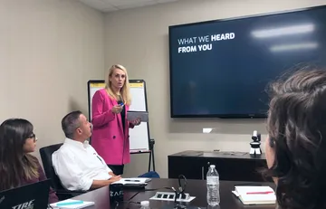
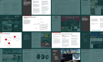
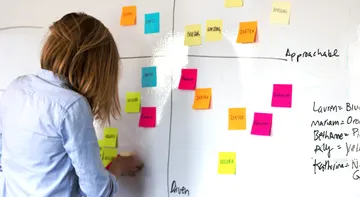
We spent several weeks digging into what makes Armstrong tires unique. Through stakeholder interviews, customer interviews, market research, and an all-day strategy workshop, we discovered a product with a compelling warranty value proposition backed by a company with an uncompromising level of integrity and service.
-
-
-
-
Big Insight: Nobody Cares
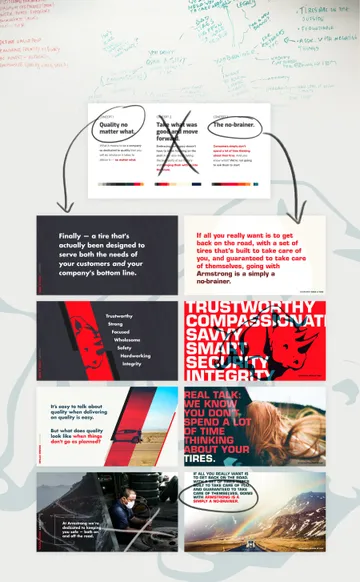
One of the key insights that came out of our research was that people don’t spend a lot of time thinking about their tires. As we started concepting our core strategy ideas, we realized we could either try to change that reality, or we could take advantage of it. We decided to take full advantage, dialing in on a strategy we called “The No-Brainer”.
-
-
The No-Brainer
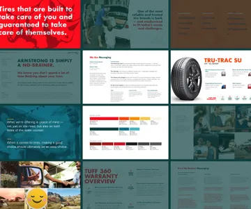
The No-Brainer concept centered on this proposition: If you just want a tire that’s built to take care of you, and guaranteed to take care of itself, then Armstrong Tires are simply a no-brainer. We used a straightforward, savvy, and compassionate tone to make the brand stand out in a field of competitors that range from aggressive and braggadocios, to expected and treacly.
-
-
-
B2B2C
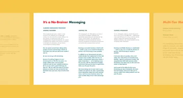
The No-Brainer concept also allowed us to target both of Armstrong’s audiences with the same strategy. The “making a good choice should be an easy choice” messaging was tailored to the consumer B2C audience. But for the B2B audience — the tire dealers that Armstrong sells to directly — we pointed out that a gold-standard warranty and an under-market price point make adding Armstrong to your store’s product lineup a clear no-brainer.
-
-
A Rhino in a Tophat
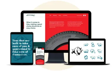
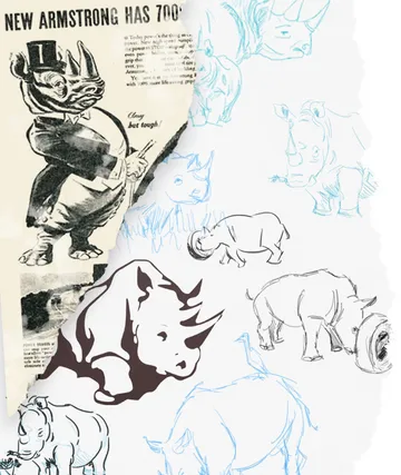
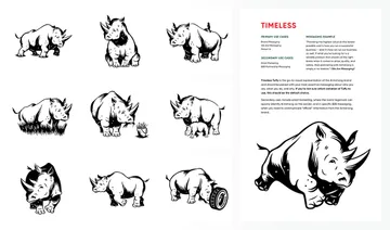
We wanted to update the Armstrong mascot in an efficient way that wouldn’t add months to our brand effort. We realized the answer might lie in the Armstrong logo itself: What if we used the rhino in the logomark as the inspiration for our new mascot? We worked with illustrator Drew Lakin to modify the image into a less anthropomorphic rhino character and created 10 signature poses to represent each of the new brand attributes.
-
Armstrong’s “Tuffy” mascot really came to life in the 1950s with the illustrations of Keith Ward. Ward created a dapper tophat-wearing character — essentially a person who just happened to be a rhino. While iconic and important to Armstrong history, this quirky mascot didn’t feel like a great fit for the more modern and straightforward tone of the new brand.
-
Building A Digital Footprint
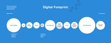
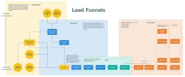
To ensure the success of the new brand rollout we did another series of strategy workshops with the ZAFCO team. We identified key communication touchpoints throughout their sales lifecycle and targeted those touchpoints with the highest potential ROI. We also explored some low-effort/big-impact ways to refresh their entire brand portfolio.
-
-
-
-
-
-
-
Black, Round, and Red All Over
We wanted to make sure the flagship site for the new Armstrong brand stood out amongst the gritty, techy, and corporate-blue sites of their competitors. We built out the modern, straightforward, and trustworthy brand using a bold but focused color palette, thoughtful animations, on-voice messaging, and special attention to their warranty and product pages. We came up with an innovative “reversible jacket” site concept to service Armstrong’s distinct B2B and B2C audiences. When you land on the site you’re on the “Passengers” or B2C version. When you click on “Commercial” on the top nav, the site “turns inside out” — the colors change, the photography changes, and the messaging changes. Structurally the site stays the same, but it is now tailored to the B2B commercial audience.
-
This video has no audio
Summary
We helped relaunch the century-old Armstrong Tires brand using an in-depth research and creative concepting approach, resulting in a new Armstrong brand, mascot, communication strategy, and flagship website.
