-
-
Challenge
Help WWF conquer disorganized content and tell its organizational story in a compelling way.
-
Solution
Do research to determine how people categorize animals, and work with WWF’s wealth of content to create the kind of stories users wanted to see.
-
Results
A site with a custom content management system (CMS) that leveraged WWF’s existing material to create an engaging and informative user experience, resulting in a 49% increase in visit duration.
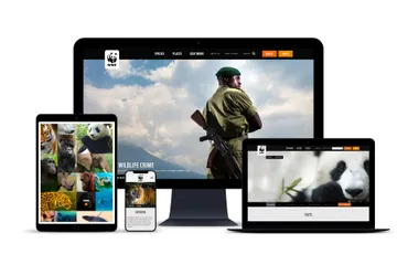
What’s the best way to tell your organization’s story? Ask your users. The World Wildlife Fund (WWF) is the largest independent conservation organization on the planet. After several years of publishing on separate desktop and mobile sites, content sprawl and disconnect had become a real issue. WWF needed a better way to share their mission and connect with supporters. By starting with in-depth user testing and site analytics, we let WWF’s own audience help us develop a site that is intuitive, engaging, and effective — increasing revenue per visit by 22%.
Areas of Expertise
-
-
Ask the Audience
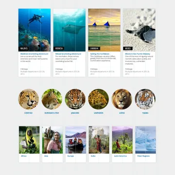
Through our research, we discovered that WWF’s audience doesn’t categorize animals the way you might expect. For instance, elephants and rhinos were usually grouped together, even though they’re not scientifically related. With this in mind, we were able to organize the site’s content in a way that made it easy for users to locate and learn about the animals they love.
-
Showcasing Great Content
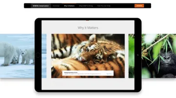
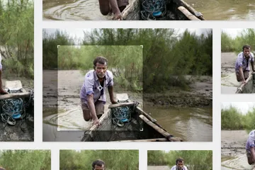
WWF already had a wealth of existing content, including images taken by photographers all over the world. We created a content strategy and custom CMS that made it easy for users to find and enjoy those stories, and at the same time better understand WWF’s mission to protect wildlife.
-
-
Bringing the Site to Life
We wanted WWF’s site to feel as exciting and vibrant as their content. We used motion-filled grids, thumbnails, and carousels to make the content come to life. We were also able to illustrate the relationship between animals, the places they live, and the threats they face in a way that was dynamic and engaging.
-
-
-
22%
The newly-structured site resulted in a 22% increase in revenue per visit.
-
Strength in Numbers
Tools like Google Analytics and SiteCatalyst showed that our audience-focused approach to design and content increased Conservation Advocacy Network advocacy actions, like signing petitions, by 146%. By pruning 27% of pages, we simplified content and made the remaining pages even more compelling and actionable for visitors.
Summary
Our work allowed WWF’s audience to get the stories and information they wanted, the way they wanted. Using a customized Rails CMS, we brought WWF’s desktop and mobile sites together in a responsive solution to create a more unified and consistent experience for the user. Our focus on easy photo management created stories that were more visually engaging. The result: a 22% increase in revenue per visit and a 49% increase in visit duration.


