-
-
Challenge
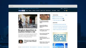
What does going responsive mean for a news site that requires a right rail (a layout convention that places news stories in the center column and reserves the right-hand column for advertising) as well as support for legacy and third-party content (like partnerships and promotional content) with a significant portion of traffic from legacy browsers?
-
Solution
In a word: Standardization. We needed to update the design so all content, including ads and promotions, has a standard width (with a baseline size of 300 pixels). Content also needed complete flexibility, so that it could increase or decrease in size and display in different places on the page depending on the viewing device.
-
Results
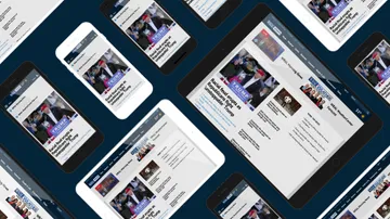
High-quality reporting in an environment that is easy to navigate, intuitive to use, and that maintains its visual integrity no matter what device it’s on. Advertisers can have confidence that their messaging remains visible across a variety of platforms, and WRAL has the framework and design tools to keep their online home fresh and dynamic well into the future.
Not your average local news. Many local TV news web properties have limited market share when it comes to traffic and reach. WRAL is quite the opposite. WRAL.com was already providing the most trusted and current local news content––the site gets over 175 million visits per year. With average users spending 28 minutes on the site, it's obvious that WRAL is a trusted news source for the Raleigh-Durham area. But a lack of visual consistency between news and promotional content often caused the popular website to feel cluttered and difficult to navigate, particularly on mobile devices. We knew we needed to craft an online news experience for WRAL that was responsive, dynamic, and even more engaging.
Areas of Expertise
-
A Responsive Right Rail
News sites are one of the few sites that requires a right rail (a right-hand column reserved for advertising.) We found that other sites with a rail either drop the rail content beneath other content as it responds to screen width, or stack and interweave the rail content. We opted for a combination of those two options. WRAL’s ad content reflows either beneath the news content or stacked within the news content. This allows us to deliver content with the appropriate importance on all devices while preventing gaps in the design.
-
-
Creating Consistency
WRAL lacked a visual consistency to their branding elements. Promotional branded content was often presented in various sizes and styles and lacked the uniformity and polish of the overall brand. We designed a flexible system that could display these promotions with the proper presentation and distinguish them from other ads on the page.
-
Responsive, Custom Content Placement
To deliver on our blended reflow strategy for advertising content, we built Transport, a responsive framework for moving elements between containers. It identifies and executes content hierarchy and placement, and achieves fluid resizing of both dynamic news content and advertisements. This allows for custom content placement at any screen size.
-
-
Working With Widgets
Working closely with the WRAL team, we conducted a thorough content inventory. We learned that the content was primarily widget-based, which meant it existed in variably-sized components that were too inflexible to flow across all devices. We created a plan for updating their components to work responsively.
Summary
WRAL’s 175 million visitors per year now peruse a site that is easy to navigate, intuitive to use, and that maintains its visual integrity no matter what device it’s on. Advertisers can have confidence that their messaging remains visible across a variety of platforms, and WRAL has the framework and design tools to keep their online home fresh and dynamic well into the future.


