-
-
Challenge
Help the Association increase brand recognition and improve content curation.
-
Solution
Use a two-phase approach to first redesign the Association’s communication strategy, and then create a new online home for one of the world’s most famous houses.
-
Results
Visitors spent 58% longer on the site, compared to the same period during the previous year, while viewing an unparalleled collection of presidential artifacts and historical content. Additionally, the site bounce rate decreased by 53%.
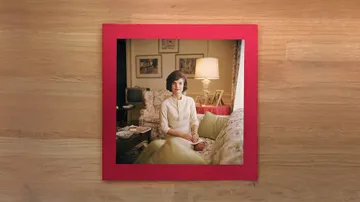
Supporting the future of history. Founded in 1961 by First Lady Jacqueline Kennedy, the White House Historical Association strives to protect, preserve, and provide public access to the rich history of America’s Executive Mansion. The organization is well-known for its annual White House Christmas Ornament, but struggled with both brand recognition and online execution of one of their primary efforts: the creation and promotion of historical content. The Association needed a better way to tell historical and organizational stories in the digital age.
-
-
Becoming A Gracious Host
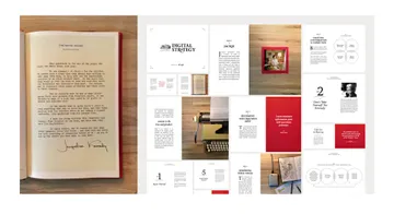
To help the Association more effectively tell their story and further their mission, we developed a new messaging strategy, brand strategy, and content strategy for the organization as a whole. We realized that, as the primary entity responsible for White House history, care, and hospitality, the Association had the opportunity to establish itself as the quintessential host of one of the most famous homes in the world. Our “gracious host” concept formed the basis of our strategy work, which we then used to guide the full redesign of the site.
-
Content Is the Product
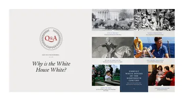
Thanks to our strategy phase, we knew we needed to create a system that functioned more like a dynamic publishing platform, and less like a static association site, to give users multiple access points to WHHA’s vast content collection. We ended up building a custom Craft plugin to import almost 2,000 pieces of content that were on the original hard-coded HTML site — this included text, photography, video, and mp3s.
-
We had an abundance of content, but it was inaccessible, unsearchable, siloed, and static. The Viget team dove deep in learning about what type of content we had, how it aligned with our mission and goals and made informed recommendations that leveraged the right technology for our rich and growing content collection.
-
-
Creating a Custom Look
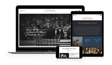
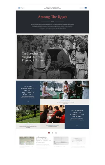
Craft is a powerful CMS and a great choice for custom websites. We pushed the envelope of what a CMS could do by using Craft + Flexbox, a CSS layout module that allows positioning of elements in horizontal or vertical stacks. This let us create the signature responsive grid we used on Collection pages.
-
-
A More Flexible Way to Navigate
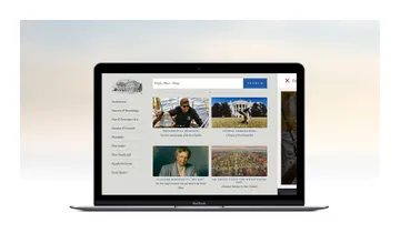
Craft’s modular content matrix gave us an incredible amount of flexibility when it came to building custom pages on the fly, and it helped us design a search-based navigation system using keyword and content tags rather than a traditional hierarchical menu navigation. Users can now search the site in three different ways: via a general search bar, using a collection of pre-selected filters, or through pieces of content that are surfaced based on the tagging system we created.
-
-
-
Historic Mobility
Our focus on fast, responsive design helped us realize a 96% increase in mobile visit duration post-redesign, and increased the number of visitors arriving from social by 350%, year-over-year.
-
96%
Visit duration via mobile increased 96% after WHHA’s redesign.
Summary
We started with an in-depth brand and content phase to help the the Association re-shape their digital communication strategy. We then used this overarching strategy to guide the creation of a new site that leads users through the Association’s wealth of content in a thoughtful, organized way. Visitors can now easily access an unparalleled collection of White House historical resources, which has led to a dramatic increase in site visit duration.
