-
-
Challenge
Redesign a flagship site using a unique visual aesthetic to better communicate organizational values to a diverse audience.
-
Solution
Develop a new visual branding system and bring it to life using a flexible Rails CMS that supports bold photography and design.
-
Results
A digital platform that inspired audience engagement with striking, user-focused visuals and design, leading to a 59% increase in end-of-year donations.
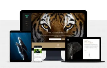
120 years in the making. Since 1895, the Wildlife Conservation Society (WCS) has worked to protect the world’s wildlife and wild places. Our collaboration with the organization has resulted in the groundbreaking 96 Elephants campaign and a redesign of their five zoo and aquarium sites. We were two years into our partnership with WCS when they came to us with an exciting new challenge: could we help them refine their visual branding through a redesign of their flagship site? Through close collaboration with our stakeholder team, we helped refine the WCS aesthetic and build a flexible new CMS that leverages a bold new approach to photography and design.
Areas of Expertise
-
-
Curating the Content
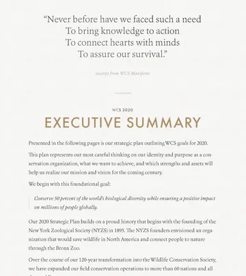
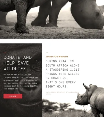
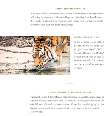
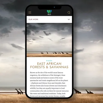
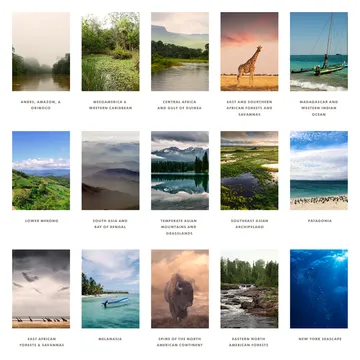
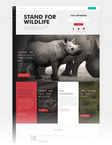
We created a visual design that could speak to WCS’s diverse audience — from users seeking general wildlife information to dedicated advocates and donors. The site is composed of different content “zones”, which feature visual elements that tie back to the core aesthetic, while also targeting a specific audience segment.
-
Free to be Flexible
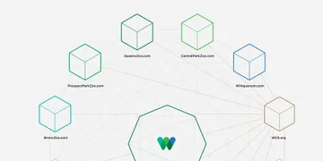
Using the Rails-based CMS we created for WCS’s five zoo and aquarium sites, we were able to build in tools that give them the freedom to generate new sites and templates without outside help. The new CMS can support their publishing needs and allows them to create and display new content as needed.
-
-
-
-
-
-
-
Being Bold
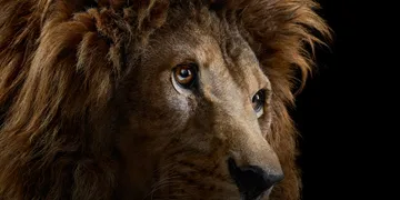
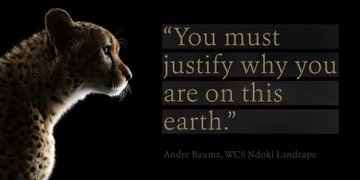
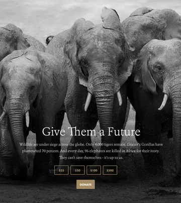
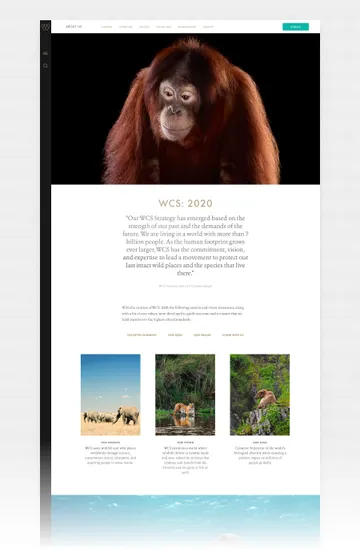
Applying our new brand aesthetic to the flagship organizational site allowed WCS to express a bolder, more inspiring point of view as it connects with its varied constituency. The photography we incorporated showed animals outside of captivity, set against a dramatic, black backdrop. This new look served as a unique and striking complement to the WCS logo designed by our friends at Pentagram.
-
-
-
-
Coding Customized Pages
The "zones" we created within the site architecture and back-end infrastructure have their own unique style sheets. This flexibility allowed us to design seemingly custom, audience-tailored pages within an easily-manageable CMS admin experience.
-
Summary
We helped WCS refine their visual aesthetic and bring it to life on a new digital platform. Our approach to photography and design helps tell WCS’s story in a fresh and compelling way — using the same Rails-based CMS that we created for their five zoo and aquarium sites — resulting in a flagship property that naturally complements their other platforms. We also built in tools and flexibility that allow WCS to handle their publishing and template creation independently. The result: a new home for a 120-year old organization that lead to a 59% increase in donation revenue at the end of the first year. Continued split tests and optimizations drove an additional 23% in end-of-year giving during the second year after launch.
