-
-
Challenge
Scientists, government officials, and others working on water conservation issues needed a streamlined process for organizing and executing water funds.
-
Solution
Centralize a library of resources into a platform where information on how to create water funds is better represented, easier to find, and as transparent as possible.
-
Results
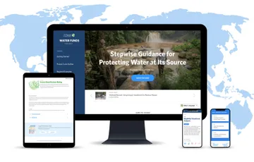
A redesigned site that is part marketing tool, part step-by-step guide for conservationists working on water funds, both educating and equipping them to bring their water funds projects to fruition.
Having developed expertise on water issues over many decades, The Nature Conservancy knew that a variety of professionals, from hydrologists to government officials, needed access to information on how to obtain grants for water funds as well as how to execute them. For the most part, they had been providing this information personally, on a case-by-case basis, to those who sought out their institutional knowledge. This time-intensive process led to another realization: what these groups really needed was a more efficient, centralized depository for all the available information on water funds.
Areas of Expertise
-
-
Diving into Complexity
Information about water funds — financial funds that help upstream communities improve their water practices — is both broad and deep. Our team started with high-level research and interviews with a cross-section of the audience ranging from field scientists to government officials who run the funding process. Our goal was to ramp up quickly and understand this space well enough to make thoughtful recommendations on how to present TNC’s wealth of information to users.
-
-
Designing for Clarity
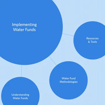
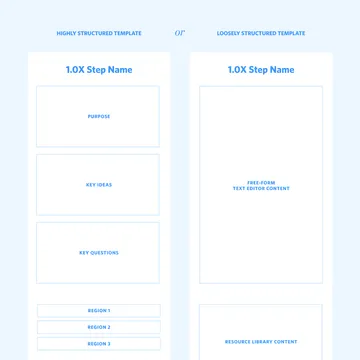
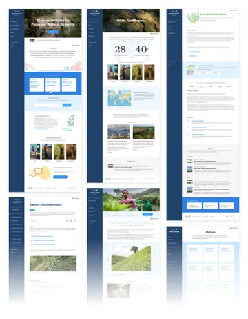
We worked with the TNC team to come up with design solutions for the site’s information architecture and content structure. Since there are plenty of gray areas in the stepwise process (each region has its own set of rules, for example), our goal was to implement a balance of structure and flexibility for the site. The result is a clear, organized IA that makes it easy for users to find specific items of content.
-
-
-
Equipping Users for Action
The centerpiece of the new Water Funds site is the Toolbox, which houses and organizes TNC’s resource library. Users can walk through the timeline of the water fund setup process, and each step contains background information (such as recommendations for when you need to get a lawyer involved) plus example documentation and templates available for download.
-
-
Visual Cues + Tools
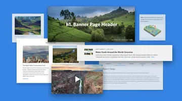
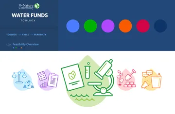
Making a content-heavy site digestible for users requires keeping it interesting. We designed a set of five icons that categorize information and an accompanying color-coding system to help users keep track of which focus areas apply to each item they view. The design system we developed also lets the TNC team build and edit pages on the fly by combining pre-defined design elements. They can easily add video, images, carousels, and much more to help them communicate clearly and adapt content to changing needs.
-
-
-
Summary
We used stakeholder interviews and efficient research to ramp up on a niche subject matter for The Nature Conservancy’s Water Funds site. Our insights led to clear, thoughtful organization of information on a complex topic, plus an elegant design that achieves TNC’s goal of making the process for water funds transparent and accessible.
