-
-
Challenge
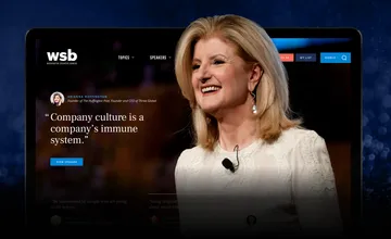
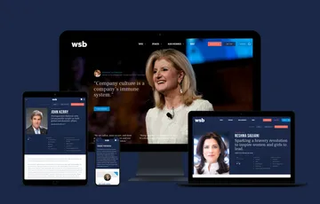
Help a Washington institution revitalize their site and organizational brand through a comprehensive redesign and custom rebuild.
-
Solution
Showcase WSB’s premium speakers and unique brand story, while also providing smart new customer conversion features.
-
Results
A modernized site that embodies WSB’s belief that the shared stories of passionate individuals have the power to inspire — and even transform — the lives of others. This new site had a 9.8% increase in lead conversion rate.
Champion of the shared idea. The Washington Speakers Bureau (WSB) is one of the world’s premier speaker booking agencies, but they were struggling to effectively communicate the premium quality of their brand. Competition was growing from organizations like TED, who were reaching a highly diverse audience using a more modern approach. At the same time, being perceived as a quintessentially “Washington” organization was becoming increasingly challenging in a divisive new political era. WSB reached out to Viget for help reimagining the way they tell their organizational story and market their speakers. The result was a complete overhaul of their site’s branding, user interface design, and backend infrastructure.
-
-
To Share Is Human
We explored several new brand concepts for WSB — some focused on their unique organizational expertise, while others highlighted the value their speakers provide. Ultimately we selected a brand direction called “To Share is Human”. This concept grew out of the realization that sharing ideas is at the root of what makes us human. This strategy positions WSB as “the champion of the shared idea” — an advocate for both the speakers who share them, and for the audiences who spread those ideas around the world.
-
-
Looking The Part
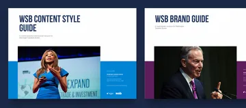
Based on this brand direction we began a complete overhaul of WSB’s visual system and editorial style. This included a new vision for design, photography, video, voice, and content hierarchy; we also gave WSB’s logo a refresh that modernized its look and digital usability. To help WSB’s design and content team leverage the new strategy, we produced a full complement of brand deliverables, including: a brand vision deck; a brand style guide for visual design, editorial voice, and brand extension; and content strategy guides for both structure and substance.
-
-
-
-
-
-
-
Built for Growth
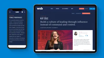
Having developed a strategy to promote speakers based on ideas, the site needed a variety of ways to find and present those speakers in a way that added value to pages and not bloat. The Design System we built allowed speaker pages to intelligently scale based on the content available. With the flexibility our Design System provided, every speaker was able to present their unique experience and ideas in a way that promoted both the speaker and the WSB brand.
-
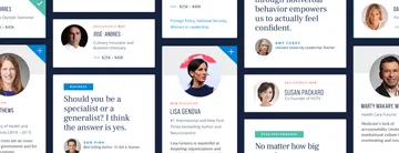
We built speaker card patterns to scale based on the context in which it was used. From inline strips to half-page cards, and everything in-between. -
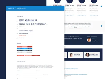
Creating a flexible and consistent Design Systems start with a foundation of basic design elements. We spend a fair amount of time stress testing these elements within simple patterns—carefully building out our system to promote consistency, flexibility, and efficiency. -
Speaker pages—the workhorse pages of the site—were built to intelligently scale. Completely rebuilding itself based on the content available. -
Divide Content and Conquer
We also developed a content “triage” plan to help prioritize the content migration team’s efforts and progressively update their almost 40-year-old brand. We outlined 5 basic page levels that represented increasingly robust and labor- intensive update efforts, and made preliminary recommendations for which pages should be updated first. This means WSB can focus their content resources on their highest priority communication areas — like their exclusive speaker profile pages — without the entire system feeling like it’s still “under construction”.
-
“We’re geeking out here a little bit. The vision has really come to life.”
Summary
We developed a system that let the Washington Speakers Bureau update their almost 40-year-old brand using a modern and inspiring site redesign approach that connects with a more diverse audience.
