-
-
Challenge
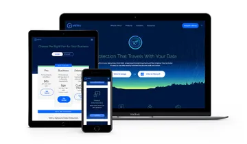
Create a sophisticated yet approachable B2B site that clearly answers, “What is Virtru?” and creates user paths that optimize conversions.
-
Solution
Redesign the sales funnel, use animation and illustrations to visualize how Virtru works, and clarify product offerings.
-
Results
A website that functions as a sales tool for enterprise customers, while staying true to consumers and Virtru’s mission to bring data protection to all.
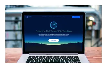
Protection that travels with your data. Virtru’s mission is simple — your information should always be safe and secure, no matter where it goes. That’s why they built Virtru, a platform that adds encryption and access control to the applications you already use. Already differentiated from others in the encryption market with its easy-to-use UI, Virtru came to us with challenges that had nothing to do with their product and everything to do with their marketing site, which didn’t speak to the customers they wanted to target or reflect existing product packages. We partnered with Virtru to create a new site and messaging strategy that catered to a range of customers (from individuals to B2B), streamlined the sales funnel, and simplified the complexities of data protection.
Areas of Expertise
-
-
Evolving the Brand
Coming up with the right visual analogy was paramount to bringing Virtru’s brand to life. We settled on the idea of an information force field — something that provided impenetrable protection, was invisible, and could go anywhere the information went. To illustrate this, we animated a force field around Virtru’s logomark and adapted it depending on the different types of data that needed to be illustrated (emails, documents, media, etc).
-
Showing > Telling
We used illustrations and animations to clearly explain how Virtru works — and to create a simplified demo of their complicated tech.
-
-
Shifting Emphasis
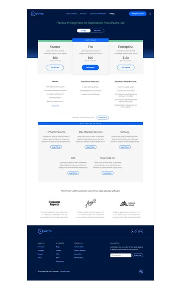
Showcasing product benefits — instead of product packages — was one of the key elements in optimizing the sales funnel.
-
-
A New Conversion Strategy
Instead of constantly pushing potential customers towards a “Sign Up” call to action, we created a flow that fostered learning and incremental progression toward the ultimate conversion point. Our goal was to get people invested in the product by the time they were presented with plans and pricing to increase the likelihood they would convert.
-
Summary
We designed a new marketing site for encryption startup Virtru that uses animation and thoughtful content strategy to cleverly illustrate the value of their products.


