-
-
Challenge
Help U.S. News leverage data to tell the stories of the states that serve their citizens best.
-
Solution
From the provided data, define which charts should exist and standardize that data, to generate all of the charts, tables, and graphs from a single, flexible source.
-
Results
A single standardized and flexible dataset paired with a robust delivery solution to power the site’s over 160,000 animated charts and graphs.
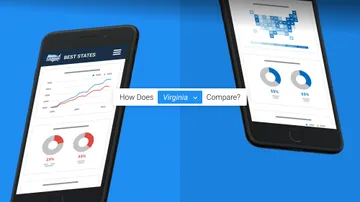
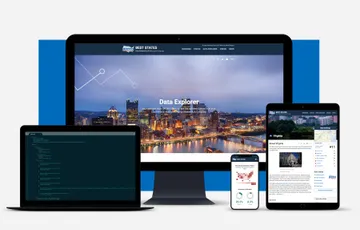
Making data work for journalism. Already well-known for its popular rankings for colleges and hospitals, U.S. News & World Report wanted to try its hand at evaluating something new — the 50 states. U.S. News planned to compare the states by gathering thousands of data points about each one, and using that data to gauge their performance. We worked to define and develop a web app that would allow their editors to feature data-driven stories — alongside the actual data — that would help readers dig into the numbers behind the rankings.
Areas of Expertise
-
-
A Model for Data Modeling
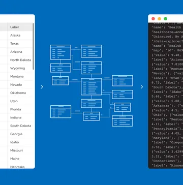
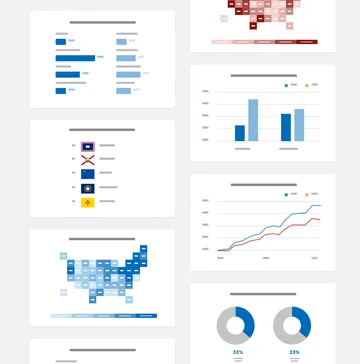
We reviewed, standardized, and consolidated thousands of data points within dozens of unique data sets to ensure accuracy. After defining how each data point would be presented in visualizations, we created a system that allowed us to create over 160,000 unique charts at once from a single data source.
-
-
-
Keeping Content Managers in Mind
Seamless integration with U.S. News’ CMS and APIs was key so that authors could manage Best States content within their existing editorial flow.
-
-
Making Data Easier to Handle
Translating spreadsheets into usable data for chart creation allowed us to visualize the metrics that are the backbone of the ranking, giving the audience the power to explore. And during buildout, we added features like lazy loading, chart animations, and infinite scroll to match anticipated user behavior and needs.
Summary
Helping U.S. News recreate the success of their popular school rankings for a new list, US States, involved parsing huge amounts of data. We concepted and developed an app that made managing that data efficient, while also creating a compelling user experience with clear, dynamic visualizations. As the rankings were released, the site drew the attention of Senators, Governors, and other state officials, giving these leaders a data-driven way to show their state pride.
