-
-
Challenge
Modernize Motley Fool’s flagship product, Stock Advisor in six weeks.
-
Solution
Onsite collaboration with Motley Fool’s engineering team along with a focused, efficient approach to design.
-
Results
A product redesigned with a simpler, more strategic approach to surfacing the information their audience was looking for.
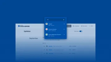
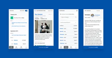
Bringing back a classic. Motley Fool’s flagship product, Stock Advisor was designed for a simple purpose: to provide users with quality stock picks at regular intervals. But the simplicity of the product’s core function was undermined by a confusing user interface. Our work on the design focused on stripping away anything that could hinder users from accessing and acting on their stock picks. Working onsite with the Motley Fool development team, we developed a component library that they could bring into their existing codebase.
Areas of Expertise
-
-
We designed an onboarding process that helped new users understand the app and successfully record their first transaction. -
Collaboration
We used Storybook to build a robust component library that the Motley Fool development team was able to implement immediately — and continue to build on in future. We emphasized collaboration during this phase, working on site and alongside the Motley Fool development team. This allowed us to respond to needs in real time and ensure that the MF team was set up for long term success.
-
We created a more efficient and comprehensible interface for finding companies and reviewing stock recommendations. -
-
Summary
We worked with Motley Fool to create a simpler, more intuitive user interface for their Stock Advisor app. Through onsite collaboration, we gave them the tools to not only implement our work, but to continue modernizing their product long after the engagement.
