-
Challenge
Better incentivize employee wellness through an easy-to-use gym reimbursement program.
-
Solution
Build a native app with a Firebase backend that automatically tracks and logs gym attendance for employees choosing to participate.
-
Results
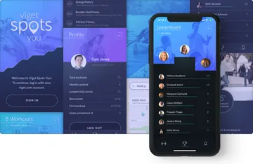
A digital product that went from idea to a polished beta app in less than two months. Since launch, users have logged over 900 workouts in the app.
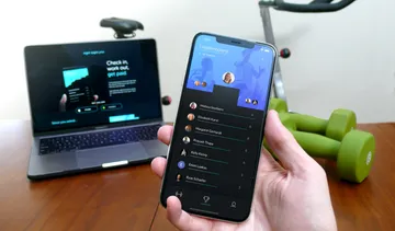
Get excited about getting fit. How do you promote wellness in your organization without making team members fill out nosy forms and submit receipt after receipt? At Viget, employees can now open the native-built app, check-in at their gym of choice, and after eight visits, their reimbursement is automated. No passwords to remember or manual processes for logging expenses. The app also highlights inspirational stats like the longest daily streaks, an individual's total workouts, and the number of times a team member has been reimbursed.
Areas of Expertise
-
-
Code while you design.
We had a limited amount of development time, so we started building right away. This meant making decisions about the design on day one, with a sketch wireframe that came to life as a clickable Figma prototype. This aligned the team on what to build and why, without locking us into a UI direction too early.
-
Wireframing in a grid notebook let us quickly try several layouts. This video has no audio -
Figma makes stitching wireframes into a clickable prototype a snap. This video has no audio -
Looking better every day.
Since this was an internal app, we focused on the aspects most valuable to our team: making it fun and intuitive, building out a showcase-worthy design, and experimenting with new techniques. We started with working features, polished design as we went, and got developer and user input early and often. Because we iterated on the design throughout the project, we saw the product in action real-time and allowed user feedback to guide future work.
-
Bringing the design to life.
Once screens were near-final, we grouped up to create and prioritize animation tickets on the highest-impact parts of the app. The animations followed a rough guideline, but each developer contributed their own ideas and discovered techniques for giving the screens flashy but sensible movement.
Implementing Custom UITableViewCell Separators in iOSPrayash Thapa, Former Developer
-
This video has no audio
-
This video has no audio
-
Build quickly.
Most tech decisions were made in the first meeting after reviewing a rough design spec. We went with Firebase for data, because it was easy to use, lightning-fast, and enabled us to update the leaderboard in real-time.
From Idea to App: Building Spots YouDoug Avery, Former Senior Developer
-
Summary
We built an internal app using rapid cycles of feedback-driven user experience, design, and development work. By balancing development speed and design quality, the final product is a slick and functional app that runs fast, works well, and looks great.


