-
-
Challenge
The National Park Foundation needed to clarify their message in order to better target major donors.
-
Solution
A web ecosystem audit, content strategy, and site redesign that enables NPF to engage park champions rather than park visitors.
-
Results
A targeted messaging strategy and a distinct visual design that led to increases of 62% in session duration, 21% in revenue, and 43% in donation rate.
Evolving an Identity. As the official charitable partner of the National Park Service, the National Park Foundation (NPF) exists to garner financial support for projects across the entire national park system. With growth in mind, NPF sought to engage a new audience: high-end donors who want to protect and preserve these historic places. Together, we refocused their primary content site, NationalParks.org, to inspire more people to give.
Areas of Expertise
-
This video has no audio
-
Getting the Lay of the Land
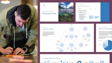
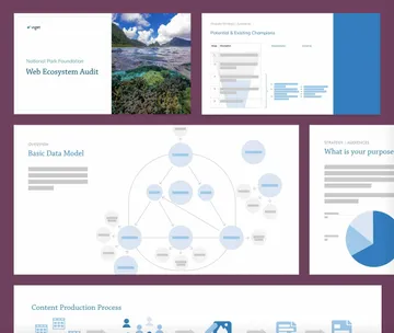
Our work began with a thorough web ecosystem audit, including stakeholder and user interviews, research into peer organizations, and analysis of their site data. We developed an expansive map of their content and website strategy and discovered that NPF spent too much time on content geared towards park visitors while neglecting content that spoke to their donors. To attract more park philanthropists, they needed to blaze a new trail.
-
-
Talk So Donors Will Listen
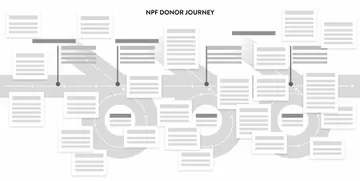
NationalParks.org had impressive site traffic but wasn’t driving enough conversions to reach ambitious growth goals. Informed by user interviews, we mapped out the experience for every donor level, plotting out the motivations and triggers from small- to high-dollar donors. A detailed donor journey map showed NPF how their target audience actually engages with their website. Knowing where to focus their energy helps their fundraising team focus on what they do best – sharing the value and possibility of the future of our national parks.
-
-
Calling All Park Champions
NPF’s brand strategy embraced the awe of our national parks with their tagline Wonder Calls. And while this got people excited to visit the parks, it didn’t necessarily inspire people to give to them. We saw an opportunity for true impact storytelling and improvements within their content editorial system to make their team more effective. With a site reorganized around their work and impact, NPF has increased their session duration by 62%, their donation rate by 43% and their overall revenue by 21%, helping preserve our national parks for generations to come.
-
This video has no audio
-
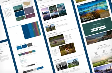
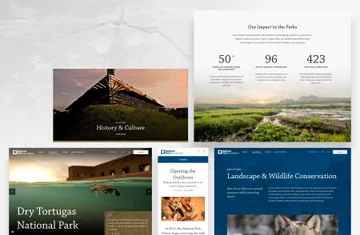
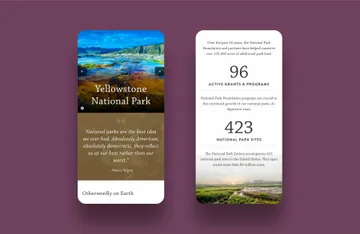
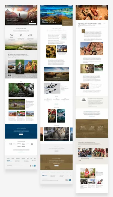
We created a unique Visual Strategy for NPF's redesign to appeal to high end donors and differentiate from their competitors. -
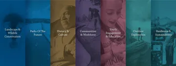
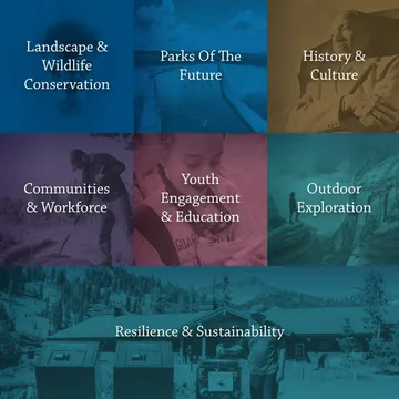
We highlighted NPF's 7 priority areas of impact. -
-
-
Summary
By rethinking NPF’s visual brand and developing a content strategy around their most impactful audience, we helped NPF connect with more major donors, increasing their donation rate by 43%, revenue by 21%, and session duration by 62%.

