-
-
Challenge
Massachusetts General Hospital wanted a centralized hub for their research, blogs, and thought leadership content that would be aimed at peer institutions and physicians.
-
Solution
Employ a user-centered design approach to the Advances in Motion site by testing decisions with the target readers — busy doctors.
-
Results
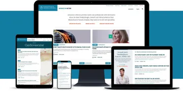
A content-first, adaptable platform that makes finding the latest information on medical advances easy thanks to user research for a specialized audience.
Content is king. Massachusetts General Hospital (MGH) was already one of the leading hospitals in the country when they saw an opportunity to further serve the medical community. They wanted to create a centralized, journalistic outlet where they could share their cutting-edge work and research with medical professionals. Knowing that other peer institutions have sites that serve a similar purpose, our main challenge was: how do we make MGH’s content hub the top resource for doctors.
-
-
Challenging Assumption
MGH could have chosen an off-the-shelf solution for the Advances in Motion site, but in our experience, one-size-fits-all design approaches rarely work well for niche audiences. To create a solution tailored specifically for doctors, we tested our design assumptions with the audience itself. Their feedback taught us that image-heavy pages were an obstacle to finding content for doctors, not an enhancement.
-
-
-
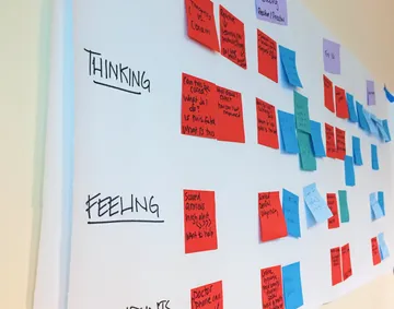
We held on-site workshops with MGH to make sure we were closely aligned on goals and fully understood the needs of the audience. -
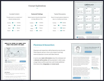
We dug into different potential directions and how each would affect our goals. -
MGH was also looking for a design that would be engaging and unique. We explored different directions that would each still feel consistent with the MGH brand in their own way. -
Text in Context
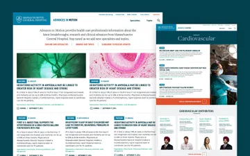
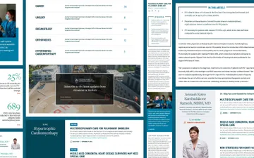
Informed by our research, we determined that the content doctors would be seeking out when visiting Advances in Motion needed to be front-and-center. We created a design that highlights MGH’s work in a focused way, and meets the needs of doctors by making it easier both to scan and to dig deeper into content.
-
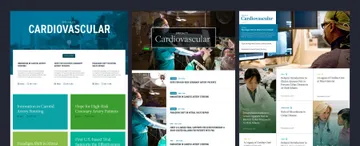
The final site design uses photography sparingly to let the content take center stage. -
Summary
Massachusetts General Hospital wanted to find the best way to feature their thought leadership and research, specifically for doctors. As a result of user-driven thinking, research, and design, the Advances in Motion site highlights MGH’s cutting-edge work in the way that doctors want to consume it: content first.

