-
-
Challenge
With over 30 centers with differing specialties, we had determine how to talk to a wide variety of online audiences with the same empathy and compassion that defines Mass General’s level of patient care.
-
Solution
Design an all-inclusive digital presence for the ‘no one size fits all’ organization.
-
Results
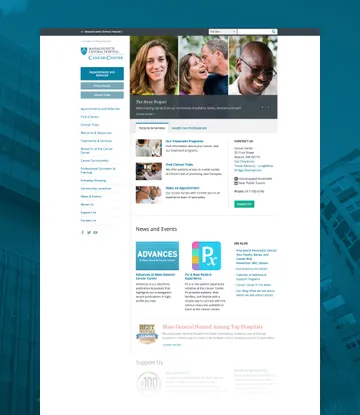
The new website is a strong foundation for the future of Mass General online, and gives the hospital the tools they need to share the work they do every day with the world.
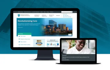
Since 1811, Massachusetts General Hospital (Mass General) has been committed to delivering standard-setting medical care. Throughout the decades, the hospital has had a consistent commitment to advancing that care through pioneering research and educating future healthcare professionals. However, the design and content organization of Mass General's former website made it difficult for the hospital to tell all its stories online. The #1 U.S. News and World Report hospital in 2015 needed a new online home that could speak to all the hospital's specialties - and all its audiences.
Areas of Expertise
-
-
Tailoring a Communication Plan
Given the depth of the site, continuous progress was necessary in order to hit the launch deadline. To ensure we continued to move forward, even with layers of approval, we met with the Mass General team multiple times per week, communicated daily via Slack, and scheduled regular travel to get together in person.
-
User-Informed Design Decisions
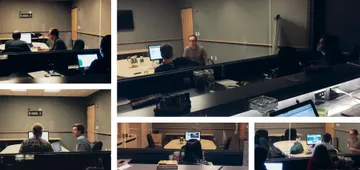
Throughout the process, we relied on user testing methods to validate critical design decisions. We developed a comprehensive testing plan, which included in-person testing, to make sure that our changes to important calls to action and navigation made the site experience more clear and intuitive for both patients and healthcare professionals.
-
-
Centralizing Design Elements
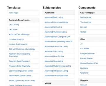
We created a web-based design system to catalog our template, component, and element designs. As we started buildout, we replaced those static designs with production-ready code and turned the design system into a living parts kit. Having one place to go to see the latest update on everything allowed both teams to keep in sync throughout the project.
-
-
-
-
Creating an Inclusive Experience
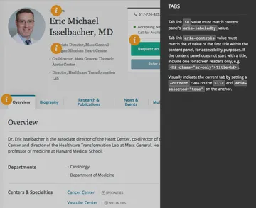
Using the Web Content Accessibility Guidelines (WCAG) as our standard, we paid special attention to HTML semantics and document structure to help those using a screen reader navigate the page. In addition, we used Accessible Rich Internet Application (ARIA) roles to give screen readers additional information about how to interact with components on the page.
How to Implement Accessibility in Agency Projects: Part 1Jeremy Fields, Platform Development Director
-
This video has no audio
Summary
Mass General’s redesign proved to be a project with unique considerations, requiring a unique approach. With a focus on the hospital’s user groups and their needs, we were able to design a truly useful site that reinforces the hospital’s reputation, while streamlining a complex content management process for the hospital’s team.

