-
-
Challenge
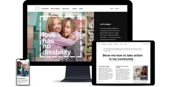
Migrate the Love Has No Labels website off of Tumblr and help them craft a content strategy that inspires and engages new supporters.
-
Solution
Close collaboration with Ad Council and in-depth user research allowed us to identify the content our audience needed, and the way they needed it to be delivered.
-
Results
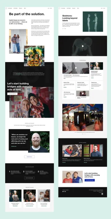
An engaging new website featuring actionable tips and inspiring stories, presented in a simple, approachable way and verified by user research.
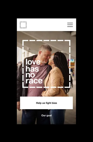
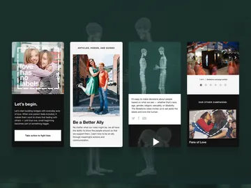
Actions speak louder than words. On Valentine’s Day of 2015, Ad Council’s PSA campaign Love Has No Labels made its debut, capturing our hearts with their “Skeletons” video. Since then, Ad Council has produced two more successful campaigns, including “We Are America,” featuring John Cena, and Fans of Love, shot at the NFL pro bowl. When they came to Viget, Ad Council had decided it was time to take Love Has No Labels one step farther. They didn’t just want to inspire — they wanted to activate. They saw an opportunity to help audiences across the threshold of believing in equality to doing something about it. They needed a website that would complement their creative campaign work, where people could find the practical tools they needed to act inclusively.
Areas of Expertise
-
-
Turning Belief Into Action
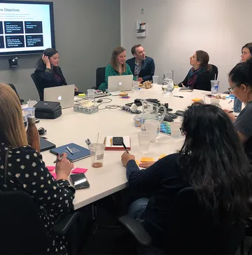
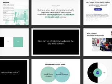
Ad Council’s target demographic believed the Love Has No Labels message, but had a harder time turning their belief into tangible action. Starting on the train to the kickoff, we dove into research about our audience — reading, sharing, and discussing all the books, articles, and podcasts we could find. Who exactly were we trying to reach? What areas of the country were they from? What did they care about? What held them back from taking action? We applied our findings to the creation of our content strategy, using it to inform everything from our use of terminology to the design of the site itself.
-
-
-
-
-
The Ripple Effect
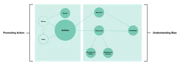
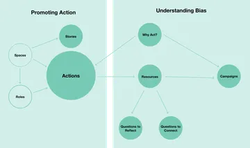
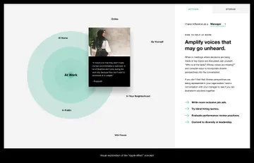
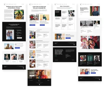
Our audience, like most of us, was intimidated by the thought of “taking action.” Our job was to break what seemed like a daunting task into something more approachable. We created a new type of content for the site — a collection of small actions, divided into spaces like “community,” “school,” and “work,” that people could incorporate in their everyday lives to show love and acceptance to those around them. Our goal was to show people that everyday actions can add up — that even a few small actions can create large-scale change.
-
This video has no audio
-
-
-
Real Life Love Has No Labels
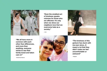
Ad Council’s campaigns are powerful because they put us in touch with real people telling real stories. For the site, we not only wanted to show people how to take action — we also wanted to show them what those actions could accomplish. We worked with Ad Council to interview people who represented their eight discriminated classes, asking simple questions like, “can you tell us about a time somebody made you feel included?” The results were in-depth, personal stories accounting everyday instances of people (often strangers) reaching out and making them feel accepted.
-
-
Putting Design to the Test
We knew useability and accessibility would be a top priority for a site dealing with diversity and inclusion. We created a clickable prototype for our user testing phase and administered 10 remote moderated sessions. The sessions provided some unexpected insights — for instance, we realized that people were having a hard time recognizing the Love Has No Labels logo without the name in the iconic box.
-
-
-
-
This video has no audio
-
Summary
We used in-depth audience research to inform the content strategy for the redesigned Love Has No Labels site. By incorporating new content types, including actionable tips and inspiring stories, we were able to reach a new audience, equipping them to take action in a meaningful way.

