-
Challenge
Improve customer acquisition in an increasingly crowded industry.
-
Solution
Revamp the end-to-end trial experience to increase the number of trial users who successfully send an email and convert to paying customers.
-
Results
Our React.js email message building application, sophisticated product design, and intuitive trial experience flow positions iContact to over-deliver for new trial users.
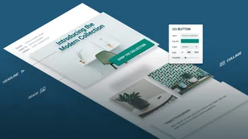
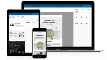
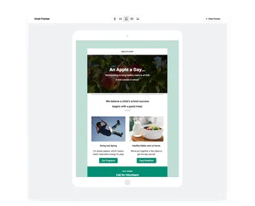
Building better email. iContact was one of the original email marketing service providers, and among the most widely used in the mid ‘00s. But the burden of legacy software and interface design made it increasingly difficult to compete against newcomers with responsive email templates and drag-and-drop tools. iContact needed to catch up or risk being outpaced — permanently — so time was of the essence. We partnered with iContact’s savvy product and development teams to redesign the entire application interface, revamp the trial user flow, and develop a modern, feature-rich email-building React application from scratch… all in just fifteen weeks.
Areas of Expertise
-
-
Putting Design to the Test
Backed by weekly user testing sessions, our product definition and UX design efforts stayed one step ahead of development. Our research validated (and challenged) our design decisions, allowing us to make adjustments along the way and giving us confidence that the product we were building would serve both the users’ and the business’s needs.
How to Create Fast, Searchable Notes for Real-Time ResearchKatherine Olvera, Former Senior User Experience Designer
-
-
Trial Users as the Top Use Case
By keeping trial users as our priority, we were able to work effectively with the iContact product management team to prioritize the features that would be most usable and useful to iContact trial users.
Bringing Analytical Thinking to Product Decisions with Client TeamsClaire Atwell Eisinger, Product Management Director
-
-
Technical Planning as the Foundation
The first three weeks of our aggressive timeline were dedicated solely to definition and planning. Working closely with the iContact product and tech teams, we mapped out the ecosystem of our message builder application, created a feature set list, defined our technical approach and conducted comparative research on competitors.
-
-
React-ing Efficiently
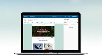
React and Microcosm provided us the direction we needed to quickly build a wide variety of features. This made it possible to implement features like a file manager, image crop/rotate functionality, undo/redo, a custom spell checker, conversion of content to HTML, and much more.
-
This video has no audio
-
Built for Speed
The performance of an app can have a lasting impact on user experience. Robust Javascript apps can present a number of performance challenges. Webpack allowed us to lazy-load pieces of the application as the were needed, significantly reducing the initial time to interactivity. On top of that, we built a client-side image optimizer and optimized how we loaded custom web fonts.
Performance Loading Font Picker PreviewsJeremy Frank, Former UI Development Director
-
-
-
A Group Effort
Everything from the way we defined roles and delegated work to the way we committed code and our deployment strategy was optimized for a large team of designers, developers and product managers working together on the same thing at the same time, and getting it done.
Js App Continuous Deployment (for Every Branch) Using CircleCI & S3Mike Ackerman, Former Senior Developer
Summary
A deeply collaborative effort, we partnered with email marketing company iContact to completely rebuild their core product. This involved everything from technical planning, research, and testing, to cutting-edge application development using React. In only fifteen weeks we redesigned the entire product experience, including onboarding, a new interface, and a sophisticated email builder aimed at making it easy for trial users to become iContact evangelists.
