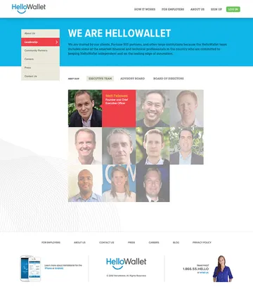
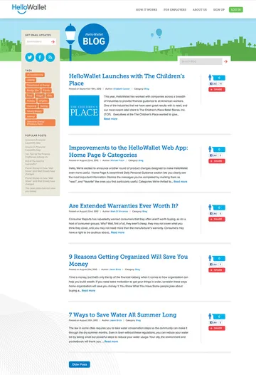
HelloWallet.com
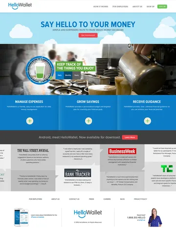
With Series B funding secured and a broadening customer base, neighborhood startup, HelloWallet, was in a position to evolve its look and posture as it continued to bring honest financial guidance to the masses. Viget drew on its deep experience working with emerging companies, lean processes and enthusiasm for visual storytelling to help relaunch HelloWallet.com.
What we did
Visual Narratives
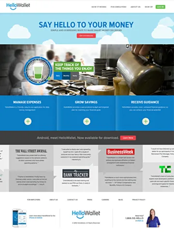
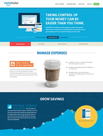
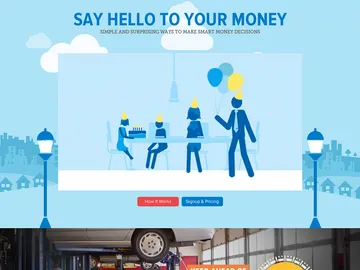
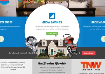
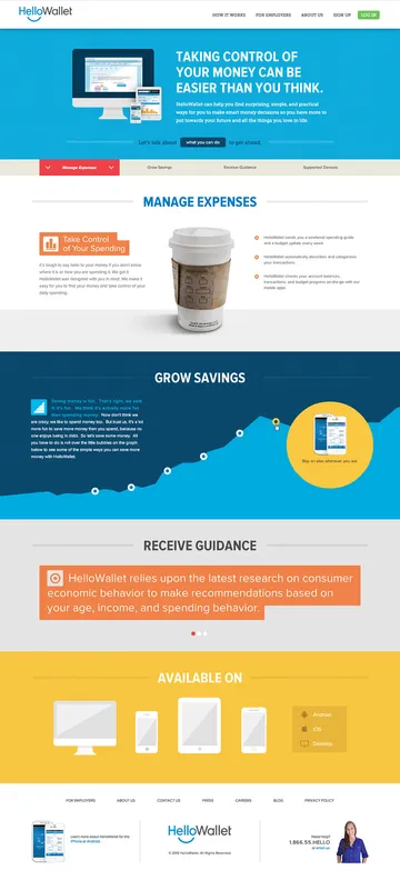
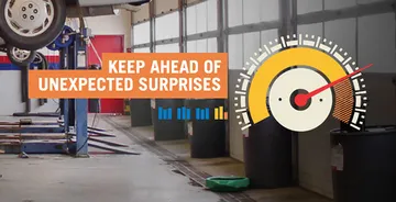
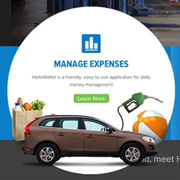
A fun challenge designing HelloWallet.com was to create an inviting, fresh and interesting experience, recognizing that the subjects of savings, expenses and financials are well-worn and often positioned negatively. Instead of focusing on the costs of car repair, we stress that HelloWallet prepares you for these inevitable surprises. And saving money doesn't just mean squirreling it away; you can save by simply modifying your spending. Communicating HelloWallet's unique ability to provide financial guidance was best suited for an object-oriented aesthetic and rich infographic elements. Everyday items and friendly charts reinforce the company's focus on being a daily companion to your financial success.

Sketches vs Wireframes
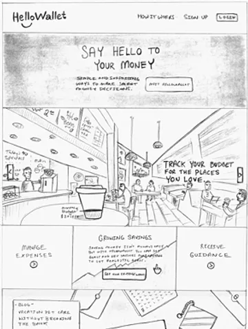
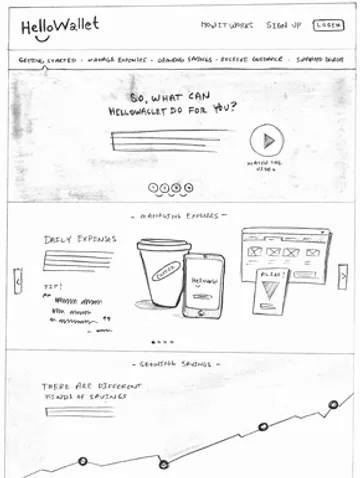
Viget oftentimes adapts its process to suit the particular project or client. In HelloWallet's case, there wasn't a need for formal wireframes or time-intensive documentation upfront. Instead, early definition was collaboratively established via whiteboards and sketches, which were then translated into high-fidelity design compositions. This process, though not suited for all clients, was particulalry beneficial, efficient and suited to this fast-paced, evolving company.
