-
-
Challenge
Create a shoppable, product-driven platform that grabs the attention of DSG’s target audience: 16-to-25-year-old baseball-loving guys.
-
Solution
Create an online environment that lets users step into the game and experience the next best thing to being on the field themselves.
-
Results
An interactive video lookbook featuring products “in action”. Visitors spent more than 4.3K total hours exploring, sharing and shopping across desktop and mobile.
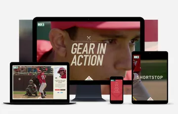
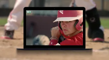
Taking the field. As convenient as online shopping has become, there’s still something special about seeing a real product “in action”. Finding a way to bring that product tangibility online was the goal for the DICK’s Sporting Goods (DSG) Baseball campaign. With the season right around the corner, DSG needed a way to get the word out about their new baseball gear — and it had to be something more attention getting than just another catalog. Our solution to this dilemma was to create a video “lookbook” — essentially a catalog come-to-life, made up of interactive full-screen video that makes the player’s view of the game the shopping experience.
Areas of Expertise
-
-
A Combination of Intuitive UX and Film
We used storyboards to map out the scenes and assumed any site UI would be subordinate to the film experience. This forced us to concept simple interactions that would augment the video, instead of driving it.
-
-
Thinking Big and Small
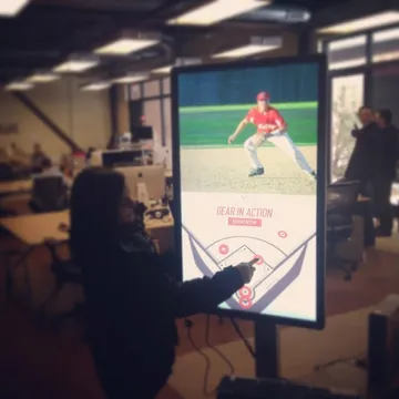
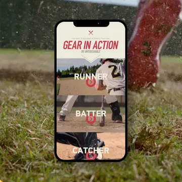
The experience needed to work on everything from mobile devices to a 42” in-store touchscreen display, so we focused our efforts on creating one set of interactions that would work across all views. We devised a scaling solution with CSS transforms to address the variety of displays being targeted.
Going Fullscreen: Scale and Define Focal Points for Responsive HTML5 VideoChris Manning, Development Director
-
-
-
Video-Based Interactions
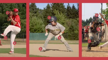
We featured six player positions and pinpointed the moment before the play’s climax to transition to a slow motion sequence with interactive “hotspots” atop the player’s gear; each hotspot opened a product description and a link to buy.
-
-
Home Run Animations
To create a cohesive experience, the UI needed to feel as interactive and busy as the videos. We build a variety of lively features, including a countdown “flip-clock”, a 3-D field navigation, and fun animations and transitions.
Make a Flippin’ 3D Countdown with CSS & JavaScriptDoug Avery, Former Senior Developer
-
-
-
Getting the Most Out of Paid Media
Paid media was an important part of driving traffic to the site. Early on, we saw that traffic from paid media engaged with the site at levels notably lower than than those from organic searches. We worked with DSG to re-align the media buy resources which resulted in a 59% drop in bounce rate, a 215% improvement in average session duration, and a 36% increase in conversions.
-
4.3K
Visitors spent more than 4,300 total hours exploring, sharing and shopping across desktop and mobile.
-
Summary
Our video “lookbook” was a catalog come-to-life, made up of interactive full-screen video that makes the player’s view of the game the shopping experience. Visitors spent a total of more than 4.3K hours exploring and shopping through the lookbook.
