-
-
Challenge
Create an app for the Bronx Zoo to improve visitor experience by providing access to up-to-date directions and information.
-
Solution
Digitize the Zoo’s data management system and apply it to a smart, user-friendly map that complements the existing signage.
-
Results
A mobile app that reinvents the way the Zoo manages data — allowing them to help over 180K visitors better explore the park.
Roaming with data. The Bronx Zoo is the largest metropolitan zoo in the United States and one of the largest in the world. It’s easy for visitors to get lost — the Zoo wanted to make sure that didn’t happen. Onsite research helped us understand the types of information and guidance visitors needed. The mobile app we built reinvented the way the zoo processes data, allowing the Zoo to guide visitors through the park and share relevant information efficiently. The mobile web map app we designed and built helped guests get from point A to point B with minimal hassle and confusion, whether that was an attraction, restaurant, or restroom.
Areas of Expertise
-
-
Day at the Zoo
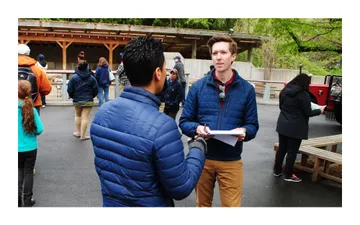
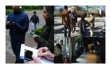
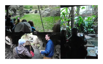
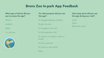
Our research took us into the Zoo itself, where we were able to interview visitors as they explored. Through this hands-on approach, we discovered that many guests didn’t just need help finding various attractions. They wanted to organize all of their stops in a logical, efficient fashion so that they could avoid wasting time and energy on multiple trips across the park.
Fostering a Culture of User Research in Your OrganizationLaura Sweltz, Director of UX Research and Strategic Initiatives
-
-
Information on the Loose
Throughout each day, Guest Services tracks and stores information on all areas of the park. When an attraction closes temporarily, they know — when ground transportation is running behind, they know. Unfortunately, their paper approach made it difficult to share relevant information with visitors. We gave them an admin tool to allow them to enter data into a system, which would then disperse the data to guests through the mobile app.
-
-
You are Here
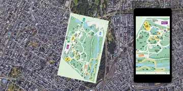
The maps in the zoo are carefully designed to give visitors the most helpful view possible. They’re rotated exactly 80 degrees north of what you would see on Google maps. To create consistency, the digital map we developed was rendered with the same rotated view — a feat that required advanced trigonometry and in-person testing within the park.
How to Bring Digital to a Physical Facility in 4 StepsDave Schools, Former Digital Strategist
-
-
Summary
We used on-the-ground research to define the challenges the Bronx Zoo was facing. Our solution leveraged smart development and UX to create a data management system and mobile app that guides guests through their visit.


