The Making of VigeTurf - Design
The making of VigeTurf brought together folks from all our labs. In this series, we're pulling back the curtain to give a detailed explanation of how it was created. Here, it's all about the design.
The Big Picture
The Vigeturf project required some branding, detailed packaging design, functional web design, and loads of intensive illustration. Coming up with a plan of action and then creating a simple style/brand guide ensured we had structure around what we wanted to accomplish with the different pieces of the project.
Mood Board
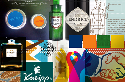
Stephanie, Hilary, Brian, and I kicked-offed the project with an initial brainstorm meeting to lay down expectations and decide exactly how we wanted to push the project in both the web and print arena. Since we were building this concept-turned-product from scratch, we had the luxury of dictating exactly what we needed on the site as well as a rough sketch of the assets that would be included in the packaging upfront. With the basics put into place I moved on with a quick mood board to convey my initial ideas. I immediately gravitated towards classic brands like Hendrick's Gin with refined filigree elements. At the same time, I wanted to make sure that there was a touch of whimsy since we were creating a product that reminded me of something that you might have purchased in a general store back in the day.
Branding
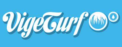
After getting approval on the moodboard, we moved forward on the branding (logo and initial elements of the packaging) sketches. I met with our illustrious design director Tom to brainstorm a 1950's kitchy advertising vibe while still maintaing a few refined elements. The big question on the table was whether we should (and to what level) retain a level of the Viget Brand in the project. We decided that since the project was more about the message and the holiday spirit, we would play down the Viget branding but include elements that didn't feel forced. The logo process moved forward pretty quickly after that. I sketched up some ideas and cleaned them up in illustrator. We included a nod to the Viget logo by using the staggered circles and rounded out the logo with a few simple illustrations that could be reused in the packaging. Now that the logo was done, it was time to move onto the packaging design.
Packaging
Hilary had already chosen the box that would make up the base of our packaging, so I already had the specs up-front. This is why Hilary is the bomb.
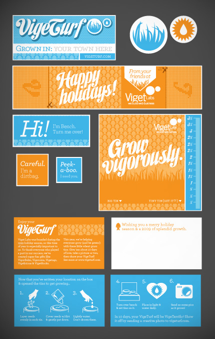
The packaging for Vigeturf consists of 10 graphic elements: 8 stickers of different sizes and 2 cards that include instructions and seasons greetings. The actual process of designing the packaging went smooth since we now had a logo and moodboard to help dictate the elements that would be included. We met to finalize what would be on the packaging, including the direct messaging that Brian wanted included. I worked out all the stickers in Illustrator, stopping periodically to mock-up a box to see how all the elements were coming together. I can't stress how important doing at least a few mock-ups are to the packaging process. Without it, we would have not been able to foresee resizing a few elements to make it more ship-able.
Taking Vigeturf Online
Now that we had the branding, logo, and packaging done, it was time to give Vigeturf a home online. We had a pretty good idea what content we wanted to include on the Vigeturf site. We needed a cool custom application to support a twitter-like mini-app so users could leave messages about what they wanted to grow in 2009. We wanted a Flash area that would allow people who didn't receive one of our real-world Vigeturf gifts to have a little fun growing one online. Included in that would be a place where people could save their creations and share them with others. Finally, we needed an area to put pictures that we received from people growing their Vigeturfs at home, and a messaging area where we at Viget could introduce the project and show a little "behind the scenes" of the creation of Vigeturf.
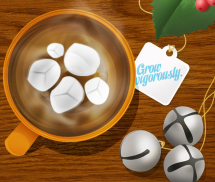
The big decision when starting on the website was that we weren't going to just extend the brand that we had just created. Instead, I worked up a comp that would include elements of what we had done so far but also push it a little to create a richer experience online. The inspiration for the site is a "workspace/desktop" that incorporates illustrations and elements created as if being viewed from overhead.
After getting a grid together (a very loose, manic grid, for sure) I put as much of the content in as possible and started sketching up illustrations and getting them drawn in iIlustrator. After I created a few elements like the mug and ribbons, I moved them into Photoshop and started the process of adding light and shadow to them. After I found a light-source that worked well, I finished the rest of the illustration elements and got them placed.
At this point, I was able to hand-off the comp to Keith so he could start Rock-Starring the buildout.
Storyboarding the Flash
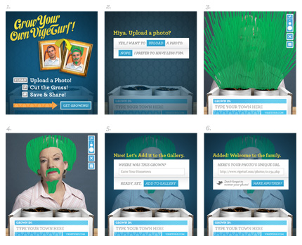
Next was on to writing the storyboard for the Flash piece for Erik. He had quietly been building the working elements of the flash portion of the site already, and it was quickly coming up to the deadline for handing off the design elements to him. Storyboarding is a great way to get an idea across for projects that require multiple animation elements. I wanted to provide a groundwork of what I was looking for while still allowing room for Erik to do his thing, which he does sooooo well. I comped up a series of screens that included all the elements designed with suggestions for motion to start a dialog. At this point Erik had already created an awesome prototype of how the grass would work, so we skipped over that step.
Wrapping it All Up (in a Bow)
Closing in on our deadline, it was time to produce the physical Vigeturf boxes. We printed all the stickers in-house and did all the cutting for those here. Needless to say, it took some time, but well worth it when we were all done. We sent the cards out to be printed since they were double-sided, and we knew how much we could handle getting done before our deadline. The project was a success, and I was really happy how all the design elements came together as a cohesive unit.
If you have any specific questions pertaining to any part of the design process let me know.
