Art Movements and Web Trends (and Gratuitous Mucha Posters)
Art Nouveau was popular in the very end of the 19th century, into the beginnings of the 20th century. It affected all branches of fine art and design. Before Art Nouveau, anything that wasn't painting or sculpture was considered an inferior art form. It sought to establish that ads, architecture, furniture, etc all deserved just as much craftsmanship and good design.
As it rose to popularity, Art Nouveau was considered new, modern, and young. It was characterized by natural, organic forms and shapes. The goal of all these curving, flowing shapes was to create buildings, environments, and furniture that was an extension of the natural environment around it. Designers emphasized high quality craftsmanship over sloppy mass production, and form that follows function above decoration just for decoration's sake.
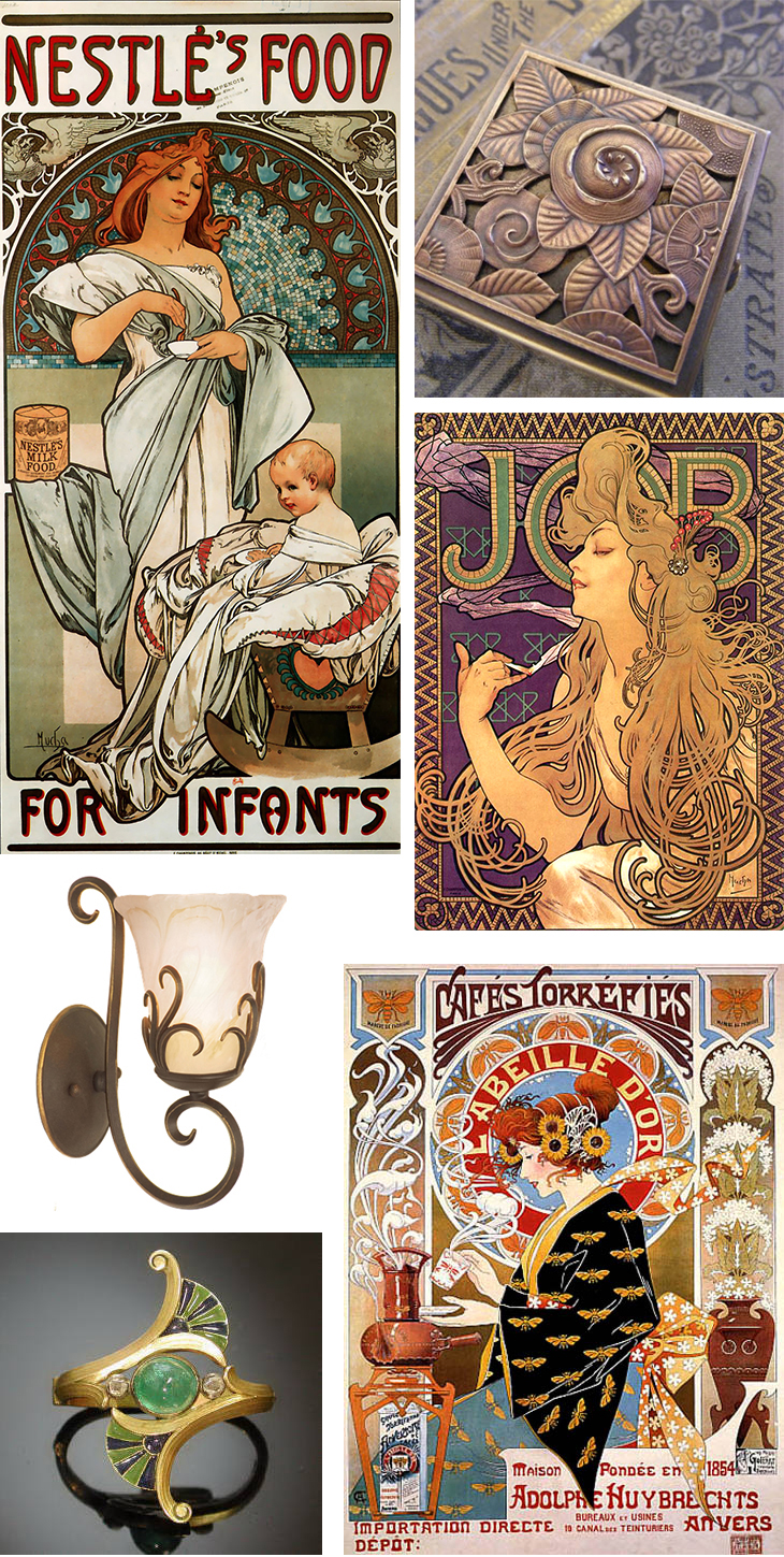
(Nestle and Job advertisements by Alfons Mucha. Cafes Torrefies by Henri Privat-Livemont)
In architecture and furniture, designers used iron, glass, and wood in unconventional ways to achieve this beautiful, decorative aesthetic.
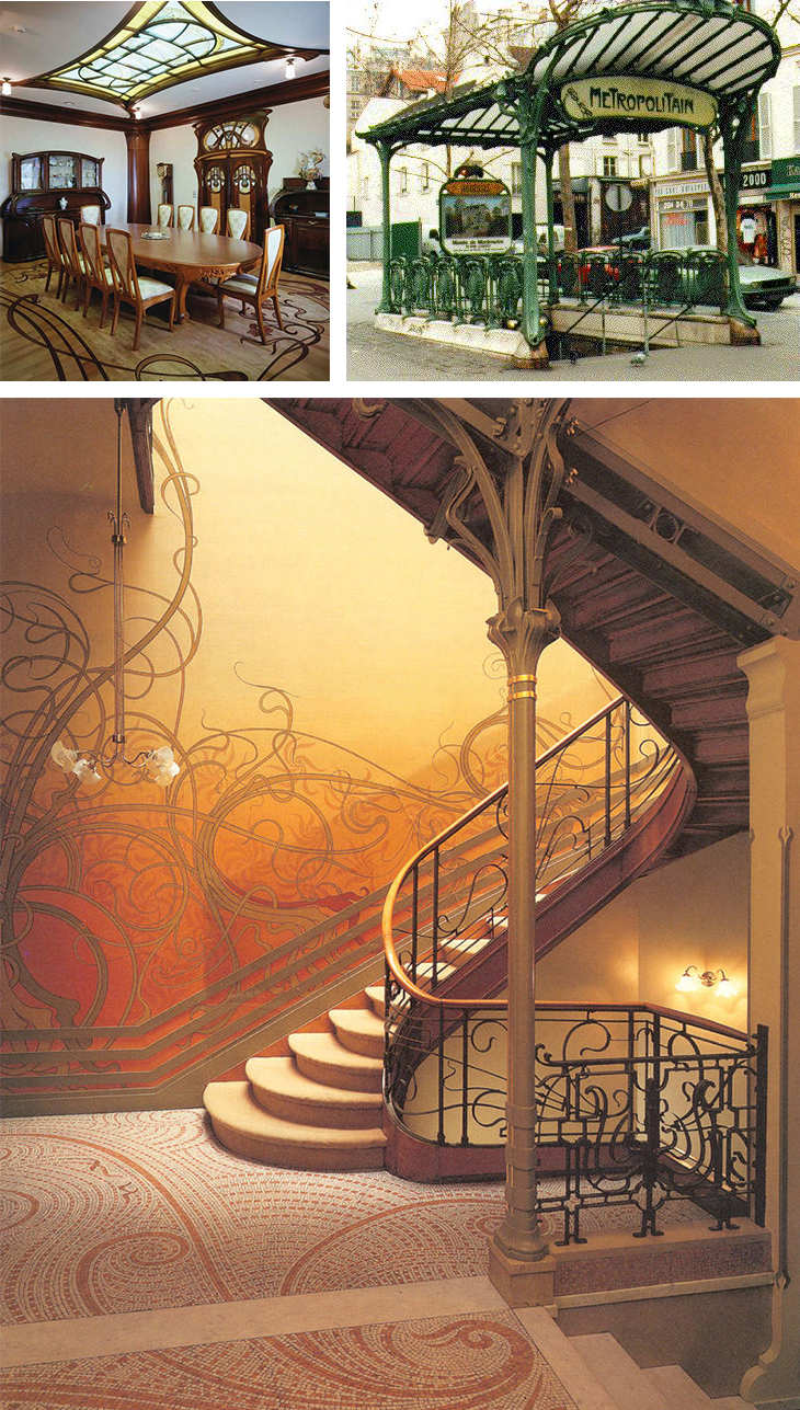
(Paris Metro entrance designed by Hector Guimard)
In spite of how popular and influential Art Nouveau became, as a movement it was relatively short-lived and really, what it best did was transition design from the 19th century to modern styles. It had meant to get away from clutter and pointless decoration, but as artists and designers took it further, that principle seemed to go by the wayside. And as World War I approached, the inefficient and expensive way architecture used its medium no longer seemed worth it. Iron and glass had more important things to do, like fight the Central Powers! Bauhaus, Art Deco, Plakatstil, and other styles that were more streamlined, geometric, and matter-of-fact took over. Decoration and ornamentation were suddenly out; stark, minimal design that focused intensely on function over form was in.
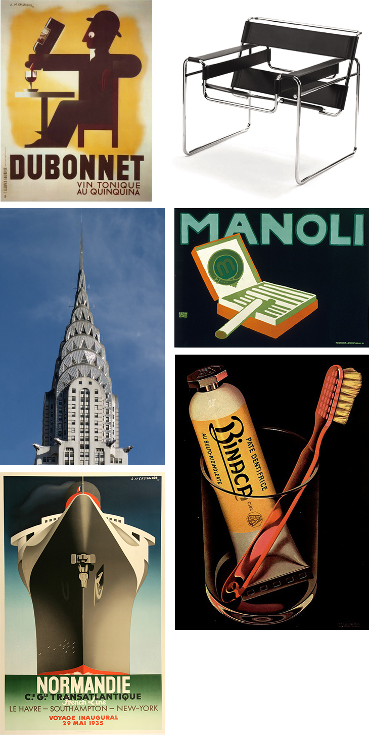
Bold, strong shapes! Advertisements that showed the product, not half-naked ladies! (Dubonnet ad and Normandie poster by A.M. Cassandre. Manoli ad by Lucian Bernhard. Binaca ad by Niklaus Stoecklin)
Today, Art Nouveau still influences designers. Just as Bauhaus, Mid-Century Modern, Pop Art, and other past art movements simultaneously do the same. They're constantly being reimagined, remixed, and reinterpreted in ways to best suit the needs of a design.
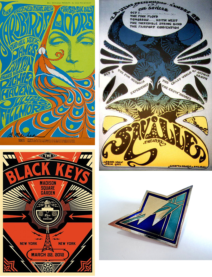
Art Nouveau experienced a bit of a psychedelic revival in the 1960s. And Art Deco is always being tweaked and used in new designs. (Fillmore poster by Bonnie MacLean. Saville poster by Hapshash and the Coloured Coat. Black Keys poster by Shepard Fairey)
My Point Being…
Digital and web design as a medium is young. Really young. The fact that it is even recognized as a real medium, one that deserves the craftsmanship and quality of design as any other medium, is still a relatively new accomplishment. And it's changing and evolving every day, just as technologies and our relationship with them are constantly new and different. So it's natural that periods of transition are sometimes needed; what we need from the web and our devices changes. Our digital language is constantly changing. At one point in time, we needed a calendar on a computer to look like a calendar on a desk, because what the hell does a computer calendar look like?!
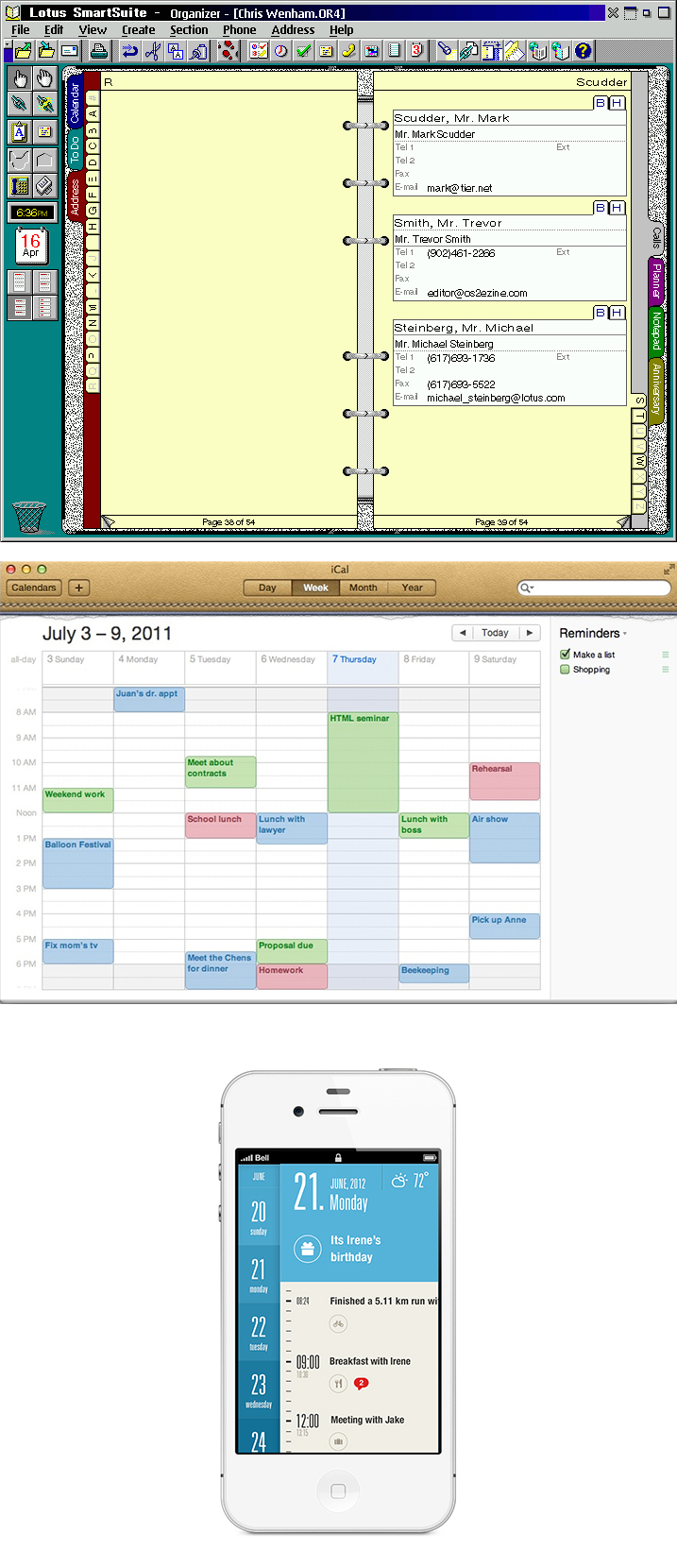
The never-ending evolution. Once upon a time, Lotus Organizer looked amazing. (Lotus Organizer, iCal, Anchor)
We have needed to take nature and extend it into UI, site design, apps, into all things interactive, so that this new and foreign thing is relatable and familiar. So that our definition of what is a part of our natural world is redefined. So, fashions come and go. We get excited about one thing, take it too far, then course correct. From this we're constantly learning strengths and weaknesses of different styles.
Art Nouveau, at its best, is beautiful, functional, and richly elegant. Skeuomorphism has the same capacity. (Is now the part where I link to 76 Synthesizer? Yep.) And our historically heavy reliance on visual metaphors has served a purpose. It bridged the gap between our natural and digital environments. That linen texture, the first time you saw it on an iPad, helped you emotionally connect to this new, alien device.
Flat design feels exciting and new right now because it is a visual shift. It represents a new relationship between users and their devices. One that is, visually, more streamlined, matter-of-fact, and honest. It doesn't hide the medium behind these visual metaphors; it embraces it for what it is. It dares to assume that it doesn't need visual cues from the real world to feel comfortable, familiar, and engaging.
So does this mean creating flat designs will always generate work that's trendy or forward-thinking? Does it mean skeuomorphism is always dated and tacky? Neither. It just means we, as an industry, have lately been consciously focusing on another option in our collective toolbox. Though it may start to feel like overkill, this reflection on our evolution is worthwhile. We have a fuller picture of the directions that are available to us. Whether the best solution for a project is to go west, into untamed, wild flat territory, go east and find a new, fresh perspective on the classics, or Robert Peary out and be the first to trek into uncharted northern lands. We explore what's out there to become better navigators and conquerers of the vast terrain ahead of us.
As we start reinterpreting and remixing digital design trends, we'll begin creating solutions that aren't trendy at all. They'll simply be the best solutions for a project.