Picking the Perfect Palette
Mark Steinruck, Former User Experience Designer
Article Category:
Posted on
I recently visited a friend who was having some rooms painted. The walls of the living room looked like a patchwork quilt with daubs of various paint colors all over the wall. "I can't make up my mind," my friend said in response to the giant grin on my face.
My friend's dilemma is typical when starting a new project. Whether you're painting a room or designing a website, it can be a challenge to select the perfect color combination. Rather than getting into the process of color selection, I'm going to focus on some resources and techniques that can help make the job a little easier.
kuler

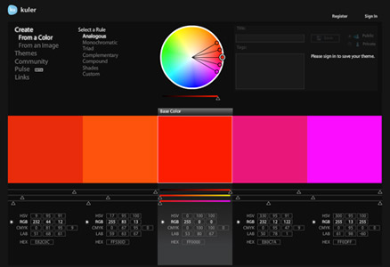
Kuler is an amazing tool by Adobe that allows you to explore, create, and share color palettes. The growing community of designers that have embraced kuler has made it a rich resource for inspiration.
Take some time to dig into the Create section. It takes a little practice to use the interface, but it's worth the effort. There's also an option to upload an image and select five individual points in the photo to generate your palette. Then you can then save, tag, and share your palette with the entire community.
Both Photoshop and Fireworks include kuler as an extension. You can perform many of the same functions in the panel, including searching by keyword. It can be found in both applications under Window > Extensions.
COLOURlovers

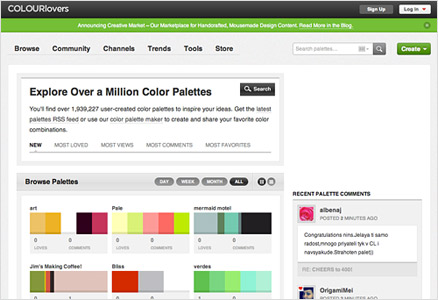
This is also a great community site that has expanded beyond just color palettes. It now covers patterns, pattern templates, trends, and shapes, and it has lots of discussions and articles to fuel your creativity. The site says there are over 1.9 million user-created palettes in its database. That ought to keep you busy for a while.
I like searching palettes by keyword because I can quickly narrow down a few that fit my project. Sign up for an account, and there are great tools that allow you to interact with the community by creating and sharing your own color explorations.

Okay, hang with me here. Pinterest is a little trendy, yes. And yes, there's a chance that you'll see a lot that you're not the least bit interested in. But in terms of finding a large variety of inspiration that is precisely related to a keyword or topic, I haven't found anything else that matches it. Trying doing a search for "warm color," and you'll end up with a menagerie of images like crayons, clothing, paintings, rooms, wedding cakes, wallpaper, flowers, and even some pre-defined color palettes. You may leave the site with more inspiration than just colors.
Photoshop + The Mosaic Filter

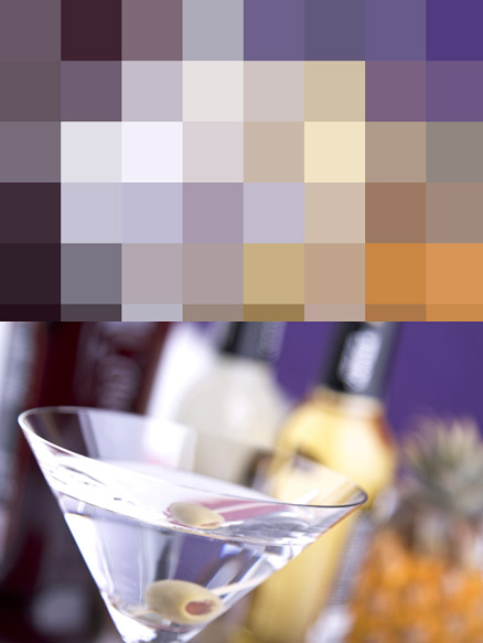
After pulling some photo inspiration, I might click around using the eye dropper in Photoshop in an attempt to create a winning combination. Sometimes that works, but using the eye dropper tool, even set to 101 by 101 average, can sometimes be difficult. I like to see the colors side-by-side, so there has to be an easier way.
The Mosaic filter in Photoshop is the key. Open your image and adjust the pixel dimensions based on the number of color options you want to see. The larger the pixel dimensions, the greater the number of color swatches you'll get. I like to keep the largest measurement (height or width) between 500-1000 pixels. Any more than that, and you might as well just use the eye dropper tool. Now go to Filter > Pixelate > Mosaic and adjust the cell size. Remember that the larger the blocks are, the less color detail you'll get. (Sometimes this is a good thing.)
Note: I looked for a way to replicate this effect in Fireworks, but the filter options are limited. If anyone knows of a way to do it, please leave a comment.
These are just a few of the many tools and techniques at our disposal. I'd love to hear what works for you.