Let’s Brand a Hackathon!

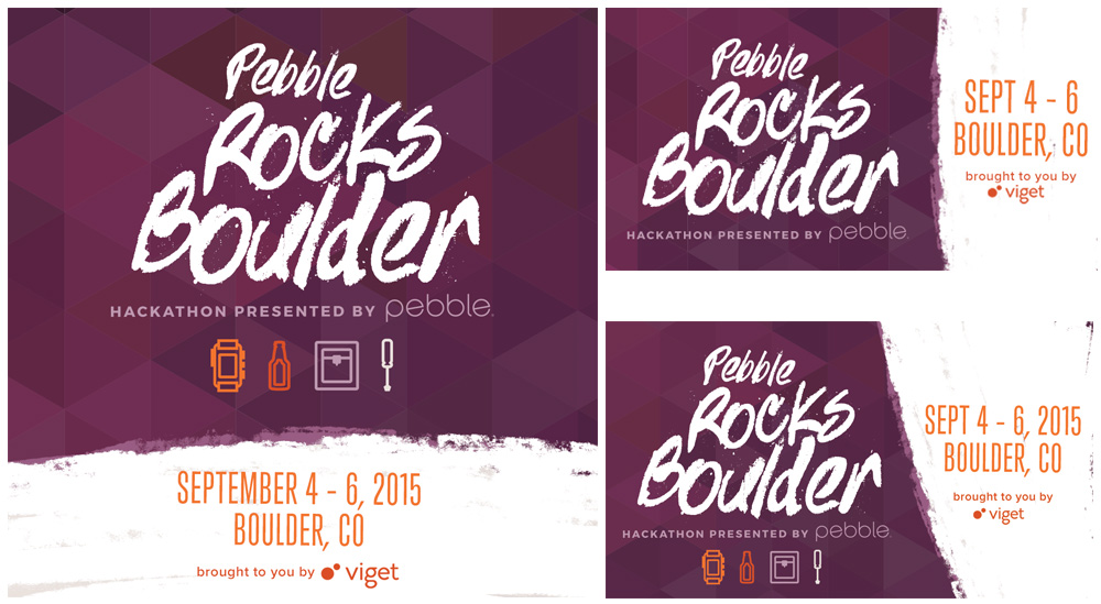
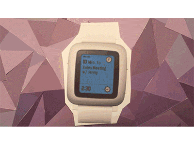
Viget recently organized, Pebble Rocks Boulder, a weekend-long hackathon focused on hardware like the Pebble watch, wearables, 3D printing, etc. (Read all about the actual event here!) My job for the event was simple: make sure everything in terms of visuals, voice, and concept lived up to that name and, well, rocked. As the first hackathon Viget’s organized, everything had to feel cohesive and polished to give the event an air of credibility. Above all though it had to look fun! Fun to participate in, fun to sponsor, fun to volunteer at. So here’s a look into what went into branding an event like this:
Core Visuals
I started with a logo and some core visual concepts that would guide all other visuals. Since the hackathon focuses on hardware and making something rough and physical, dimension and a rough, hand-done look were key. And then since this hackathon needed to rock, a lot of inspiration came from gig posters and album covers. A touch of rock ’n’ roll ‘tude was applied wherever possible. Having a set of flexible graphics that could be used in different ways was tremendously valuable in creating a consistent tone across mediums.
Logo exploration. Already playing with a balance of geometric dimension paired with a rough handmade aesthetic.
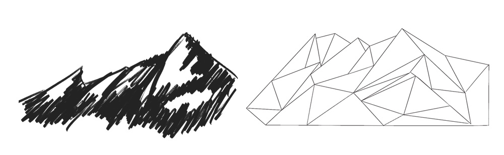 Two versions of the Boulder Flatirons: one rough and sketchy, the other geometric. Both brand appropriate and both came in handy for digital and print needs that popped up throughout the project.
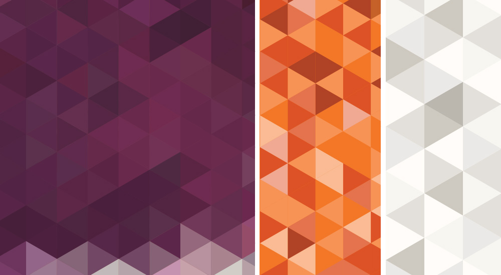 A set of dimensional geometric textures in the brand colors gave me a lot of flexibility to create unique assets that looked cohesive.
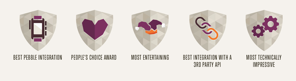 A set of illustrated badges served as the official graphics for event awards. They ended up appearing on the site, and in the award presentation at the end of the hackathon.
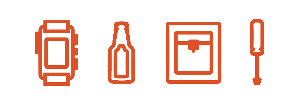
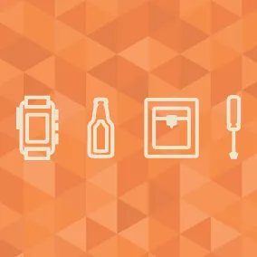
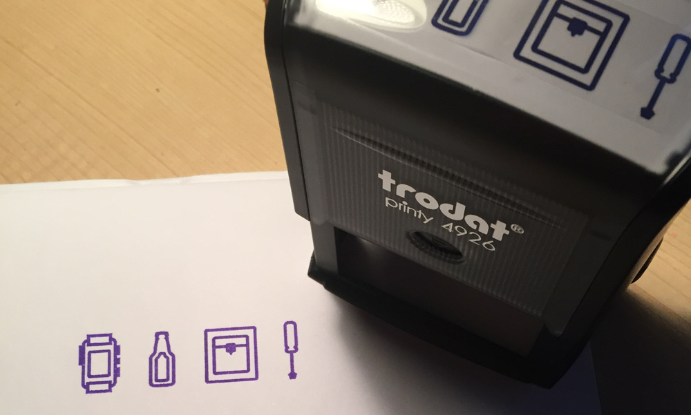
An icon set communicates the core of the hackathon visually: Pebble watches, beer and camaraderie, 3D printing, and building. They were used on the site, on social media, on t-shirts, and even as a stamp!
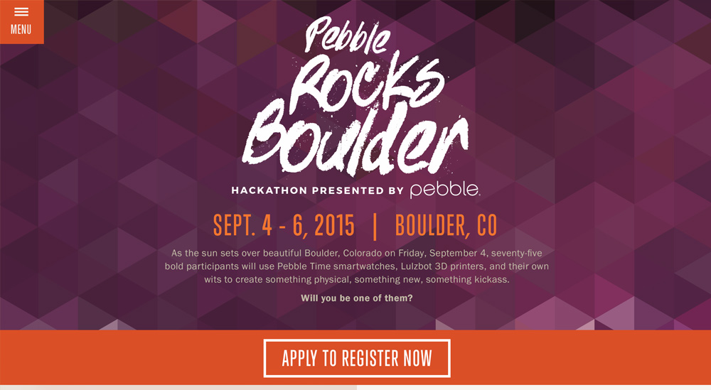
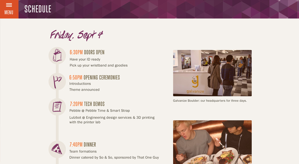
The Site
The site itself was quick and simple, just a few pages to share event details. But it gave us a home base, and the sharp design and personal, quirky voice of the content lent the event immediate credibility.
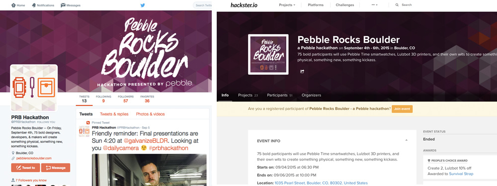
Make it Shareable
The site gave us some credibility. But having a consistent brand and experience elsewhere on the web was equally important. It meant that potential participants and sponsors would see we were legitimate, even if they only saw us on Twitter or Facebook. I made sure our profile pages on Twitter and Hackster were branded and looking sharp:
 The second key ingredient was making a variety of polished, shareable graphics to look good and convey key information. Want to make sure your custom assets will look good across Twitter, Facebook, Instagram, Reddit, Pinterest, and any other corners of the internet you may have forgotten? Check out these helpful posts:
- Ideal Open Graph Image Meta Tag Size (og:image) For Facebook & Reddit Sharing
- Must-Have Social Meta Tags for Twitter, Google+, Facebook and More
Promote Online
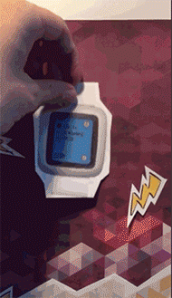
Besides basic sharing, we wanted something a little more fun and intriguing that would catch people’s attention. As always, it needed to tie into “physical” and “hand-done.” The logical conclusion: create a stop-motion animation promoting the event.
Viget’s forays into stop-motion have been few and far between. (The claymation video a couple years ago for Vige-Doh was on par with Wallace and Gromit.) But what I lacked in experience I made up for in enthusiasm.
Phase 1: I started by creating some assets and recording a prototype (aka a video of me physically moving everything) to get the team on board with my plan:
Phase 2: Print out my geometric picture of the Flatirons as a guideline, “borrow” a, uh, lot of paint samples from the hardware store, and cut and paste for forever.
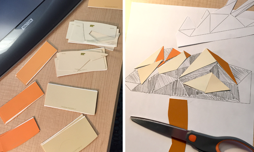 Scissors and glue stick skills finally coming into play, after all my second grade training.
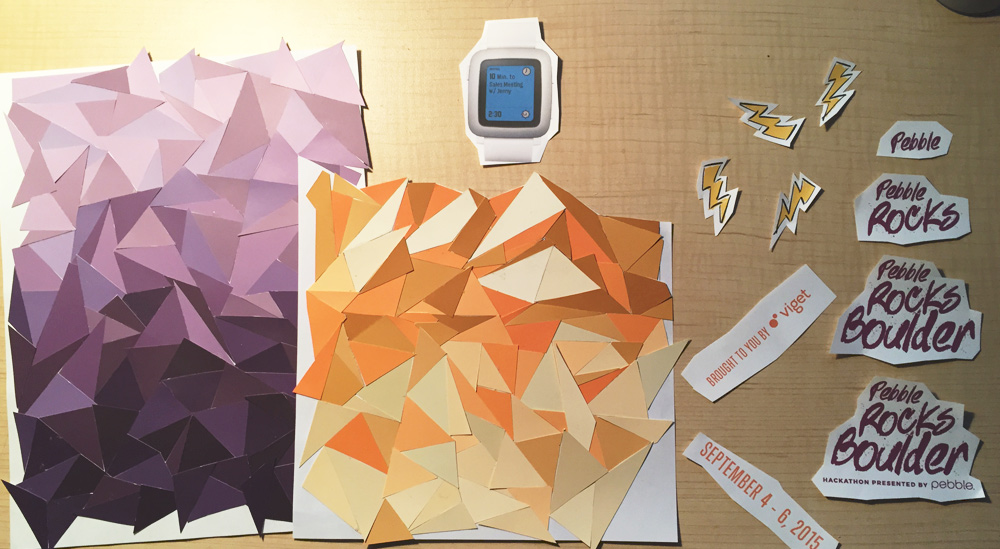 All the final assets ready for showtime.
Phase 3: Lights (a desk lamp), camera (my iPhone), action! Wanting to have a rough, DIY feel was an asset in this case since it meant the animation could actually be rough rather than perfectly polished and buttery smooth. Stop Motion Studio was really easy for an amateur like me to figure out and start using quickly. The final result makes me way too happy. It was a great learning experience and a great asset to be able to share across the far reaches of the internet. It conveyed not just information, but the spirit of the hackathon in a really fun way.
Promote Offline
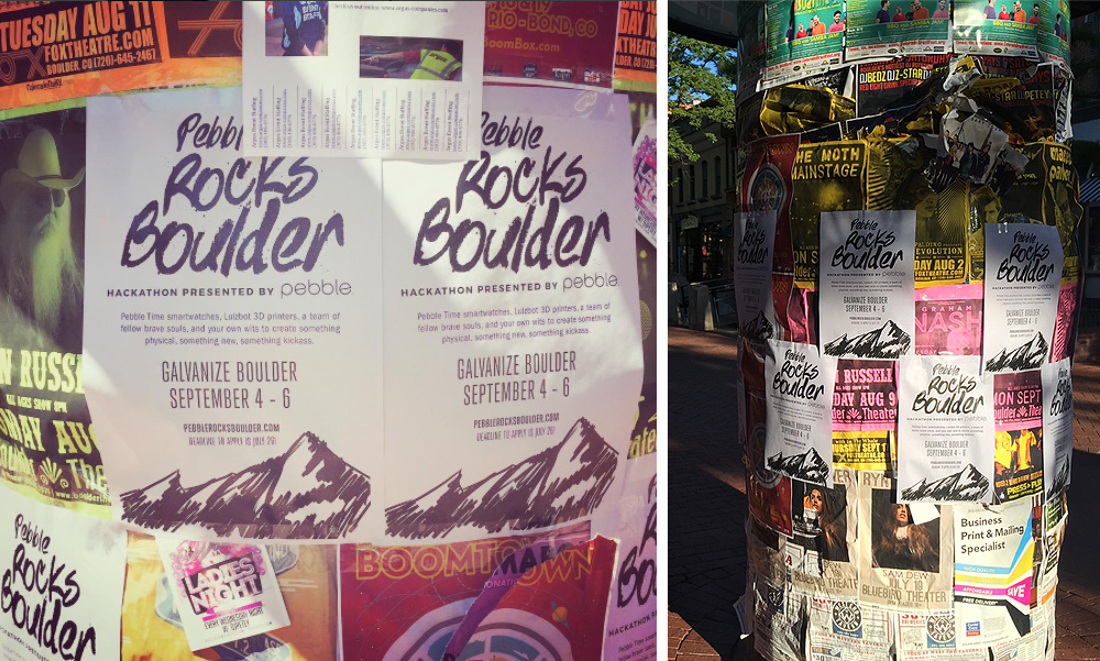
A local, in-person event could also benefit from local promotion. Pearl Street Mall is usually plastered with posters for meetups, bands, and college shows, so our flyer fit right in. A bold, simple, single-color design looked sharp, was quick and cheap to produce, and stood out nicely. I was able to repurpose some early sketches of the Boulder flatirons I’d created; they looked perfect next to the sketchy logo. And they did the trick! More than one applicant said they heard about the event through the local signage.
Create Consistent Communication
There’s a voice and visual language established on the site and in social media; it was important to carry that voice through all forms of communication. From docs sent to potential sponsors, to emails for participants. And an event like this meant lots of emails to participants. Acceptance emails, rejection emails (*sad emoji here*), registration info, reminders, event details, the list goes on. For me this meant a combination of proofreading, suggesting, and writing content. It also included designing an email template and creating some email graphics. This level of attention to detail and consistency meant the hackathon had a solid, polished personality that gave participants confidence in what kind of event to expect. It also just created a consistently fun, engaging experience for them, even from their inbox.
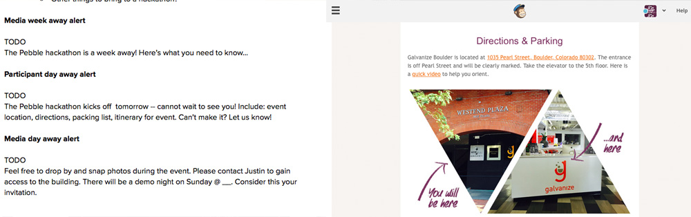
A google doc of bullet points and tasks morphed into carefully written emails and fun visuals.
Make Swag!
We made all sorts of fun things! We could have made even more if time had permitted. (Temporary tattoos? Tote bags? Pet rocks?!) Here are some of the things we created:
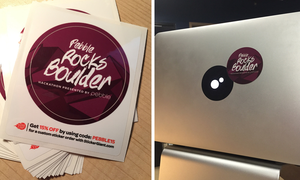
A sticker. Because it’s not a real tech event unless there’s a sticker. StickerGiant’s stickers were high-quality and came out super sharp.
A stamp. Not exactly a swag item, but we used it to quickly and cheaply give some branding love to our plain paper swag bags. If you ever have the tiniest excuse to make a custom stamp, for crying out loud, do it. It’s inexpensive and maybe the most satisfying medium ever to see your design in action. (Okay, maybe second most satisfying after cookie form.) You now have, in your hand, the power to brand anything instantly! A bag! A card! A human arm! We ordered a custom stamp through Simon’s Stamps; it was easy to upload a design and it arrived in the mail just a few days later.
 Omgz it’s a stamp!
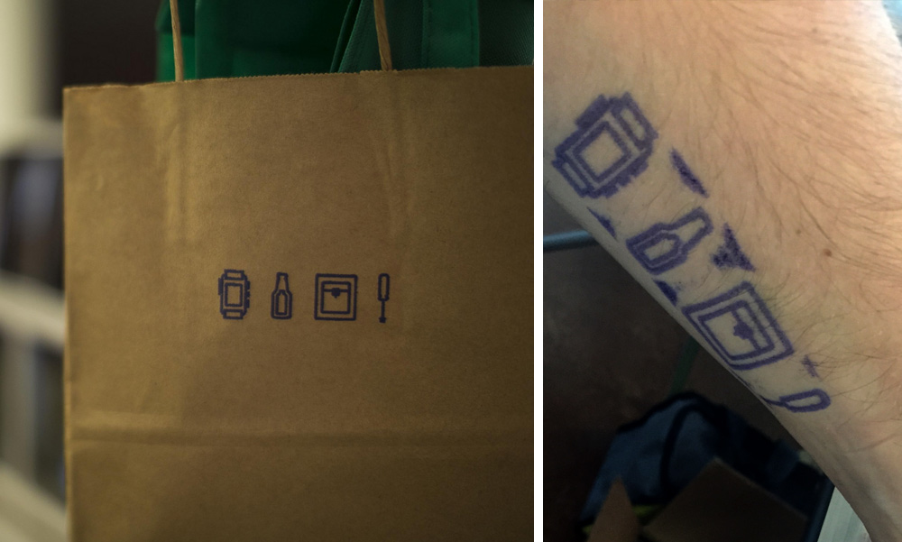
On the left: the stamp being used for its intended purpose. On the right: not so much.
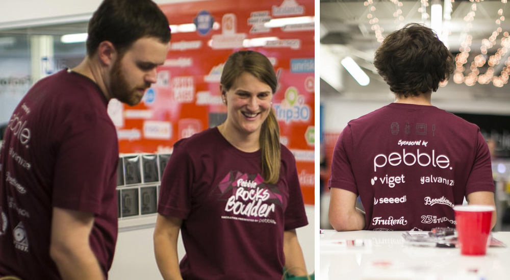
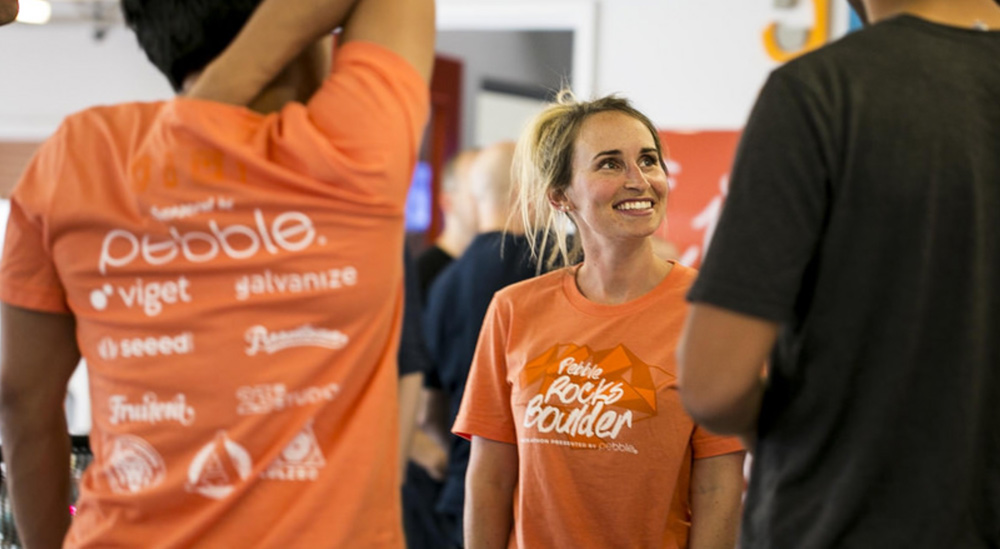
T-shirts, like stickers, are just a given. The punchy, punk-rock color scheme of the brand meant we got shirts in really fun, atypical colors that (I hope) people actually want to wear. Orange for participants and purple for volunteers/organizers made it easy for people to spot an organizer in the crowd when they needed help. CustomInk is our go-to for custom shirts because of their attention to design details and general comfiness and these were no exception!
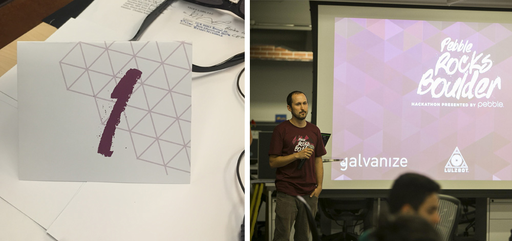
Represent at the Event
Even after participants had arrived and picked up their swag bags, there were still little opportunities to give them a consistently branded experience during the event. Designed table number placards were easy and quick to make and a nice touch. And designed slides for the opening and closing ceremonies added to the sense of occasion. If time had permitted, it would've been great to do even more, like card-sized copies of the schedule participants could keep in their pocket.
Conclusion
Phew, that was a lot to write out. But if you find yourself designing for a hackathon or similar event, hopefully this gives you an idea of the breadth of work you’re in for! It’s a lot of details to juggle, but that level of attention is worth it. Fun promotion got potential participant’s attention. A consistent experience across the site, social media, and emails built trust so participants and sponsors could feel comfortable giving their time and money to an untested event. And finally high-quality swag and branded touches at the event added to everyone’s experience at the actual hackathon.
You won’t be able to plan for every little thing ahead of time, so plan to be flexible! Creating a set of vector-based visuals meant I had options that quickly and beautifully worked for everything from email headers to t-shirts.
And above all, remember to have fun with it! It’s not often in our day-to-day jobs that we get to film a stop-motion animation or design table place cards. So embrace those unique learning experiences that pop up! (And make sure to pick a t-shirt color you want to wear. :)