How to Create Design Concepts in Rapid Fashion
Tom Osborne, Former VP, Design
Article Category:
Posted on
Sometimes you need to get a bunch of ideas in a short amount of time. Its not always easy for one person alone (though easier for some than others). Collaboration is key whether it be collectively or individually within a working group of people. Team design is one of the benefits of working in an agency or inhouse studio.
In borrowing from an idea that originally began in partnership with some of my former colleagues, the design team at Viget recently embarked on our first Design Flash Mob (DFM). You may have heard the term 'flash mob' to describe wacky collaborative events such as massive pillow fights where a large group of people gather in a single place, fight each other with pillows and leave with a pile of feathers on the ground as a residual reference to the event. The basic steps of these events are as follows:
- Plan and promote in advance of the event. What do you hope to accomplish? When and where should this take place?
- Gather at the designated time and place.
- Act upon on what you set out to do.
- Disperse and reflect on the madness.
In the spirit of design synergy we can take these steps and use them to collaborate quickly on things like logo designs, t-shirt ideas or rethinking user experience problems. Plan to do something about a week out. Think ahead about what you might want to create. When the time comes you'll be ready to jump in and start designing in a rapid but refined way. Take a morning or afternoon to hold the event. At the end, take time to talk about it and share different perspectives on working under pressure.
Another important aspect of a design flash mob is that it should not be treated as a competition. Even if one design is to be chosen it should be a democratic effort including those who played a part in the event. Benefiting the greater good should be the goal. In effect, the whole is greater than the sum of the parts.
One great place to start with a DFM is to have several people participate in designing desktop wallpapers. They're simple to design in a short period of time and have no production costs associated with them. This is where we started on our first Viget DFM. The assignment was simple. Take an afternoon (roughly 4 hours) to assemble one or more desktop wallpapers within the given time and include the Viget brand no matter how big or how small. Everything else was left up to the designer's discretion. Planning ahead was ok but no one was allowed to begin until the start of the event. Additionally, you didn't have to be a designer to participate. Our design team consists of UX designers, visual designers and production specialists with a wide range of talents and skills. How you work within the guidelines is all that matters.
Each designer picked one or more of his/her favorites to share. Here are the results:
Erik
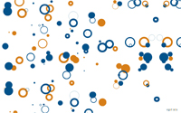
I was inspired by a talk I heard recently by Erik Natzke who is a brilliant...well I wouldn't know what he calls himself but you can call him an Actionscript Artist. For this task I took the idea of creating art through Actionscript. What I did hear was to create random circles (fills and strokes) using the two colors from our logo which also happens to consist of circles. The shapes appear on the stage in a random pattern, in random sizes in a random chance of using either our orange or blue colors with the same random chance of appearing as either a fill or a stroke. The trick is how long to run the script for? At some point there will be too many shapes on the stage and the design suffers. The question I have to ask myself is 'is this art?'. Would you agree that it is?
During this process I created a number of different shapes and patterns, all of them interesting (although beauty is in the eye of the beholder here). Should you want to fool around with these classes you can download them here. Inside the zip file is a readme txt to get you started. If you come up with any interesting designs I would love to hear from you. Please contact me. If you create something interesting I would love to post them to our Inspire Blog.
Keith
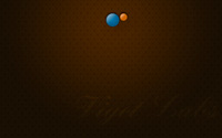
My goal when I started working on wallpaper ideas was to make something I would use. Looking at wallpapers in my personal collection, I noticed a lot of them were very simplistic and actually looked like real wallpaper or surfaces. I really hate it when wallpaper is busy or conflicts with my desktop icons, so I created a couple wallpapers using different textures and wallpaper patterns. Ultimately I picked this one because of the pattern and lighting. I also really like how much the Viget brand stands out yet doesn't interfere with anything on the desktop.
Mindy
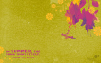
My recent move to the south has me in a summery mood so I wanted to play around with flowers, textures and a vibrant color palette. I went ultra-girly since it's a style I don't often get to use in my professional work.
Peyton
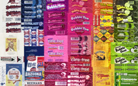
'Gum Wrappers' is simply inspired by the idea of using found objects/images and the visual interest of gum packaging to create a collage. It's made slightly less random by experimenting with color banding. In the end, I think I'd prefer more randomness and some rotating of the images. Thanks to Dan Goodsell for his shots of so many of these wrappers. Check out his work if you get a chance, as it's good stuff.
http://www.flickr.com/photos/60585948@N00/
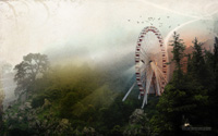
'Wilderness Carnival' is a Photoshop exploration in combining and layering different images and effects to create a bit of a fantastical scene. It's a bit rough and needs more attention, but works for now. Although this approach is nothing new, recent inspirations come from Doug Avery and Jeremy Prasatik. Thanks to Pranav Singh for the use the base photo. Be sure to check out his collection as well.
http://flickr.com/photos/pranavsingh/
Rob
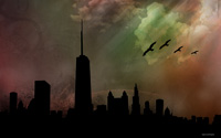
'Skyline'
For a while now I've had the idea of doing some sort of cityscape/skylight peice of artwork. So when the discussions of flash mobs came up this idea was at the top of my list. My thought behind this particular cityscape was the idea of light versus dark. The city below representing the 'dark side' and the clouds and birds representing the 'light side' or hope.
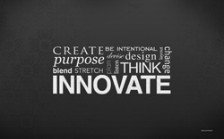
'Innovate'
When brainstorming before our flash mob session began the thought and word 'innovate' kept coming up in my mind. I based this second composition off of that idea. I started with the word innovate and then added words that I felt complemented that idea well.
Samantha
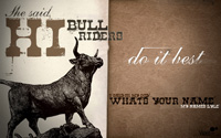
I am a huge fan of Lyle Lovett for his fantastic storytelling capabilities and humorous lyrics. The first time I saw him live the lyrics to "Give back my heart" got stuck in my head, and I began to conger up images of this humorous exchange that went down in "cowboy-looking bar". The song is whirlwind tail that resistantly converts Lyle's traveling days to those of a cowgirl's paradise all because of a pickup line that would make any cowboy blush. I rarely get to bust out my super secret western style, and have wanted to do so for a long time, the flash mob gave me that opportunity.
Tom
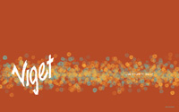
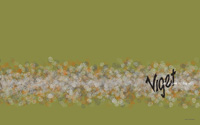
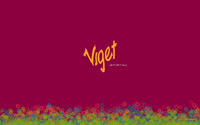
I abandoned my original idea of riffing on The Princess Bride's rodents of unusual size (Viget's mascot is a 'lab rat') when half way into the event I realized there was no way to finish my lofty goals in time. Instead, I put pen to paper and sketched out some line drawings to scan. I was able to use the drawings to create a logo concept and tagline plus use some of the design elements to create brushes within Photoshop (something I had never done before). Just like the art of painting, there ended up being about 3 hours of planning and prep work and about an hour of designing. As a result, I learned something new. Using the scatter technique with the custom brushes brought me to these stylistic designs.
Share your own methods of rapid collaboration.