Experiments in Loading - How Long Will You Wait?
Ian Tate, Former User Experience Intern
Article Category:
Posted on
Intro
Entering Viget’s summer internship program, I was asked to devise a solo user experience project. Once I came across past Viget UX experiments I knew I wanted to add to this body of research. I quickly honed in on studying the ubiquitous digital experience of the loading animation.
Background
Waiting for something to load can be boring, especially on the web. By making a loading screen less generic and more novel, we might be able to make time seem to pass more quickly or even make the wait more pleasant. I set out to see if a novel branded loading experience would in fact make users more willing to wait longer for a page to load than an unbranded generic loader.
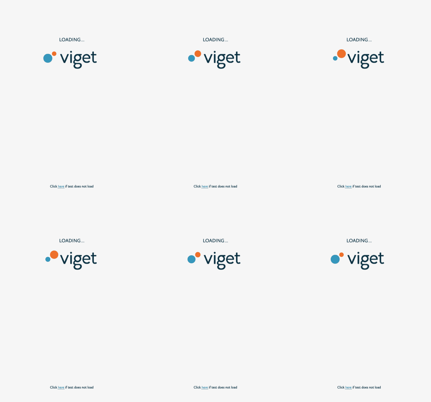
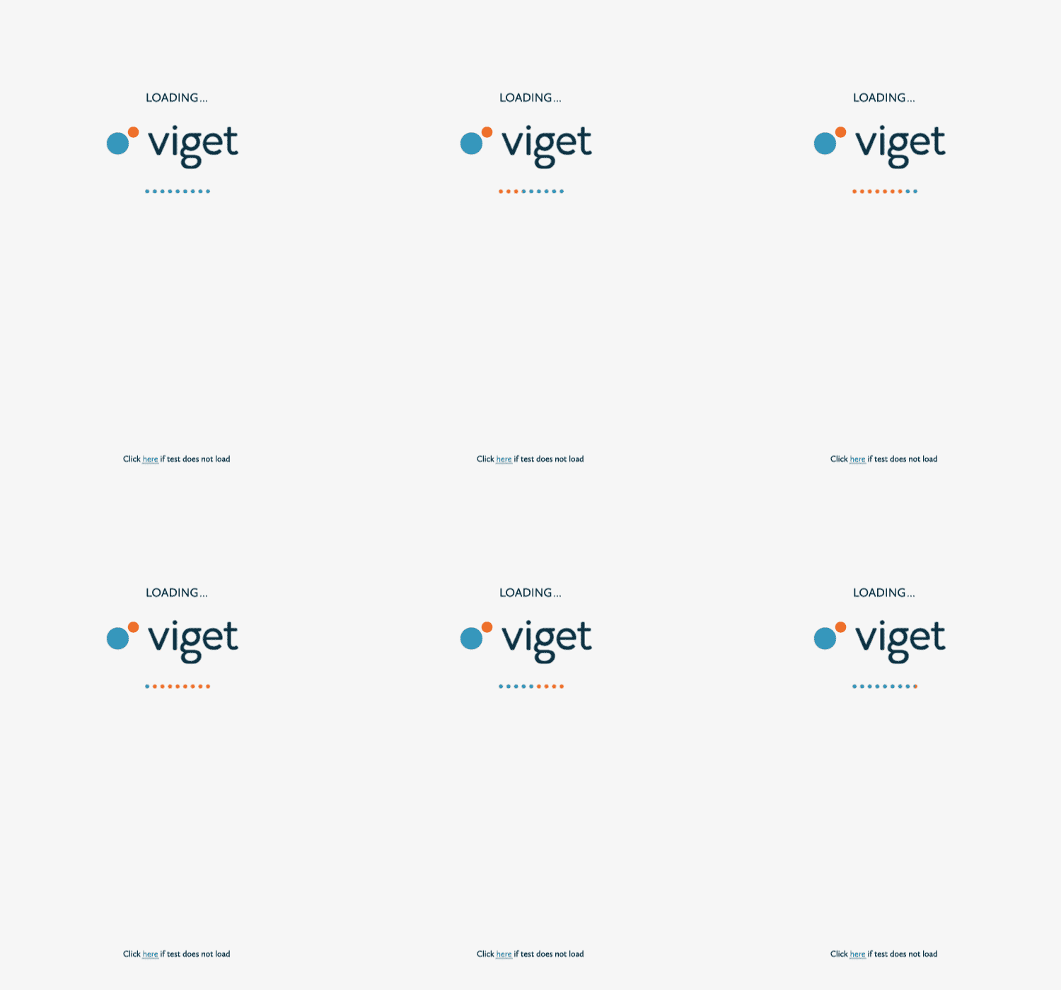
The first step I took in devising my test was to create several Viget branded loading animations (pictured below). I wanted to create animations that were comparable to the common generic animation you see populate the web, like the spinning pinwheel or loading bar.


After several iterations and a few critiques I narrowed my test animations down to three branded and three unbranded animations (pictured below).



Experiment Design
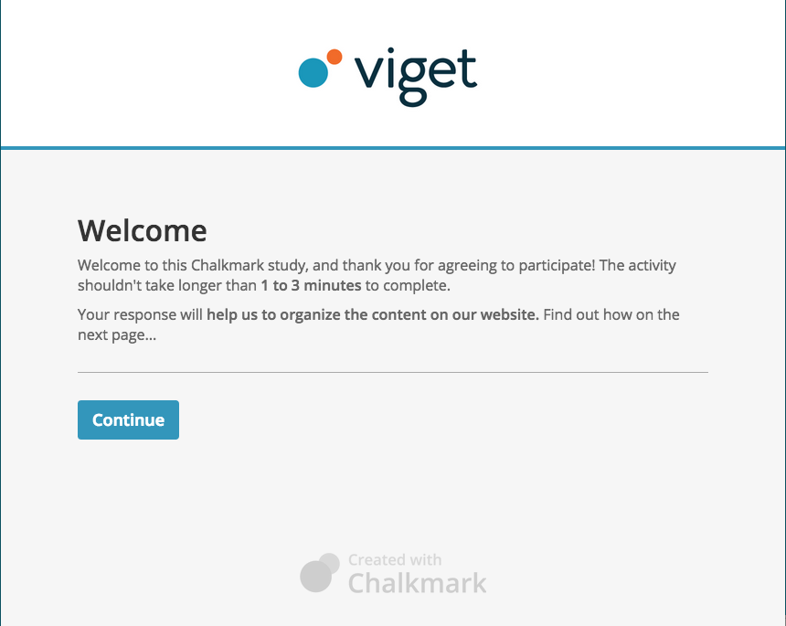
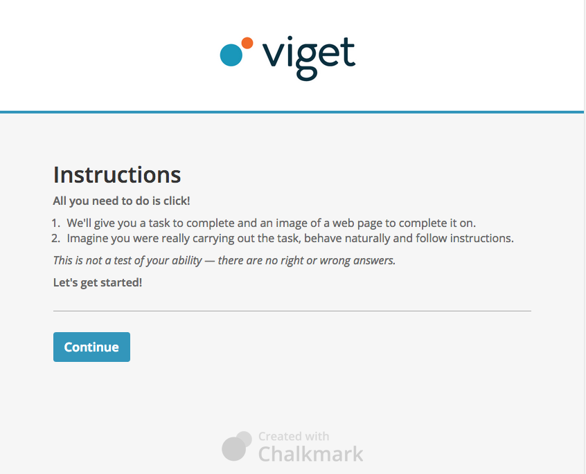
The experiment (which is still active) was created in Optimal Workshop’s screenshot click test, Chalkmark. Over the course of a week, 106 participants took the test.
The entire test was, in effect, a deception. After agreeing to begin the test, participants were presented with a loading screen ahead of the first task. What users didn't know was that this loading screen was never-ending, and that they were already being tested. The test recorded how long participants would wait before deciding to abort the test or click the link that said "Click here if the test does not load.”
Of course, that usability test never appeared. Participants who clicked anywhere on the screen were routed to a screen that thanked them and informed them that they had just participated in an experiment to test users’ willingness to wait during loading experiences.
During the loading screen, each participant was randomly shown one of six different loading animations.
Experiment Results
Analysis
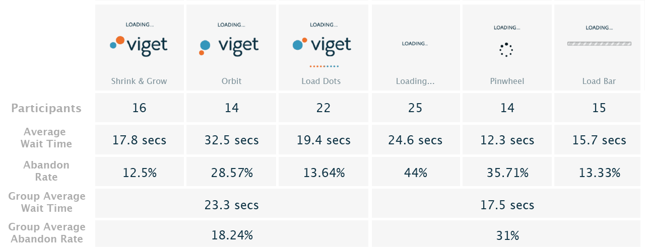
Despite some individual variation, novel loaders as a whole had a higher wait time and lower abandon rate than generic ones. Individually there were no clear ‘winners’, the ‘Branded Orbit’ animation kept users on the page for the longest time, but also had the highest abandon rate among the novel branded experiences. The ‘Loading…’ animation, while having the second highest average wait time, had a significantly higher number of participants abandon the page compared to all the other animations.
Overall, the branded loading experiences as a group held participants' on the loading page for longer, and had lower abandon rates than the non-branded, generic experiences. I’d surmise that this could be due to participants...
- assessing the experience they are waiting for to be of more value because time was put into crafting a unique loading experience.
- becoming fixated on the colorful and novel aspects of the branded animations.
- readily perceiving the generic loaders as being fundamental errors within the site.
Conclusion
Of course more data needs to be collected to have a concrete conclusion. If I could expand the experiment I would love to test how long a user would interact with interactive loading experiences like the mockup below.

I hadn't expected to spend my summer testing interaction design patterns, but I'm grateful for the experience. This whole project taught me a lot about the processes involved in testing, and gathering UX data. I entered the project feeling like a designer, but I left feeling more like a scientist.