Designing Device Assets: Templates and Tips
In olden times, as long as you remembered to create a favicon you were golden. Now, between phones, tablets, retina screens, iOS 7, Windows 8, everything and the kitchen sink, there are literally dozens of icons, images, and assets a designer can create for a project. It can be overwhelming to keep track of all the variations and each of their individual quirks. And if you're me, it can be daunting even to remember to design all of these assets in the first place. I'd like to think that when I hand off a design to a front-end developer, I've crossed every T and named every Photoshop layer. And yet every time, every time, ten minutes after handing over a project, Jeremy asks me for the Apple touch icons, which I have invariably forgotten.
To end this vicious cyle of forgetfulness and confusion, I have created a set of Photoshop templates for device assets. These templates cover, as completely as possible, favicons, Apple touch icons, startup images for iPads and iPhones old and new, and Windows tiles for IE10 and IE11.
Download Template Set .Zip
Favicons
Good old favicons. In order to have the classic 16x16 px image ready for retina, you now need a 32x32 px version as well. You can save a 32x32 px .ico file straight from Photoshop (with help from Telegraphics's plugin) and let non-retina browsers do the work shrinking it down for you. Or for the pixel perfectionist, you can create 16x16 and 32x32 .pngs and use a tool to combine them into one .ico file. Check out the links below for a good run-down of the best tools for the job. This template set includes both 16x16 and 32x32.
Further favicon resources
- Telegraphics's plugin for saving .ico files directly from Photoshop
- The State of Favicons
- How to Create Retina-Caliber Favicons
Apple Touch Icons
Web apps, responsive sites, anything that a user might want to save to their Apple device's homescreen needs an Apple touch icon. Between iPads, iPhones, iOS 7, and retina screens, there are several variations to account for, the largest being 152x152 px. This template set includes a whopping seven templates to cover everything you could possibly need. Taylor Fausak has a fantastic, clear breakdown of how each size correlates to a different device:
- 152x152 for retina iPads on iOS 7.
- 144x144 for retina iPads on iOS 6.
- 120x120 for retina iPhones & iPod touches on iOS 7.
- 114x114 for retina iPhones & iPod touches on iOS 6.
- 76x76 for iPads on iOS 7.
- 72x72 for iPads on iOS 6.
- 60x60 for iPhones & iPod touches on iOS 7, although no such devices exist.*
- 57x57 for iPhones & iPod touches on iOS 6.
*I'm not including a template for a non-existent combination of device and operating system. Even I have my limits.
Remember, Apple automatically rounds the corners of your icon for you, so you don't have to do a thing. iOS 7 doesn't apply any additional styles to your icon. With earlier iOS versions, you can choose whether or not to have Apple apply their good old glossy shine on top of your image.
Apple Startup Screens
Now that a user can fire up your site straight from their homescreen, it's nice to have a startup image while it loads. Again, the differences between devices, operating systems, and screens means lots of variations! iPads can have startup screens in either landscape or portrait mode. Meanwhile, iPhones can only use a startup screen in portrait. The fun part about landscape iPad startup screens, as you can see when you crack open the templates, is that the image itself needs to be rotated 90 degrees. Here's the breakdown of templates included:
- 1536x2008 for retina iPads in Portrait mode
- 1496x2048 for retina iPads in Landscape mode
- 768x1004 for iPads in Portrait mode
- 748x1024 for iPads in Landscape mode
- 640x1096 for retina iPhone 5
- 640x920 for retina iPhones pre-iPhone 5
- 320x460 for ye olde iPhones
Further iOS resources
Windows 8 Tiles
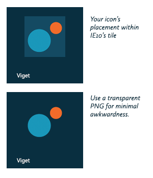 We're still not finished! Windows 7 simply used your 32px favicon to pin sites. But Windows 8 caught up with the icon craze and needs its own, unique assets. IE10 tiles are a little limited and tricky. The tile itself is 150x150 with a solid color background and a site's title in text towards the bottom of the tile. So where does your icon come in? It's an 80x80 square PNG in the center of the tile. Its actual dimensions are 144x144 to account for high resolution screens and devices. (Nope, your math isn't wrong. Now that you're used to doing everything 2x for retina, Windows has its own spin: do everything at 1.8x.) Since your image won't cover the entire tile, the best practice is to make it transparent. At least you can control the solid color it will sit on.
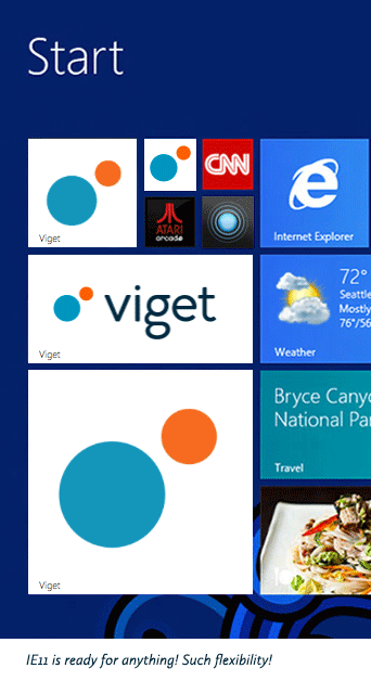 IE11 is a bit more flexible. Very flexible, in fact. You have full control of the tile's look; you also have a whole family of tile dimensions to design. There is:
- 128x128 for small square tiles
- 270x270 for medium square tiles
- 558x558 for large square tiles
- 558x270 for wide rectangle tiles
Again, these assets are 1.8x their display dimensions. So they should look good when displayed at 70x70, 150x150, 310x310, and 310x150, respectively. Windows again can insert a text title at the bottom of the tile; keep the bottom 36 pixels clear of any noisy imagery that could affect legibility. Windows decides whether white or black text will be more legible against your design, so don't necessarily count on the text being the color you'd prefer.
Further Windows 8 resources
- Pinned Sites in Windows 8 (for IE10)
- Windows's own dev page for creating custom IE11 tiles
- Windows's wizard for generating IE11 tiles and code
Phew!
I'm sure you could go even deeper down this rabbit hole if you wanted. And this brand new template set is probably somehow already outdated. But hopefully it's useful for you and your process. Make sure to check out the resources I link to for top-notch insights into the implementation that goes along with these assets.