Behind the Scenes: Lafayette College
Tom Osborne, Former VP, Design
Article Category:
Posted on
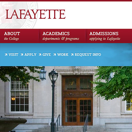
Back around the time of the first and second North American blizzards of 2010 (more popularly referred to as the Snowpocalypse and/or Snowmageddon) we started working with Easton, PA based Lafayette College on a redesign of their Lafayette.edu website. It had been years (many years) since the site had a major overhaul so when we sat down with the varsity team of Lafayette stakeholders we knew this was going to be a fun project. Six months later on the heels of a new academic year the shiny new website was ready for primetime.
This was no small undertaking. There was much to figure out from understanding what made the college unique to improving the usability of the website. With much cooperation from the Lafayette internal team we approached the redesign from a few different angles. Among them, we looked at the site architecture, user interfaces of key pages, and brand personality/identity. We built out the website in HTML, CSS, and JS, implemented it in Wordpress, and then adjusted some of our design work based on user testing conducted by the college.
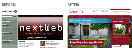
Based on that work the transformation was complete:
To dig into the visual aspects of the design, we first needed to better understand who the college was and what was it that made them special and unique. We learned that there was a strong desire for them to stand out among other small liberal arts colleges in the US. As we talked to them we learned that Lafayette College students and faculty had the following characteristics:
- Friendly and community driven
- There is a shared sense of altruism – students and faculty have helped out with disaster relief both inside and outside of the US
- They are a small college with large resources for both students and alumni
- The staff is committed to research and bettering their respective fields of practice
- They are known for Engineering but there is so much more to offer including a recent focus on the Arts
- The campus is beautiful (we visited to witness first-hand)
- They teach their students HOW to think, not WHAT to think
- Interdisciplinary studies are a tremendous asset
- Teachers work with teachers, students work with students, and teachers work with students – there is much collaboration at all levels
From that we focused on a few themes:
- Enriched Lives / Broadened Horizons / Leaders of Tomorrow
Students who attend Lafayette are taught to think in ways they never thought possible. They focus on bettering their local community and prepare themselves for community involvement around the globe. In a unique way, this teaches them about building friendships, philanthropy, and environmental care. Students from Lafayette graduate and go to places all over the world to help improve living conditions in areas they never knew existed. - Small College, Large Resources
Founded in 1826 and located in close proximity to New York City, the college has a significant history. It may still be a small college by most measures but alumni support is strong and many have gone on to lead enriched lives. In addition to human connections, all across campus students have abundant access to research materials to help support their needs. - Dynamic Environment / Interdisciplinary Activity
Due to the close-knit community both on campus and locally in the town of Easton, students are encouraged to work with others to start new programs and initiatives. Individual students, student groups, as well as faculty and alumni are known to work together to think locally and act globally on a variety of needs. Collaboration happens at all levels to help create a truly unique collegiate experience.
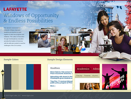
Mood Boards
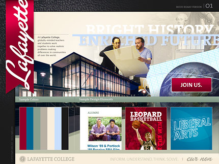
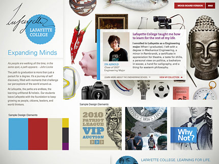
Pulling from each of these themes, we created these stylistic concepts to stoke a design conversation:
Final Design
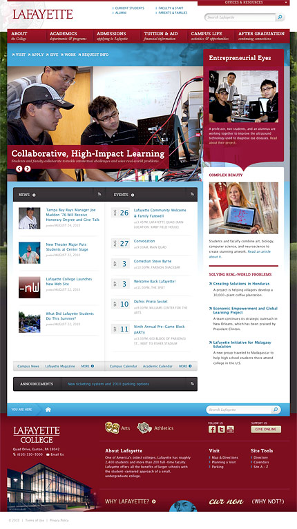
Once the wireframes were ready and we had the feedback we needed from the Lafayette College team, we began to focus on the final design. Some key elements included:
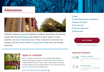
- Navigation tailored to different audience groups to improve findability for various needs
- Showing students working together to solve problems
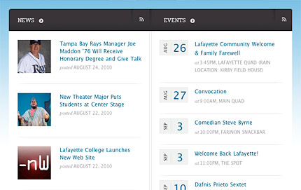
- Highlighting individual student profiles to give a more personal account of what student life is like
- Using imagery to help prospective students get a feeling of what being on campus is like
- Expanding the color palette in new ways
- Embracing history but focusing on the present and future
- Playing nicely with a new brand identity and logo mark (a separate initiative)
- Playing nicely with an existing but upgraded content management system
- Like all good redesigns, a fresh feeling
Here is what that looks like:
Home Page
Snippets
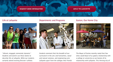

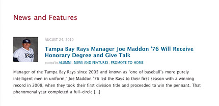
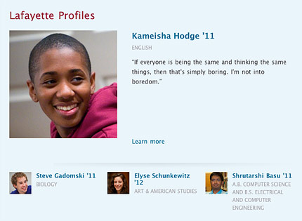
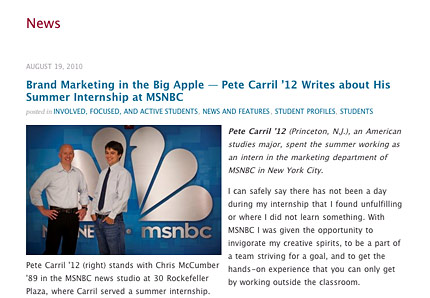
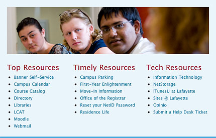
One final note, when we first met with our partners at Lafayette we joked about putting an easter egg into the design. Not ones to let this kind of opportunity pass, we just had to follow through. Without telling you too much about it, here's a clue to guide you where to look:

Visit the Lafayette College website to see more.
Update
10/22/2010: Learn more about Lafayette on Wordpress.