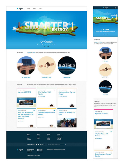
The New Viget
In March of 2008, we launched the last major redesign of viget.com, and I can say unequivocally it had a huge impact on the success of our business. Here are three main ways:
- It highlighted our collective personality. A company culture happens, but a personality is something to be deliberate about. What kind of company were we? We’d been in business for eight years and taken our lumps. We felt like a brazen teenager, finally comfortable in our own skin, finally confident that we’d figured things out enough to have some swagger. That site - with a fun design and casual tone - was us coming out of our shell, being proud to be us, and showing everyone who we really were.
- It connected. 2008 was the emergence of Twitter and Facebook, and events like SXSWi and Refresh felt new and exciting. There was a community forging locally and nationally for our industry, and our site was the center of our connection to that community. We weren’t an old entrenched agency, but we weren’t the wide-eyed newbies either. People responded.
- It wasn’t all about us. We launched four niche blogs, each one written for our peers in the major roles we have at Viget (UX, design, development, and marketing). We didn’t over think it. We just shared stuff that we thought was relevant. Problems we’d faced, tools we’d used, ideas we'd discussed, stuff we'd made, approaches we’d tried. It was truly a conversation. Looking back, I'm amazed at the result. Every person we've hired since that launch has referenced the blogs as important to either finding us or getting to know us before joining. A number of our clients -- including major brands like Choice Hotels and PUMA -- found us first via a blog post that helped them solve a problem.
Today, we've launched another new version of viget.com.
We learned a lot from the last redesign, much of which we applied here again. If the last version was a raw and unsophisticated teenage Viget, perhaps this is Viget as a young adult. Smarter, more savvy, more confident, more efficient. A bit more calm and collected, but still energized, excited, and leaning forward. Successful and proven, but still with our best years -- many of them -- ahead of us.
We’ve grown a lot in four years. Not just people and offices, but knowledge, skills, experience, and relationships. We’ve matured without losing our sense of humor, become more consistent while always innovating. Most of all, we’ve done work we’re proud of on projects we care about.
The goal for this relaunch was simple: simplify. Say more with less. There are just three main sections:
- About. Who are we? Where are we? What makes us tick? Who should join us?
- Work. Front and center. Show me, don’t tell me. Results. Don’t waste space pontificating about procedures and methods -- good process reveals itself best with great work and successful clients.
- Blogs. Kind of a boring title, right? Yes, but why leave you guessing with a section like “Thinking” or “Ideas”. Sharing what we know on our blogs remains a central focus. We’ve condensed them a bit to address three key audiences: developers, designers, and marketers. We’ve renamed the old FourLabs blog to the more enticing Flourish (the loose translation of Viget) -- this one is unapologetically about us. We continue to hope you’ll read, comment, and share. We certainly appreciate it when you do.
This is the new Viget.
For a behind-the-scenes look at the redesign, check out Tom's post.

