Why Sketching Sessions are Always Worthwhile

Samara Strauss, Former User Experience Designer
Article Categories:
Posted on
Sketching sessions generate ideas, bring people together, and set the tone for further collaboration.
There’s a lot of talk in our industry about how we need fewer meetings and those that remain should be more productive. I totally agree with this; it makes me cringe to think that people actually have meetings about having too many meetings. In honor of productivity, I want to take the opportunity to give a shout-out to my favorite kind of meeting: team sketching sessions. Here are a few reasons why I love them and find them to be so worthwhile.
They’re a great way to generate a lot of ideas quickly
Sketching sessions are an exercise in simple math. If you have, say, five people in a room for an hour, they’re going to be able to come up with more ideas than one UX or visual designer can in that time. More importantly, the team will have ideas that one person will likely never think of alone, no matter how much time they spend working.
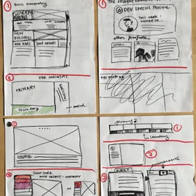
 Many fantastic sketches from a recent team sketching session.
They don’t take a lot of time
Sketching sessions take 1 – 2 hours depending on how many pages you’re sketching and the number of people in the meeting. This is a relatively small time investment in a given week, even if some team members are resourced on multiple projects. Most people are usually happy to take 1 – 2 hours to work with the team.
Their structure keeps them productive
It can be easy to get lost in conversations about design, especially early in a project. Sketching sessions can help provide a framework to guide these early discussions.Typically, teammates sketch and discuss one page at a time, which helps focus the discussion. Exercises and discussions are also time-boxed, which encourages high-level thinking and discourages getting lost in details.
They create a shared sense of investment without making things overly democratic
Let’s face it: team members aren’t going to have any sense of investment in a design they had no hand in creating. This is why it never goes well when a UX designer creates all the wireframes and then presents them to the team. If people have no skin in the game, they’re not going to care much if things fall flat later on in the project.
However, we don’t want the pendulum to swing too far in the other direction: if every design decision has to be vetted with the entire team, a project will never get anywhere. No part of a project can be fully democratic.
Sketching sessions find the balance between putting together wireframes or comps in a vacuum and vetting every design decision with the project team. They allow everyone to share and discuss ideas and have input into the high-level vision for the interface while also building up enough trust so that the UX or visual designer can more fully develop the details on their own. A shared investment is created and the UX or visual designer is empowered to continue with their work.
 Some Vigets sketching together.
They reduce the need for design reviews later on in the project
One of the reasons formal design reviews are necessary is because it’s nearly impossible to explain all of the nuances of how goals or research influenced a wireframe over Slack or Basecamp. However, formal reviews become less necessary if everyone on the team had a had a hand in creating the interface.
Sketching sessions provide an opportunity to review project goals and research so that when sketches generated in the meeting are later converted into wireframes or comps, the whole team has a better understanding of where everything came from. This usually reduces or eliminates the need for formal reviews later on. Informal discussions over Slack usually suffice.
They set the foundation for later collaboration
If you’re working in a more waterfall process, the discovery/UX phase is the first part of the project, which means — whether it’s fair or unfair — that it’s part of a UX designer’s job to help set a collaborative tone for the project. Sketching sessions are a great way to do this. Simply inviting your coworkers to a sketching session sends the message that you are excited to work with them and want to hear their ideas. Actually listening to their ideas and creating a shared direction for the interface shows them you’re willing to put your money where your mouth is as far as collaboration goes. This sets an important precedent and tone for the rest of the project.
So you want to run a sketching session ...
Now that you’re totally onboard with how awesome sketching sessions are, here are some tips for running a successful sketching session with your team:
- Allocate about 1 – 1.5 hours to sketch 2 key pages — You may need longer if you have a large team in order to allow time for discussion.
- Invite everyone on your project team — Don’t be afraid about taking an hour or two of someone’s time, even if they are resourced on multiple projects.
Come up with a list of goals, content requirements, and any unknowns — Do this for each page you will sketch and review it in the meeting so everyone can sketch productively. You may also want to include information on personas, competitors, or other research.
Have supplies ready — The usual: sharpies and blank paper or mobile/desktop templates. Ambient music can also minimize awkward silence.
Time-box exercises — I find giving about 5 – 8 minutes to sketch one page works well. Discussion usually takes about 15 minutes per page, but that may depend on how many participants you have.
If people are remote, have a way to share — Slack works well.
Happy sketching/collaborating!