Who Says the Web is Just for Squares?
Trevor Davis, Former Front-End Development Technical Director
Article Categories:
Posted on
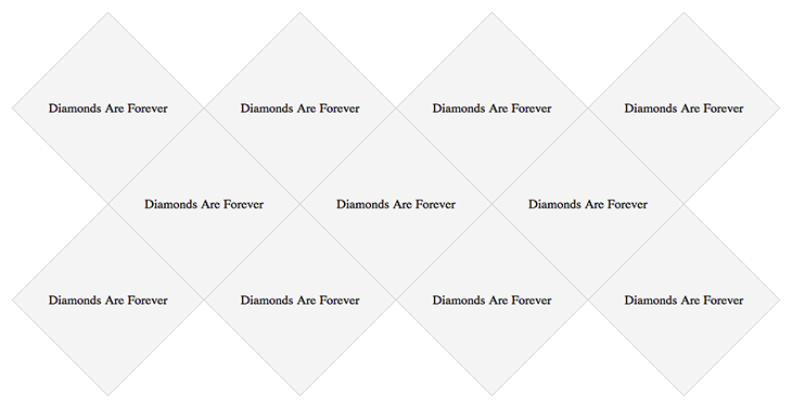
With the continued adoption of advanced CSS by browsers, we are starting to have the ability to do more and more using just CSS. As we have seen, you can make all kinds of crazy shapes with only CSS. On a recent client project, the designer challenged me with a grid of diamonds.

Oh, also, this is a responsive site. Challenge accepted!
So first, I focused on just getting a single square rotated and working how I wanted. Then, I moved to a single row. Then, multiple rows. Finally, multiple rows at different breakpoints.
Some setup for this article:
- I’m using Modernizr to detect if the browser supports CSS3 Transforms.
- I’m using Sass and Compass for all of the CSS.
- I’m including all of the Compass CSS3 mixins: @import "compass/css3".
Single Diamond
It’s fairly simple to just rotate a single square 45 degrees, and then rotate everything inside of it back 45 degress:
<a href="#" class="diamond">
    <div class="content">
        Diamonds Are Forever
    </div>
</a>
$diamondSize: 190px;
.diamond {
    background: #f4f4f4;
    @include box-shadow(0 0 0 1px #ccc);
    color: #000;
    display: block;
    height: $diamondSize;
    overflow: hidden;
    position: relative;
    text-decoration: none;
    width: $diamondSize;
    .csstransforms & {
        overflow: hidden;
        @include rotate(-45deg);
    }
}
.content {
    display: table-cell;
    height: $diamondSize;
    padding: 0 10px;
    @include rotate(45deg);
    text-align: center;
    vertical-align: middle;
    width: $diamondSize;
}
Single Rows
Next, I worked on displaying a single row of diamonds:
<ul class="diamonds">
    <li>
        <a href="#" class="diamond">
            <div class="content">
                Diamonds Are Forever
            </div>
        </a>
    </li>
    <li>
        <a href="#" class="diamond">
            <div class="content">
                Diamonds Are Forever
            </div>
        </a>
    </li>
    <li>
        <a href="#" class="diamond">
            <div class="content">
                Diamonds Are Forever
            </div>
        </a>
    </li>
</ul>
.diamonds {
    font-size: 0;
    margin: 40px auto;
    .csstransforms & {
        padding: 39px 0;
    }
    > li {
        display: inline-block;
        font-size: 18px;
        margin-right: 80px;
        .no-csstransforms & {
            margin: 0 20px 20px 0;
        }
    }
}
Honestly, the padding value on the list and the right margin on each list item were a result of me just doing some pixel nudging until things aligned correctly.
Multiple Rows
Now was when the real fun started. The basic idea is to use margins to push the diamonds around until they align into a grid. This involved some math, and a whole lot of pixel nudging until things were perfect. I used nth-child to assign specific margins to specific children. Here are the margins for the following example:

.csstransforms .diamonds > li {
    //Add left margin to the 4th diamond,
    //and then every fifth diamond
    &:nth-child(5n+4) {
        margin-left: 135px;
    }

    //Remove the right margin to the 3rd diamond,
    //and then every fifth diamond
    &:nth-child(5n+3) {
        margin-right: 0;
    }
    //Add negative top margin to every child after the 3rd diamond
    &:nth-child(n+3) {
        margin-top: -55px;
    }
}
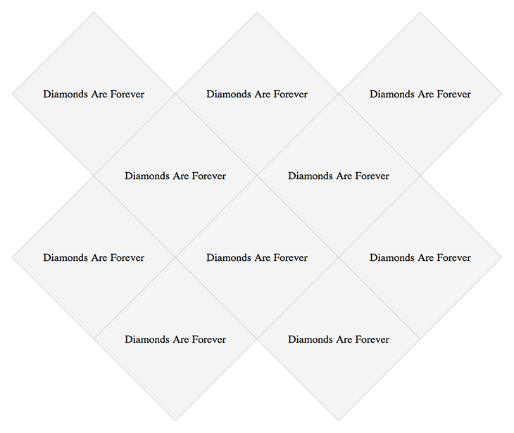
From there, I abstracted that out along with a respond-to mixin to work with various breakpoints. To see all of the code for that, you should check out the GitHub repo, but here is a little snippet:
@mixin respond-to($query) {
    @media only screen and #{$query} {
        @content
    }
}
@mixin diamond-grid-breakpoint($query, $maxWidth, $n, $maxRow) {
    @include respond-to(#{$query}) {
        .csstransforms & {
            max-width: $maxWidth;
            > li {
                &:nth-child(#{$n}n+#{$maxRow + 1}) {
                    margin-left: 135px;
                }
                &:nth-child(#{$n}n+#{$maxRow}) {
                    margin-right: 0;
                }
                &:nth-child(n+#{$maxRow}) {
                    margin-top: -55px;
                }
            }
        }
    }
}
$diamondQuery1: '(min-width: 1348px)';
$diamondQuery2: '(max-width: 1347px) and (min-width: 1078px)';
.diamonds {
    @include diamond-grid-breakpoint($query: $diamondQuery1, $maxWidth: 1270px, $n: 9, $maxRow: 5);
    @include diamond-grid-breakpoint($query: $diamondQuery2, $maxWidth: 1000px, $n: 7, $maxRow: 4);
}
Again, lots of pixel pushing to get things just right. I would expect if you wanted to use a layout like this, you will need to do a bunch of pixel nudging and adjustments to suit your needs. But, this is just an example of what can be done.
One Minor Annoyance
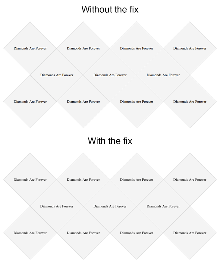
There seems to be a minor issue with webkit browsers and odd window widths. Some of the box-shadows don’t show up when the window is an odd number, but they do when it’s an even number. Very weird. A solution is to add the following:
.diamond {
    @include backface-visibility(hidden);
    @include perspective(1000);
}
But, then the text gets all blurry, so that kinda stinks, but I guess it is the lesser of 2 evils. Below is an image showing the grid without the fix and then with the fix.

Here is the GitHub repo and a demo. Go forth and make some creative layout with different shapes!