What’s in a Name: Part II

Elliott Muñoz, Former Art Director, and
Elyse Kamibayashi, Former Senior Brand Strategist
Article Categories:
Posted on
Once you have a handful of names that you like, how do you decide which one is the one?
Welcome to Part 2 of our limited series on naming. If you haven't had a chance to read Part 1 yet, we'd suggest starting there.
So, you’ve brainstormed, written hundreds of names on a whiteboard, brainstormed some more, and finally whittled your list of names down to a few front-runners. Now all you have to do is choose the best one, right?
Well, yes. But it’s not that simple.
Here’s the thing: if your front-runners are currently written on a whiteboard, or typed out on a piece of paper, then picking one is going to be extremely difficult. That’s because, when they’re written on a whiteboard or typed in Arial 11-point font, they don’t really look like names. They just look like vaguely interesting words, and no amount of squinting or imagining can give you a real sense for how any individual word could represent your brand.
What’s more, if you try to test those words with your audience, they will react the way anyone would react if a list of seemingly random words was shoved in their face — with skepticism and possibly annoyance.

The only way to eliminate the guesswork and hand-wringing is to make your finalists feel more real — more like actual names for things out in the world. And the way to do that is to create a logo and a tagline for each of them. We know. It’s a lot. But if there were ever a time to pull out all the stops, this is it.
Giving each finalist a logo and a tagline is the only way to figure out what that word is going to look like, and sound like, when it’s out there promoting your brand.
Think of it as if you’re interviewing those finalist names for a job. Would you ever hire someone without finding out as much as you can about who they are and what they bring to the role? Probably not. Especially for a role as public-facing as this.
Step 1: Collect personalities
It might come as a surprise that the first step of the logo and tagline process isn’t sketching or writing. It’s moodboarding. Up to this point, you may not have given much thought to the personality of the name itself and because of this, the writer and designer might have two different visions of what that name looks like in their head. Rather than talking about those pictures (“I see lots of fancy, lots of gold and big archways...and dragons”), we recommend developing mood boards — not overly complex or comprehensive — but simple photos of people, objects, and places that embody the name.
For Wondrium, our mood boards included The Natural History Museum in Dublin, M.C. Escher’s architectural drawings, and Diagon Alley. Each place shared a number of characteristics, but it was the differences between them that forced us to get specific about what we liked.
For Agog, we were channeling a person. But a specific type of person. One who moved to the beat of their own drum. One for whom the rules didn’t exist. The people we added to our mood board included Professor Trelawney, Lady Gaga, David Bowie, Freddie Mercury and, of course, Prince.
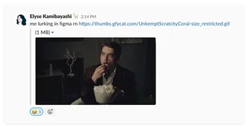
The way we’ve approached mood boards in the past is to create them in isolation and share them later with the team. For this project, the designer and writer (that’s us) worked together, using a shared Figma file. As new photos were added, we’d leave notes within Figma or hop in Zoom to discuss.

Unlike traditional mood boards where the goal is to dismiss assets that don’t hit the mark, the discussions here are never meant to challenge or dismiss, but to understand. Each photo embodies a certain characteristic of that name and the purpose of discussions should always be to understand why.
Step 2: Finding your own personality
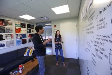
Sadly, at some point, you reach the end of Google and there are no new photos of Lady Gaga and Prince for you to dissect as a team. It’s at this stage that you’ll have to move on to your individual logo and tagline explorations. Every person has their preferred method of exploring. For our writers, it tends to be a small dry-erase board. For our designers, a short stack of printer paper and a sharpie.
Whatever your method, take care to keep the work your own. The tendency can be to start the process by referencing the work of others. (I’m looking at you, looking at Dribbble). This is usually characterized as a means of getting inspiration, which can seem harmless. And it is harmless, right? No. No, it’s not. The danger here is letting the final, polished work of others influence your own thinking and, in a process that demands originality, that can be a dangerous place to find yourself (and your client).
Fortunately, you have an alternative source of inspiration—your mood boards and all the characteristics you’ve identified within them. If those no longer get your blood pumping or you don’t feel equipped to start your own explorations, don’t be afraid to pull in your creative partner to continue the mood board phase.
If you are ready to start exploring, awesome, this is the fun (intimidating, stressful, ugly) part. Take one name at a time and give yourself a consistent block of time to explore it — that way each name is given an equal shot at looking the part. You want fully explored logos and taglines for all of your finalists. (For us, that meant 5 fully explored logos and taglines...not our 3 favorites, not the 2 with the best chance...5 fully explored logos and taglines.)
Share with your creative partner early and often. Every time you share, you should be getting closer to a solution that looks and sounds like the real thing. This doesn’t always look like refining a single direction. Sometimes it looks like eliminating those directions that don’t work and having the discussions to understand why. That’s progress.
Eventually your personality will begin to take shape. Fidelity will be added. Color and type will be explored. The logo will begin to look like something Prince would proudly use as a guitar and the tagline might be confused for one of his albums. It may seem like your work here is done—and it’s pretty close—but there’s one more critical step you’ll need to take before putting this in front of the client.
Step 3: Finding a proper balance
At this point, you should have a clear personality for each of your 5 names as well as a logo and tagline for each. As a final step, we evaluate what your logo and tagline are saying together.
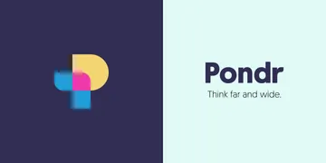
Saying something together doesn’t just mean saying the same thing, only louder because there’s two of them. It's more like a conversation. Successful logo and tagline pairings should build on a thought started by the other. For instance, let’s take a look at Pondr, whose tagline was, “Think far and wide.” If we were judging the logo based on how closely it matched the tagline, we would have missed the mark. A matching logo would've looked more open, or would've used scale to better communicate a vast expanse of thought. Instead our logo made a simple depiction of a person with a thought bubble which also happened to form the letter “P.” It felt simple and solid, but still intriguing. It grounded the slightly airy feel of the tagline, while the tagline lifted it up — making the bright yellow and pink feel like flashes of inspiration.
All in all, the logo and tagline should be like the designer and writer who created them — effective by themselves, but more interesting and more powerful together.

And that's it!
You’ve successfully created a logo and tagline for each of your names. You’ve made something that your client team can use to evaluate the names from multiple angles — from both a visual and messaging point of view. What this means is that your client team no longer has to make a decision about the future of their company by squinting at some sticky notes.
And that’s what this process is about. The ultimate goal is to create a name that will represent your brand in a compelling and memorable way. But at the end of the day, we — the people coming up with the names — are not the ones who have to commit to a name.
The process we’ve outlined was designed to help us come up with a strong set of names for our client — but it was also designed to help our client team make a decision they felt confident in. Thoroughness and rigor are our friends when it comes to the incredibly sensitive and tricky business of naming a brand — or doing anything related to branding, for that matter. Rigor and whiteboards. And creative partners. And snacks. And time. If you equip yourself with those things, you won’t fail. And you might just have some fun while you’re at it.
