What #TheDress Reminded Me About Web Design
Anjali McKenzie, Former UX Researcher
Article Category:
Posted on

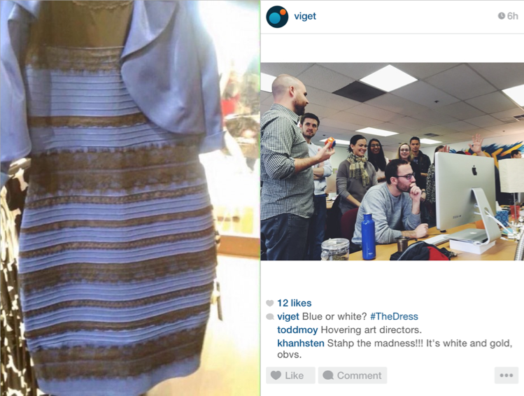
As the dust settles on #TheDress debate and the naysayers start to see that the dress is obviously blue and black, I've realized that there is an underlying lesson to be learned from this internet sensation:
People see things differently based on their circumstances.
This is an important reminder. As professionals in the web design world, it's something we need to constantly keep in mind. Whether it's due to screen brightness, environmental lighting, time of day, or some other external factor, there's inevitably going to be a number of considerations to take into account when designing for the web.
Sifting through the hundreds of articles on #TheDress, you'll find that some postulate that it might be your emotional state that's causing you to see blue and black vs. white and gold. Could this be the real reason? I can't answer that, but what I do know is that it's yet another factor to take into consideration.
Just because that grey border appears to have clear contrast against its white background on our crisp 27" Cinema Displays (thanks, Viget!), doesn't mean it's going to look that way on the client's 13" laptop when they're checking it at 9pm, after a long, stressful day, in the low light of their home office.
Though we can't always control every external factor, we may be able to control some of them if we plan in advance. More important, is how we deal with a response that was likely based on one or more of those factors. Three simple tips come to mind as ways to mitigate and deal with less-than-ideal design feedback:
- Share design work in person. We like to do this whenever possible because it allows us to control many (but not all) of the lighting factors that often affect the immediate response to a design. A bonus is sharing the work in person at our own office, but that's a bit harder to negotiate. Though the client team will likely take another look at the designs later on under their own circumstances, at least we have the benefit of knowing that that first 'wow' moment was on our terms.
- Get details about the users' environments before designing. Data to the rescue! A quick look into GA can give you insights on a site audience's typical environment - browser, screen size, location, and even time of day. Supporting research like user interviews or observational study can help you supplement the missing pieces of the user puzzle. Together, these data points will allow you to make some pretty safe assumptions about the surroundings the majority of your users will be in. When a client comes back to you with some design feedback out of left field, you can confidently present your well-informed rebuttal.
- Pick your battles. This isn't a novel idea, but I like to occasionally drop in this well-known saying to my creative counterparts. Even with perfect presenting conditions and a bunker of GA and user data ammunition, you may still find yourself facing the most absurd, most nit-picky piece of design feedback you've ever heard. In these moments of near-insanity, take a deep breath and remind yourself that the client might be under unknown circumstances and it might be in your best interest to just up that grey-line contrast a couple shades. We value design integrity, but we know that we sometimes need to raise the white flag in small battles in order to win the big ones.
Whether or not #TheDress debate was a complete hoax, it did do a good job of reminding us that design and colors can look different to different people, especially on the web. And while our designs *may* never get a reaction from Taylor Swift or Mindy Kaling, it’s still critical to consider the user’s—and client’s—environment when designing.
In closing, the dress is blue and black.