What Not to Wearable: Part 2

Katherine Olvera, Former Senior User Experience Designer
Article Categories:
Posted on
Designing the entire wearable experience.
In Part 1, I outlined strategies to coordinate the design goals of digital and physical products. Now, I want to take a look at how employing those strategies might yield wearables that appeal to a broad market.
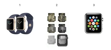
Wearables consist of three designed components:
- The Product This is the object that will house the hardware.
The Hardware These are the technology components that make a product “smart.” It includes the sensors, indicators, transmitters (as well as requisite power sources) that are layered into a physical product to add functionality.
The Digital Experience This is the suite of apps and interfaces that the user interacts with in relation to the wearable. It may be on the wearable itself (as in a full-display watch) or synced to a device (as with a fitness tracker).

There are many articles (including this one and this one) that offer guidance on designing for wearables. But, they all tend to focus on the digital experience. They advise best practices for designing apps for tiny screens or explain the consequences of inappropriately timed notifications. While these are great resources, they gloss over the biggest hurdle in wearables design: how to seamlessly integrate technology into physical products.
These articles do not address the design of the product or the hardware. Instead, they assume constraints, like screen dimensions and available sensors and inputs, based on set product and hardware specifications. Here, the digital experience is framed as a part that is layered on top of already set product and hardware designs, instead of designed alongside them.
However, I think the biggest opportunity for innovation within the wearables space is at the juncture between the product, the hardware, and the digital experience. By giving each of these parts equal weight and consideration throughout the design process, the design of these parts can influence and drive each other. Collaboration and communication between the separate teams that design these parts is key to creating more integrated and relevant wearable products.
Designing Smarter Objects
Let’s take a brief second to look at the design of an analog object to understand the goals of object design. Take a look at a handbag. You may be surprised to find that the average bag is made up of at least 20 visible component parts. This includes linings, zippers, zipper pullers, thread, leather, trims, edgepaint, and various hardware pieces. However, in a successful design, people don’t notice the parts; they see the whole. Functional elements, like zippers, fade into the background. They make the bag more useful without calling attention to themselves or creating difficulties or hassles.

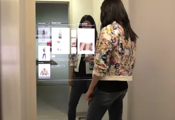
Compare the above approach with the design of many connected products. Recently, I’ve seen quite a few attempts to design connected mirrors. Many use a display behind a two-way mirror and rely on touch to control the interface.

I think we can all agree that bathroom and dressing room mirrors are designed to be able to see yourself. Despite this, connected mirrors layer on interfaces that take up visual real estate. This actually makes the mirror less useful as a mirror. The way technology has been incorporated into the product competes with the analog goals of a mirror.
Additionally, mirrors are most reliable as a tool when they are smudge-free and clean. Considering this, a touchscreen interface is not the best design choice. Think about a woman trying to apply makeup and then control the mirror. It’s going to end up a grimy mess.
Beyond this, the interfaces I've seen are generally flat, and simply adapt the basic UI of a phone or tablet to new dimensions. These designs don't account for a mirror's material properties. Phones and tablets aren’t reflective in the same way that a mirror is. When a person looks into a mirror, they have a perception of depth. To ignore this is in the interface design is a missed opportunity. A connected mirror would be far more compelling if the display functioned more like an augmented reality experience with a sense of depth and an awareness of the space and objects the analog mirror is displaying. Instead, the flat interface creates a disconnect between the digital and analog products. All this just goes to say, just because you can add a screen to an object doesn’t mean you should.

Considerations for Designing Wearables
So, to create a successful connected product of any kind, you must first align the goals of the physical and digital products. In extending this design strategy to wearables, designers are challenged to fully incorporate tech hardware into the design of apparel and accessories without disrupting the aesthetics or analog functions of those products. By doing this, wearables are more likely to appeal to the mass-market consumer (as opposed to the tech niche).
These are the questions designers will need to answer as they go about designing wearables from the ground up. Granted, these aren't easy questions to tackle, but they should steer wearable designs toward a more viable future.
- What is the use case?
With connected products, technology is sometimes thrown at analog objects to see what sticks. Later, a use case is reverse-engineered for the resulting franken-product. (See bluetooth toasters.) Over-complicating simple analog tasks by adding technology thwarts long-term adoption. If a rube-goldbergian series of interactions is necessary to do something as simple as make toast, the product is unlikely to find a large customer base. This approach frames the product as a novelty item, as opposed to a tool to make life easier. Instead, identify a problem worth solving first, and figure out if that problem is relevant to your primary users.
(A quick aside to acknowledge that Nike’s self-lacing shoes are an interesting exception to this rule. The initial shoe design stemmed from a novelty prop from Back to the Future. However, they later discovered that a self-lacing shoe could be a great assistive device for people who struggle to tie their own shoelaces including elderly adults, pregnant women, and people who have disabilities. The product could actually make the lives of people with limited flexibility, mobility, or dexterity easier.)
- Which product is appropriate to solve the problem at hand?
You then have to decide which product is the right one to connect, as well as what types of inputs and outputs it will need. Say you decide that you need a wearable with a speaker to solve a certain problem. Now, you must determine which product is most appropriate to relay that sound. Maybe it is a watch with a speaker, but would people want to hold their hands up to their ear to hear? And how private does the sound need to be? Perhaps the speaker could go on a product that is naturally closer to the ear, like glasses or earrings. Instead of thinking about which products will most readily accept hardware, concentrate on which would be most appropriate to outfit with a specific technology.
- Does the application of technology actually enhance the product?
Technology shouldn’t interrupt the usability of the non-connected product. It should enhance it. If the addition of technology disrupts the analog function of the object, it likely isn’t a good application of the technology. I don’t want a connected handbag, where the technology components take up so much room, there is no room left for me to store my stuff. No matter how many other features it might offer, it doesn’t do what a non-connected bag promises to do for me.
- How can technology be fully incorporated into the product?
Finally, we have arrived at the material sensitivity component of wearables design. First, discover a product's inherent physical properties and the nature of its materials. Then, explore ways that both the physical materials and technological components can be adapted to work together seamlessly. To me, the hybrid smart watch concept demonstrates this type of thinking. It uses analog hands to indicate digital notifications, as opposed to full digital display watches. The analog and digital components of the product are one in the same and inseparable. To that end, I’d love to see more industrial and fashion designers working closely together with engineers and hardware developers to design components that are fully incorporated into the product, both in form and aesthetics.
A Model for Innovation
So, what does a good connected product look like in the wearables space? I believe the Google Jacquard project is the best current model. Google partnered with Levi’s to overcome the hurdle of incorporating sensors directly into the physical object without sacrificing quality, durability, or aesthetics. They wove conductive wires directly into denim and used this new hybrid material in the cuff of a jacket sleeve. This allows the wearer to use the sleeve as an interface for controlling their phone, swiping across it to advance or pause music or ignore a call.
The technology is literally woven into the product. The functional components of the product are so perfectly part of the composite whole that we don’t think of them as separate anymore. That is the type of thinking and design necessary to make wearable technology appeal to the masses.
It is at the intersection of disparate fields that some of the most interesting and innovative solutions come to life. So, I’m excited to see where wearable tech leads, and how designers from the digital space to the physical space continue to integrate increasingly complex technologies into the products we interact with everyday.
Interested in reading more about holistic design approaches to wearables? Check out some of the newest wearables products featured at Dezeen or take a look at these articles
- Designing for Wearables: Beyond the Cool Factor by Kayleigh Karutis for Invision Blog
- Designing for Smartwatches And Wearables to Enhance Real-Life Experience by Jonathan Kohl for Smashing Magazine