What Are Your Brand Guidelines Actually For?
Ally Fouts, Former Creative Director
Article Categories:
Posted on
What you can “do” with your brand guidelines depends on the quality of the guidelines you have — and not all guidelines are created equal.
When I say “brand guidelines” what’s the first image that comes to your mind?
A holy text?
A barb-wired cudgel?
A PDF that’s attached to an email buried in a folder with a file name that you can’t really remember except it definitely has a -V3 on the end of it?
Let’s just be honest:
No one really needs brand guidelines.
What businesses and organizations DO need are things like:
The ability to communicate with their audiences in a clear and consistent way
The ability to build relationships with customers and supporters that are more than just transactional
The ability to convey product or mission value in a compelling way that drives conversions at scale
The best brand guidelines serve as a means to those ends — they are functional toolkits that help you achieve your organization's communications goals.
But do you actually have the right toolkit for the goals you want to achieve?
And how do you make the most of the guidelines you've got, or get the guidelines you truly need?
When our team talks about branding, we like to keep our definition simple:
Your brand is how you communicate, in a clear and compelling way, who you are, what you do, and why.
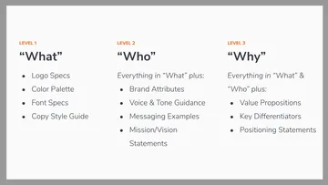
And when we’re evaluating an existing set of brand guidelines, or deciding what needs to go into a set we’re developing ourselves, we use those "Who", "What", "Why" — plus a bonus "How" — categories to define 4 basic "levels" of brand guidelines.
We use these levels as a shorthand way of assessing what a set of brand guidelines actually has in it, and consequently, what sorts of branding or marketing activities those guidelines can support.
Let's take a closer look at how we define those 4 levels, keeping in mind that the complexity of the guidelines — and the complexity of the things you can use them to do — gradually increases, level-by-level.
Level 1: “What should I do here?”
Guidelines that fit into the Level 1 category should contain everything you need to answer your basic, “What should I do here?” questions:
"What color should I make this button?"
"What font should I be using?"
"What’s our position on the Oxford comma?"
"What" guidelines contain just the basics: Logo Specs, Color Palettes, Font Specs, and sometimes, a Copy Style Guide (which outlines best practices around punctuation, capitalization, and other grammar-ish things).
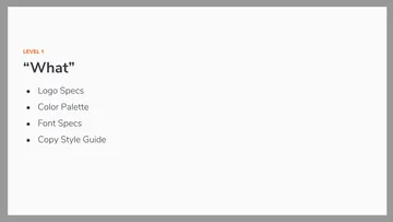
"What" guidelines help you produce respectable, no-frills, informative communication. They keep you from walking out the door with your branding pants on backwards. You can avoid rogue color or type treatments, and hopefully prevent people from committing blatant logo crimes.
If you’re not trying to “sell” anybody on anything, and if you’re not trying to send users down a specific conversion funnel, "What" guidelines have everything you need to deliver basic information in a straightforward way.
If you want to communicate with your audience in a clear and consistent way, you need Level 1 guidelines that can answer your, "What should I do here?” questions.
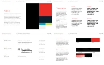
An example of Level 1 guideline content from the branding work we completed for the NFL Players Association.
Level 2: “Who are we, as a company?”
Guidelines that fit into the Level 2 category should contain everything you need to answer your, “Who are we, as a company?” questions:
"Who does our personality most resemble?"
"Who does our brand voice sound like?"
"Who (and what) do we stand for?"
Level 2 guidelines contain everything you’ll find in the previous Level 1 guidelines, with the addition of: Brand Attributes, Voice & Tone Guidance, Messaging Examples, and Mission + Vision Statements.
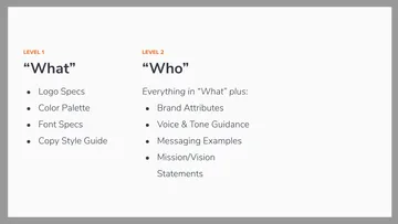
"Who" guidelines help you start shaping your organization's unique brand personality.
They’re used to create content that reflects a specific voice and tone, and they also help you snuff out unsanctioned communication experiments that just don't "feel like us”. "Who" guidelines allow you to start building a deeper narrative around your mission and vision.
With Level 2 "Who" guidelines in hand you can create styled communication that is more nuanced than simply, “we’re consistent and professional”. You can spin up a respectable small website or product MVP that looks and sounds market ready, and you can intentionally shape the voice and tone of your product onboarding flow.
"Who" guidelines help you begin to tell a brand story that your audience can connect with and believe.
If you want to shape user interactions that go beyond the merely transactional, you need Level 2 guidelines that can answer your, “Who are we, as a company?” questions.
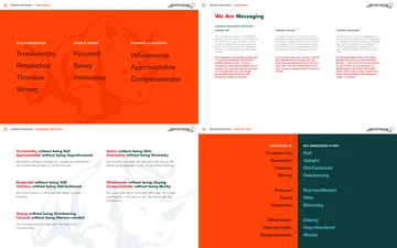
An example of Level 2 guideline content from the branding work we completed for Armstrong Tires.
Level 3: “Why should I care?”
Guidelines that fit into the Level 3 category should contain everything you need to answer your customers', “Why should I care?” questions:
"Why is your product or business something I should purchase or support?"
"Why are you different from your competitors?"
"Why should I value what you do?"
Level 3 guidelines contain everything you’ll find in the previous Level 1 and Level 2 guidelines, with the addition of: Value Propositions, Key Differentiators, and Positioning Statements.
"Why" guidelines can help you build a brand story that is capable of effectively converting your audience and driving specific actions — in other words, a brand that can do your selling for you.
They should clearly articulate, in audience-facing language (i.e., not your mission and vision statements), the problems your product or service solves and the benefits your audience can expect from their patronage. They should also outline your market positioning and what differentiates you from your competitors.
With Level 3 "Why" guidelines you have all the tools you need to dig into complex communication challenges. The content in these guidelines can help inform your broader content strategy, your site’s information architecture, your marketing strategy, your user conversion funnels, your pitch decks, your sales collateral, and your advertising materials.
If you want to convey product or mission value in a way that drives conversions at scale, you need Level 3 guidelines that can answer your customers', “Why should I care?” questions.
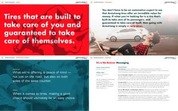
An example of Level 3 guideline content also from the branding work we completed for Armstrong Tires.
Level 4: “How do I actually do this?”
Guidelines that fit into the Level 4 category should contain advanced tools that are designed specifically for your internal communications team. They should have everything you need to answer your team's, “How do I actually do this?” questions:
"How do I use a set of brand attributes?"
"How do I write in the company’s 'brand voice' if it’s different from my own?"
"How do I incorporate our value propositions into our messaging without sounding overly market-y and gross?"
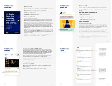
Level 4 guidelines contain everything you’ll find in the previous Level 1, Level 2, and Level 3 guidelines, with the addition of: On-brand communication examples, and step-by-step instructions that explain how those examples were created.
These guidelines can serve as a source of “brand truth” that helps your internal team learn how to use your brand correctly. They can also help an outside vendor quickly understand how your brand should be executed, saving you time and money when you’re hiring an agency or freelancer to develop additional communication touchpoints for your organization.
With Level 4 guidelines that can answer your communication team's, “How do I actually do this?” questions, you have everything you need to successfully transform theoretical brand strategy into practical brand executions.
An example of Level 4 guideline content from the branding work we completed for Wondrium.
There’s nothing quite like securing time and budget for an overhaul of your website, product, or marketing campaign, and then realizing in your first kickoff that the brand guidelines you thought were your design and messaging “true north”, contain nothing but a font selection, a color set, and 15 pages of diagrams illustrating how not to use your logo.
Or finding out that the colors and fonts you do have, while fine for traditional print applications, don't meet web accessibility standards, which isn't just a potential problem for your users — it's a potential problem for your business.
What’s even worse is investing time and resources into an organizational rebrand, and ending up with a smart and innovative brand strategy that no one on your team actually knows how to implement.
You’ll save yourself time, money, and professional heartache if you're able to confirm at the start of your project that the guidelines you have contain the elements you need to do the things you want — whether that’s spinning up an initial microsite, overhauling the voice and tone of your customer service touchpoints, or designing a high-performing user conversion funnel.
And in the end, if you discover you don’t have the brand guidelines you need, it shouldn’t be too hard to find some capable brand strategists who can help you remedy that situation.