What a car rental taught me about UI conventions and bug reports
Josh Korr, Former Product Strategy Director
Article Category:
Posted on
My wife and I recently rented a cute li'l Fiat on vacation. The car wasn't really big enough -- we had two suitcases plus a part-time guitar -- but how could we pass up something so darn cute?
We had some good times with that Fiat. We laughed, we cried, we briefly went insane in the darkness of its hideous blind spot.
Most importantly, I learned two things from that snub-nosed rascal that are relevant to Viget.
Lesson No. 1: Be Smart When Breaking UI Conventions
I learned this lesson twice.
The first instance came minutes after we got in the car. We buckled our seatbelts. I turned on the car. Played with all the buttons and dials, natch.
I reached to lock the door -- and realized there were no inner locks.
In fact, there were no buttons, tabs, or switches of any kind on the inner door. But while we easily found the window buttons on either side of the gear stick, we could not figure out how to lock the doors from the inside.
It took a day before I figured it out. We knew to pull the silver handle to open the door. Turns out you can also push in the door handle, which locks the doors and helpfully reveals an "I'm locked!" red strip.
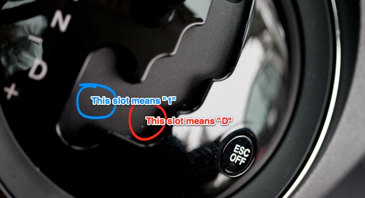
The second instance happened a couple days later. My wife called from the road, worried that the car wasn't going faster than 40 mph. After a slow ride home, we realized she had accidentally put the car in first gear. She didn't realize it because while the gear stick label says "D," apparently sometimes "D" means "1." <Shakes fist at Fiat.>

More specifically: The gear stick is the kind that moves along a predefined but back-and-forth path, making a satisfying ka-chunk when it lands in each gear's slot and giving automatic drivers the illusion of driving a manual. When you ka-chunk down to the "D" slot, there's an option to slide the stick to the left. If you do that -- despite the stick now being directly adjacent to the giant "D" -- you've actually switched into first gear. The only way to know this is to look at the digital odometer. (You can then tilt the stick down or up to a "+" or "-" to go into second gear, back to first, etc.)
In both instances -- the lock mechanism and the gear stick -- Fiat broke with design convention in non-intuitive ways, and did not provide any guidance or cues to help users understand the new conventions.
The door lock design is at least a good new design convention; it's an elegant way of reducing buttons -- and therefore user movements -- without reducing functionality. But the gear shift seems like both a bad convention and bad design. It introduces confusion without reducing the number of user movements needed to shift gears.
The takeaway for web design: if you're thinking about breaking with longstanding user interface conventions, make sure the new convention is actually better. And if it is, consider giving users a little help in acclimating to the new convention.
Lesson No. 2: Steps to Reproduce Are Key for Bug Reports
My wife's phone call about slow driving was effectively a bug report -- and a reminder of the importance of detailing steps to reproduce when reporting a bug.
A bug report's basic format is: "I did A (and B and C...), expected Y to happen, but Z happened." For those of us trying to diagnose bugs, it's crucial that "I did A" lists the discrete steps a user took before encountering the bug. That way, we can take the same steps the user took and try to reproduce the bug.
In many cases, though, "I did A" is a user's interpretation or mental model of the actions taken, rather than the actual actions taken. As I've written:
Mentally, we elide the multiple discrete steps that make up any experience, whether in the real world or on a computer. We think, "I turned on the car," rather than, "I inserted the key into the ignition, depressed the brake, and turned the key three clicks to start the engine." We say, "I checked my email," rather than, "I typed 'www.gmail.com' into the web address bar; then I entered my username and password, checked 'Stay signed in', and clicked the 'Sign in' button; then I clicked the 'Important' subnav link in the left sidebar."
But it's very hard to accurately guess the steps a user took -- and hence hard to reproduce and diagnose a bug -- based on the user's interpretations and mental models.
In my wife's case, she said "I put the car in drive" -- her interpretation of what she did. The actual steps were: "I ka-chunked the gear stick down to the 'D' slot, then slid the stick to the left." Once we thought about the discrete steps, we were able to reproduce the "bug" and realize what happened.
For those of us who report bugs to developers, it's crucial to change our way of thinking so we can break down experiences into discrete steps -- and so we can solicit these steps from users who submit bug reports to us.