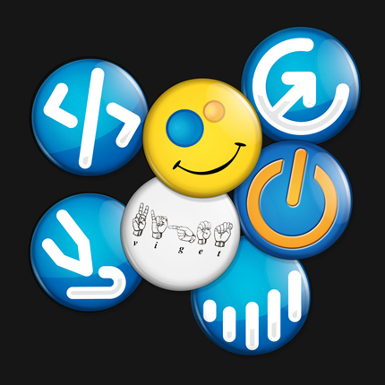
Viget Flash Mob: 1” Buttons
Samantha Warren, Former Viget
Article Category:
Posted on
On occasion, the designers at Viget reserve four hours out of their busy days and work feverishly to create a project that is outside of their daily web design routines. We call this excercise a "Design Flash Mob." We have a running list of ideas that we all contribute to, and everyone votes on a topic when the time aproaches. In the past, we have done desktop wallpapers and t-shirt designs. This time we tackled 1" buttons, a popular piece of flair amongst web nerds, design geeks, indie rock teeny-boppers, and your TGI Friday's waiter. Many of us turned to Stereohype for inspiration on designing for this tiny canvas.
Mindy
I've always had a fascination with things that are old, especially when they are reinvented and given a modern twist. My first set of 1" buttons was inspired by a collection of vintage and antique buttons I inherited from my great-grandmother. There are hundreds of buttons in the jar from every era you can imagine. After sorting through and scanning a few favorites, I layered them on top of one another in Photoshop to create interesting textures. Then I played around with the contrast and coloring to achieve a pop-art look.
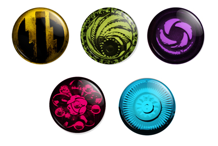
My original (somewhat blurry) scan of the buttons can be found here.
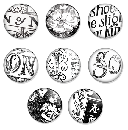
My second collection came from bits of typography found in a 1905 Burr's Monthly Magazine. Having owned and restored a Victorian home, I have a great appreciation for the amount of consideration the Victorians put into ornamentation and design. I love their eclectic sensibility. Almost every ad in the magazine has hand-lettered text and an ornate illustration. It was hard to choose just a few samples to scan and crop for these buttons!
Rob
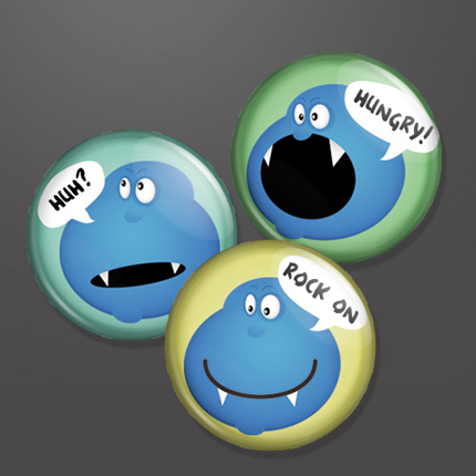
I decided to to take a more playful approach by creating a simple vector-based cartoon. It was a good opportunity for me to brush up on my illustrating skills while still having fun and being creative at the same time. Each button and subsequent quotations represent a mood (happy, hungry, and confused).
Jim
I've always been a bit envious of people who are able to grow a nice set of Mutton Chops or an elegant Franz Josef, so I thought a set of buttons dedicated to facial hair would be fun (and maybe the next best thing to being able to grow sweet facial hair). Apparently, I'm not alone in our design group (*cough* Owen *cough*). The inspiration for my button set came from Jon Dyer's excellent blog entry about his quest to grow different types of facial hair. I selected 15 of my favorites and based the model on a popular forum "not amused" icon.

Peyton
Looking to play around in Illustrator a wee bit (something I haven't done in a while), I decided to "buttonize" a few of the funnier pangrams I've come across. Given the time limit and the quirky nature of the pangrams, I decided to push the "offness" factor with some rudimentary illustrations and some of my favorite ugly fonts. Although tacky, I still wanted to create some level of cohesion between the pangram/idea, the illustration, and the font selection, which I think I did an ok job with. While these buttons are less than beautiful, I'd see them possibly adorning the bag of someone who might enjoy wearing one of these fun CNN t-shirts.
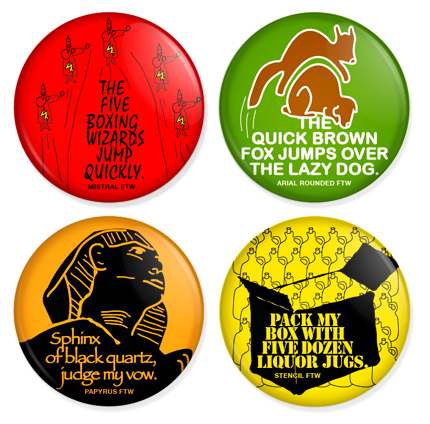
Samantha
I did not set out to create Viget branded buttons, but I liked the idea of having a series that expressed motivational words that designers can relate to. Realizing that each of our four labs have fantastic words to work around -- inspire, engage, extend, advance -- it seemed obvious to me to design my buttons around them. That way, if they ever get printed, they could be a collectors' set!
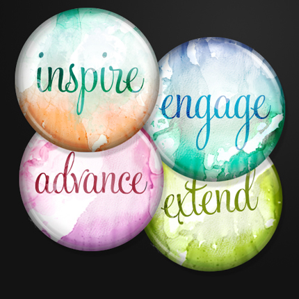
Erik
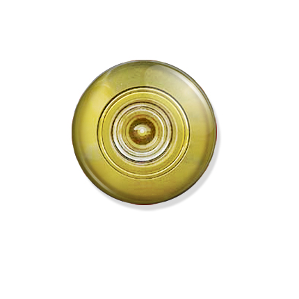
I took my inspiration from the winners page at StereoHype. I got the best vibe from the graphical buttons; however, I forgot I had no graphical ability on or off the web. From here, I decided to go in the buttons-that-looks-like-real-things direction. My first button was one of those spy holes you get in your front door at home. This causes a problem in that part of the understanding we had for this was to design a series of buttons that all have something in common. I switched my approach here to buttons. Not the buttons we were designing but real buttons you find on clothes or furniture. The buttons I found were a perfect display of vintage style and texture and brought me back to my youth when I swear each one of those types of buttons was represented somewhere in my home.
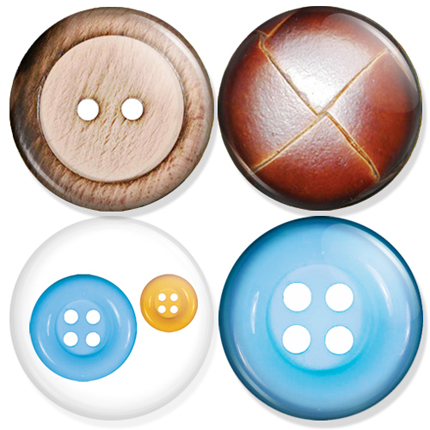
Tom
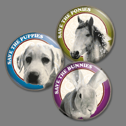
I'm not entirely sure where my head was at when I created these buttons. A sudden strange mood overcame me. They were partly inspired by Doug's passion for cute lovable animals like ponies, bunnies, and puppies -- and because he was unable to participate in our latest Design Mob. Secondarily, its social commentary on all the forgotten creatures not often seen in save the animals campaigns. We may as well cover all creatures big or small, weak or fierce, and even ugly or adorable. One for all, and all for one! Life, love, solidarity.
Owen
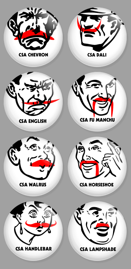
I am an avid fan of both mustaches and the CSA archive, so the most logical next step was to combine the two of them into a homage/poke at designer pop culture. In an age of over saturation in all avenues of media, I thought it was fitting to give these commercially iconic faces a little twist of satirical humor (and, in turn, also poking fun at myself for being part of this profession). At the same time, I also wanted to incorporate the question of repurposing art in the vain of Bansky and other artists who resuscitate tired works. When imagery reaches the breaking point of saturation and spill over into the tank of low-culture kitch, who really owns the art?
Keith
I went with a Viget brand for my buttons. After I had exhausted my own ideas, I took the logos from our four company blogs and threw them onto buttons to add to my theme.
