UX Scavenger Hunt—Pinterest Style
Jason Toth, Former Experience Design Director
Article Category:
Posted on
One of the most enjoyable aspects of user experience design is the opportunity to observe human behavior and interactions directly within the user’s environment. I like to picture user experience designers on reconnaissance missions, quietly gathering user behavior intel while covertly recording the interactive patterns and dialogs we observe. Melodramatic? Sure. Romantic? Possibly. Intriguing? Most definitely.
Working on these skills is like brain pilates. Observational exercises are great avenues to recharge our professional spirit, but honing our skills in observation requires training. It demands we slow down and reflect—it requires patience, passivity, and a willingness to table our personal bias. This type of empathic design will help you produce more innovative solutions and create a strong communal association with the behavior of users. It's a gentle reminder that our role is one of advocacy, trust, and facilitation.
Considering the need for this kind of professional development, our UX team has actively created “training” exercises that specifically focus on refining our observational skills. One recent opportunity we created took place at the Virginia Museum of Fine Art in conjunction with a team offsite event in Richmond, Virginia.
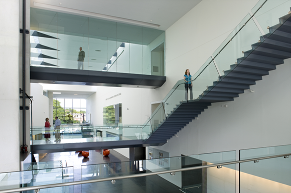
Image courtesy of VMFA. Photography by Bilyana Dimitrova.
Our goal was simple—create an engaging team exercise to challenge our ability to observe and record behaviors, usability patterns, or interactions. The museum provided a great setting for this type of exercise since it contains visitors of all ages, interactive exhibits, wayfinding/traffic flows, and wasn’t too large or too small.
We determined that a digital scavenger hunt would provide a recognizable game structure for teams to understand. Using our smartphones as a recording device, teams were given an hour to photograph examples of interactive-related behaviors. We created 11 categories modeled after a hunt created by the Computer-Human Interaction Forum of Oregon (CHIFOO). Each category included instructions to capture both a good and bad example of each category. These included tasks such as:
- Capture an arrangement of controls that make it easy to perform a task
- Capture physical feedback that interferes with a user’s ability to use a system
- Capture an interactive sequence with an intuitive user flow
- Capture an example of an agent that negatively affects the user’s behavior
- Capture an example where color is successfully used to convey meaning
- Capture an experience that users enjoy.
We also wanted to have a shared online repository where every team could record the observations they captured within each category. Our smartphones were an efficient and unobtrusive way to record our observations, and we discovered that the Pinterest app’s interface suited our requirements better than many applications specifically built for scavenger hunts. Pinterest allowed us to create shared pinboards for each usability category and pin our images to the appropriate board immediately after they were captured. Our boards could then be used for any future exercises, morphing into a long-term collection of good and bad usability examples.
One final aspect that was particularly interesting to the team was how observations or notations around spatial properties in the physical world reflect similar usability concerns in online environments. Could the observation of a flow or sequence in an environment such as a museum influence any future interactive patterns we develop for our clients? I’ve listed a few of our observations below.
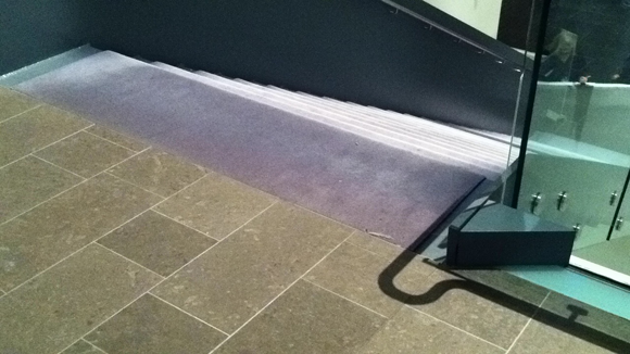
The transition from the balcony to stairs was further cued in a floor texture change from tile to carpet. While this decision likely served a practical material purpose, the subtle reinforcement of the upcoming transition prepared visitors for their descent down the stairs.
Matching the background of the exhibit description labels to the wall paint color allowed the boards to be legible when in the immediate vicinity of the object, but not distracting (and fairly invisible) when panning or surveying the entire exhibit. This allowed the art, rather than the supportive objects to be the primary focus of sight.
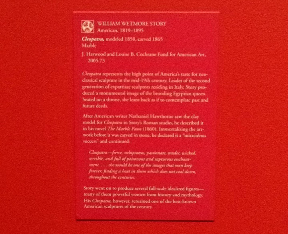
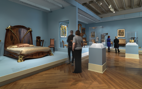
Image courtesy of VMFA. Photography by Bilyana Dimitrova.
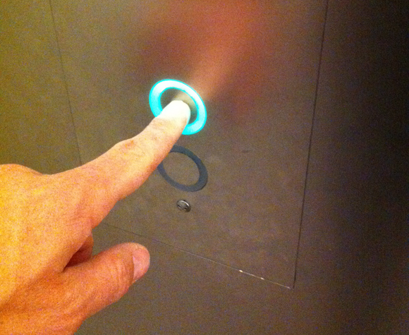
The success of pushing the elevator button is further reinforced by a visual cue of highlighting the button's outline.
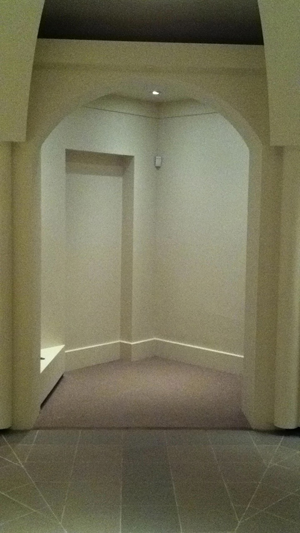
Poor user flows and navigation were not typical of the museum except in this one example where the visitor encounters a dead-end and must retrace their steps back out of the exhibit. The physical experience of dissatisfaction and confusion is not dissimilar to user flows which provide little evidence of further interactions.
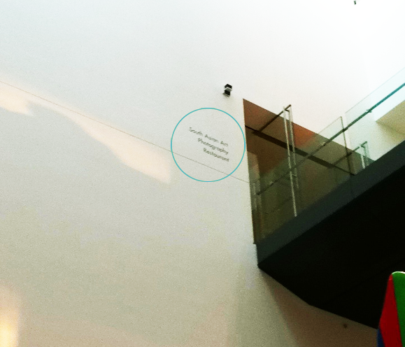
Listing the upcoming exhibits at this scale and location on this 3rd floor wall removed any ambiguity or confusion around the exhibits in this distant space, even for a user 2 floors below.
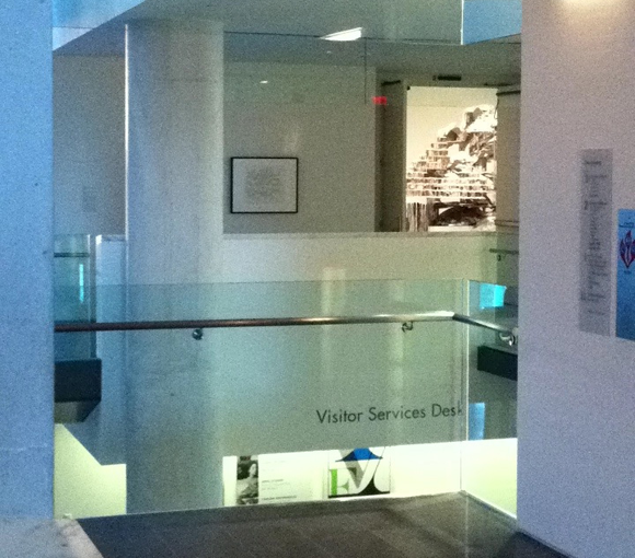
Example of a perspective where key pieces of art are visible from various points during your progression. Besides providing a sense of anticipation and wonder, the pattern of using art to mark the beginning or end of a path was established. This navigation strategy became a useful mental model for a visitor to understand progression through the museum.
A few challenges we noted were not being able to capture video for time-based observations like sequences and not having an efficient means to provide context or descriptions around the captured images. Given the limitations around mobile typing, the static image and subsequent label did not always adequately reflect the context for the observation.
Overall, the exercise was a success and provided a good opportunity for the team to practice our observational-based skills. The game-like mechanics and competition of the scavenger hunt made the exercise enjoyable while providing some categorical structure and focus to the behaviors we were looking to capture. It was also beneficial to pin our observations to a central location so all the groups could reference the images after completing the exercise .
We’d love to hear if other teams have found success in any observational exercises. In the meantime, check out our Pinterest boards or download the list of categories and tasks we used in our hunt.