Use Behavioral Analytics Data to Make Your Site More Effective


Behavioral analytics data, like data from Google Analytics or Adobe Analytics, often provide quick and inexpensive ways to see what your users are currently doing at scale.
Behavioral analytics are a great way to get a sense of what users are or are not doing on your website or app. While behavioral analytics may not provide insights into why users are behaving a certain way, this method does provide a quick and cost-effective way to see what your users are currently doing at scale. Knowing how your users are engaging with your website or product can help you make informed decisions that have a positive impact on engagement and conversions.
Here at Viget, we use behavioral analytics data for a number of use cases:
- Our client has a specific question about a certain aspect of their website or app (e.g., a specific user flow or content type) and wants to learn more about how and when users are engaging.
- We are redesigning a client’s website and want to get a sense of where the current experience is excelling or falling short.
- We are conducting an annual analysis to help clients keep an eye on potential areas of growth or stagnation.
- We are reviewing behavioral changes on a site or app after launching a new experience or feature to assess performance.
But what kind of insights can you expect to find from behavioral analytics data?
It ultimately depends on the website or app, the users, and the kinds of questions you are asking, but let’s go through a few different examples of what kind of information you can gain from behavioral analytics tools.
Who is using your website or product?
Understanding who is using your website can provide helpful context on your user base and potentially unlock growth with new user groups you may have been unaware of. To investigate this, we may look at geographic location, language, device type, and any other demographic information that may be available. Sometimes this kind of data provides what I like to call descriptive information—information that often doesn’t feel immediately actionable but can become more useful relative to other data points. This could come from comparing your data to last year, to industry standards, to other content on the website, or it might come from comparing it to an assumption that an individual or organization holds.
Here are some examples of findings that shed light on who was using the website or product:
| ✦ | 32% of sessions were from users outside the United States. | |
| Through a previously conducted survey, we were aware that some users were looking for content that was not specific to the United States. This metric helped us better gauge the size of that need. | ||
| ✦ | 97% of Canadian sessions interacted with the website in English, with only 3% of Canadian sessions using French. | |
| We were unsure to what degree French content needed to be prioritized and this metric helped provide a sense of scale. | ||
| ✦ | 15% of searches were conducted on a mobile device. | |
| Although 15% may seem low, this metric was actually higher than expected because there were known issues with the mobile search experience. This demonstrated that even though the mobile experience was harder to use than the desktop version, users were still inclined to use it, further illustrating the importance of improving the mobile experience. | ||
How do users get to your website or product?
Knowing how users navigate to your website or product can highlight what traffic sources are particularly effective in driving conversions, but it can also help to provide important context on user expectations or goals. To understand this, we look at both the source/medium that brought them to the website as well as the first page they viewed.
For example, users might:
- Come from google and land on a blog article
- Go directly to your home page
- Come from an email referral to a donation page
- Learn about you from ChatGPT and land on your About page
From there, we might look at engagement rate, conversion rates, or other metrics to get a sense of what these users are doing and whether anything stands out as particularly effective or ineffective.
Here are some examples of acquisition insights that informed our understanding and approach:
| ✦ | Only 10% of sessions started on the home page, with most users starting much deeper in the site on content-specific pages. | |
| Because only a small portion of users entered on the homepage, we could not solely rely on homepage messaging to orient users to the site. This highlighted the importance of providing sufficient context on any page of the site to ensure that users navigate to their desired content, regardless of what page they land on. | ||
| ✦ | Although the paid ads were effective in driving users to the website, those sessions had abnormally high bounce rates, with one traffic source having a 95% bounce rate. | |
| This indicated a potential mismatch between what users expected based on the ad, and what was actually on the page. | ||
| ✦ | Organic search brought in a large amount of new traffic to their site through the blog pages and while users engaged with the blog content, they were not engaging with the CTAs. | |
| Because these new users were potentially learning about this organization for the first time, the donation CTAs were likely not the best fit, and we recommended shifting the CTAs on those pages to focus more on learning about the organization. | ||
What content or features do users engage with?
Here is where we start to get to the meat of what your users are actually doing on your website or product. Knowing what users are doing and what they’re not using can help to establish priorities and inform decisions. You might be surprised to learn that users are actually engaging with specific features or content quite a bit, but others are barely used. If the content or feature is surprisingly popular, then we likely don’t want to outright remove it and may instead consider iterating or leveraging that offering more. If users aren’t engaging with content or a feature, it may be worth considering the effort to maintain and iterate on that offering.
Here are some examples of engagement insights that helped us identify opportunities related to content or features:
| ✦ | Less than 1% of users were engaging with a particular feature. | |
| These same users were showing high engagement with other features though, indicating that users either didn’t know this feature existed, knew the feature existed but didn’t understand the value add, or the feature was simply not something they needed. | ||
| ✦ | For a highly engaged audience, there wasn’t a standout page that most users visited. These users viewed a variety of pages across multiple sessions, typically viewing highly specific content pages. | |
| This indicated that instead of relying on a single page to drive conversions, getting users to the specific details they needed was likely a better approach in getting users to try the product. | ||
| ✦ | Nearly 84K sessions engaged with a particular content type. | |
| While this was lower than other content types, it was much higher than expected. It was largely organic traffic and the sessions were highly engaged. We recommended doing some additional research to better understand the potential opportunities with that type of content. | ||
What is the user journey or path?
Another major area of investigation is the sequence of steps users take when viewing content or completing certain actions. This could be perusing content on the website, going through a signup funnel, or checking out to make a purchase.
This helps us identify:
- the actual paths that lead to conversions (which is not always the path we assume it is)
- areas where users drop off at key points in the funnel
- moments where users have to “turn around” in the journey, because the path laid before them doesn’t align with their needs
This information can help you build towards a frictionless experience that encourages users to sign up, complete a purchase, or find the resources they need.
Here are some examples of user journey insights that helped us understand where there were existing points of friction for users:
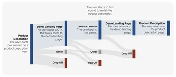
| ✦ | While the CTA to demo the product appealed to users and they were quick to engage with it, it often resulted in users backtracking to the previous page. | |
| We hypothesized that users were eager to get to the demo, but were moving too quickly and missed important context, resulting in them having to go back to a previous page. We were able to confirm this with user testing and recommended transitioning some of that context to the CTA page. | ||
What “turning around” in the user journey can look like:
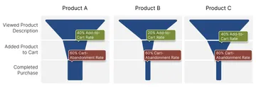
| ✦ | A select few products had abnormally high drop off rates, but at different stages depending on the product. | |
| For one product, there was an abnormally high cart-abandonment rate, and for another product, there was an abnormally low add-to-cart rate. Based on these findings we recommended looking further into what is impacting a user’s purchasing decisions. | ||
What dropoff can look like at different stages:
The Ecosystem at Large
Some clients have a larger ecosystem of products or services, and it’s important to look at how users engage with and navigate across the ecosystem. This might include subdomains for a shop, a marketing site versus the product site, help documentation, etc. By looking at the larger ecosystem we can reveal important connections that are missing or connections that could be strengthened.
Here are some examples of insights that demonstrated a need for changes in those ecosystem connections:
| ✦ | For sessions where a user was looking for a particular kind of resource, 95% of the searches were done exclusively in a single subdomain or microsite. | |
| Through user interviews we were able to confirm that this siloed experience was intentional for experienced users but unintentional for less-experienced users, who were largely unaware of the other parts of the ecosystem that were available. We recommended making changes to improve discoverability of those other areas. | ||
| ✦ | For sessions where a user navigated between two domains, 75% of sessions navigated to the other domain to view documentation specifically. | |
| Yet, depending on the product, sometimes the documentation was hosted on a subdomain specific to documentation and sometimes it was available on the product domain. This created an inconsistent experience where for some products, users could find what they needed on the product website, but for other products, users were sent to an entirely different subdomain. We recommended creating a more consistent experience for users, where regardless of the product, the documentation would be found in the same location. | ||
Here at Viget, there are a wide variety of insights we may discover for any one project through behavioral analytics. These insights can help to identify new user groups, help to prioritize content or features maintenance and updates, or bring to attention moments in the user journey that are causing friction. These opportunities can help you bring in new users and retain your existing users, by providing an experience that aligns with their needs, whether that is finding resources, getting involved in a community, or making a purchase.
If you’re interested in making your website or application more effective for your users by leveraging the power of behavioral analytics data, we’d love to hear from you.