Unsolved Zoom Mysteries: Why We Have to Say “You’re Muted” So Much

Josh Korr, Former Product Strategy Director
Article Categories:
Posted on
Investigating a video conference pitfall that afflicts us all — even the tech-savvy.
Video conference tools are an indispensable part of the Plague Times. Google Meet, Microsoft Teams, Zoom, and their compatriots are keeping us close and connected in a physically distanced world.
As tech-savvy folks with years of cross-office collaboration, we’ve laughed at the sketches and memes about vidconf mishaps. We practice good Zoomiquette, including muting ourselves when we’re not talking.
Yet even we can’t escape one vidconf pitfall. (There but for the grace of Zoom go I.) On nearly every vidconf, someone starts to talk, and then someone else says: “Oop, you’re muted.” And, inevitably: “Oop, you’re still muted.”
That’s right: we’re trying to follow Zoomiquette by muting, but then we forget or struggle to unmute when we do want to talk.
In this post, I’ll share my theories for why the You’re Muted Problems are so pervasive, using Google Meet, Microsoft Teams, and Zoom as examples. Spoiler alert: While I hope this will help you be more mindful of the problem, I can’t offer a good solution. It still happens to me. All. The. Time.
Skip the why and go straight to the vidconf app keyboard shortcuts you should memorize right now.
Why we don't realize we’re muted before talking
Why does this keep happening?!?
Simply put: UX and design decisions make it harder to remember that you’re muted before you start to talk.
Here’s a common scenario: You haven’t talked for a bit, so you haven’t interacted with the Zoom screen for a few seconds. Then you start to talk — and that’s when someone tells you, “You’re muted.”
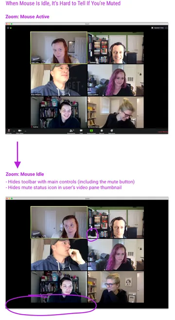
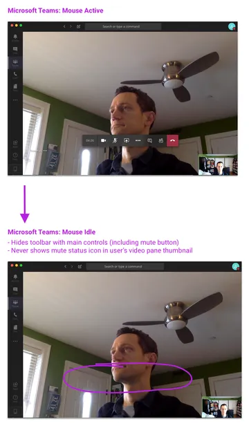
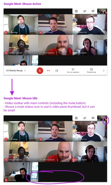
We forget so easily in these scenarios because when our mouse has been idle for a few seconds, the apps hide or downplay the UI elements that tell us we’re muted.
Zoom and Teams are the worst offenders:
- Zoom hides both the toolbar with the main in-app controls (the big mute button) and the mute status indicator on your video pane thumbnail.
- Teams hides the toolbar, and doesn't show a mute status indicator on your video thumbnail in the first place.
Meet is only slightly better:
- Meet hides the toolbar, and shows only a small mute status icon in your video thumbnail.
Even when our mouse is active, the apps’ subtle approach to muted state UI can make it easy to forget that we’re muted:
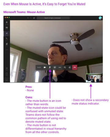
Teams is the worst offender:
- The mute button is an icon rather than words.
- The muted-state icon's styling could be confused with unmuted state: Teams does not follow the common pattern of using red to denote muted state.
- The mute button is not differentiated in visual hierarchy from all the other controls.
- As mentioned above, Teams never shows a secondary mute status indicator.
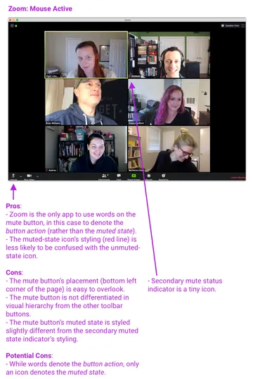
Zoom is a bit better, but still makes it pretty easy to forget that you’re muted:
- Pros:
- Zoom is the only app to use words on the mute button, in this case to denote the button action (rather than the muted state).
- The muted-state icon’s styling (red line) is less likely to be confused with the unmuted-state icon.
- Cons:
- The mute button’s placement (bottom left corner of the page) is easy to overlook.
- The mute button is not differentiated in visual hierarchy from the other toolbar buttons — and Zoom has a lot of toolbar buttons, especially when logged in as host.
- The secondary mute status indicator is a small icon.
- The mute button’s muted-state icon is styled slightly differently from the secondary mute status indicator.
- Potential Cons:
- While words denote the button action, only an icon denotes the muted state.
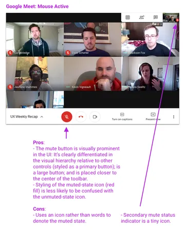
Meet is probably the clearest of the three apps, but still has pitfalls:
- Pros:
- The mute button is visually prominent in the UI: It’s clearly differentiated in the visual hierarchy relative to other controls (styled as a primary button); is a large button; and is placed closer to the center of the controls bar.
- The muted-state icon’s styling (red fill) is less likely to be confused with the unmuted-state icon.
- Cons:
- Uses only an icon rather than words to denote the muted state.
- Unrelated Con:
- While the mute button is visually prominent, it’s also placed next to the hang-up button. So in Meet’s active state you might be less likely to forget you’re muted … but more likely to accidentally hang up when trying to unmute. 😬
- While the mute button is visually prominent, it’s also placed next to the hang-up button. So in Meet’s active state you might be less likely to forget you’re muted … but more likely to accidentally hang up when trying to unmute. 😬
I know modern app design leans toward minimalism. There’s often good rationale to use icons rather than words, or to de-emphasize controls and indicators when not in use.
But again: This happens on basically every call! Often multiple times per call!! And we’re supposed to be tech-savvy!!! Imagine what it’s like for the tens of millions of vidconf newbs.
I would argue that “knowing your muted state” has turned out to be a major vidconf user need. At this point, it’s certainly worth rethinking UX patterns for.
Why we keep unsuccessfully unmuting once we realize we’re muted
So we can blame the You’re Muted Problem on UX and design. But what causes the You’re Still Muted Problem? Once we know we’re muted, why do we sometimes fail to unmute before talking again?
This one is more complicated — and definitely more speculative. To start making sense of this scenario, here’s the sequence I’m guessing most commonly plays out (I did this a couple times before I became aware of it):

The crucial part is when the person tries to unmute by pressing the keyboard Volume On/Off key.
If that’s in fact what’s happening (again, this is just a hypothesis), I’m guessing they did that because when someone says “You’re muted” or “I can’t hear you,” our subconscious thought process is: “Oh, Audio is Off. Press the keyboard key that I usually press when I want to change Audio Off to Audio On.”
There are two traps in this reflexive thought process:
First, the keyboard volume keys control the speaker volume, not the microphone volume. (More specifically, they control the system sound output settings, rather than the system sound input settings or the vidconf app’s sound input settings.)
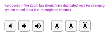
In fact, there isn’t a keyboard key to control the microphone volume. You can’t unmute your mic via a dedicated keyboard key, the way that you can turn the speaker volume on/off via a keyboard key while watching a movie or listening to music.
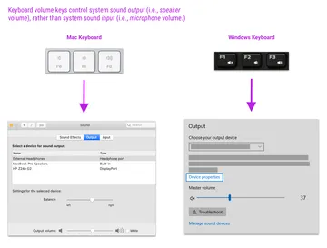
Second, I think we reflexively press the keyboard key anyway because our mental model of the keyboard audio keys is just: Audio. Not microphone vs. speaker.
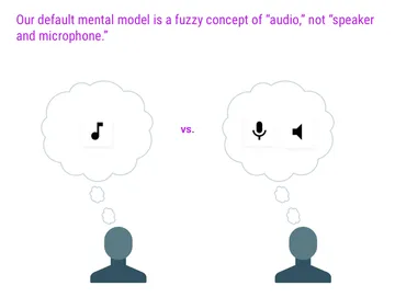
This fuzzy mental model makes sense: There’s only one set of keyboard keys related to audio, so why would I think to distinguish between microphone and speaker?
So my best guess is hardware design causes the You’re Still Muted Problem. After all, keyboard designs are from a pre-Zoom era, when the average person rarely used the computer’s microphone.
If that is the cause, one potential solution is for hardware manufacturers to start including dedicated keys to control microphone volume:
Video conference keyboard shortcuts you should memorize right now
Let me know if you have other theories for the You’re Still Muted Problem!
In the meantime, the best alternative is to learn all of the vidconf app keyboard shortcuts for muting/unmuting:
- Meet
- Mac: Command(⌘) + D
- Windows: Control + D
- Teams
- Mac: Command(⌘) + Shift + M
- Windows: Ctrl + Shift + M
- Zoom
- Mac: Command(⌘) + Shift + A
- Windows: Alt + A
- Hold Spacebar: Temporarily unmute
Other vidconf apps not included in my analysis:
- Cisco Webex Meetings
- Mac: Ctrl + Alt + M
- Windows: Ctrl + Shift + M
- GoToMeeting
- Mac: No keyboard shortcut?
- Windows: Ctrl + Alt + A
Bonus protip from Jackson Fox: If you use multiple vidconf apps, pick a keyboard shortcut that you like and manually change each app’s mute/unmute shortcut to that. Then you only have to remember one shortcut!