Under Pressure: Lessons Learned from 48 Hours of Design
Doug Avery, Former Senior Developer
Article Category:
Posted on
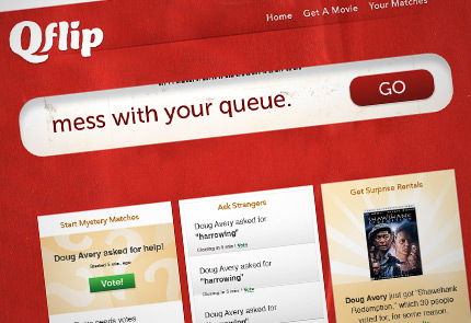
The weekend before last, I participated in Rails Rumble: a 48-hour contest between small teams of Ruby on Rails developers worldwide. Viget had members in four of the teams, and everyone really delivered (you can read more about the others here). Our team (Patrick Reagan, Nicholas Schlueter, Rob Ares, and myself) built Qflip, an app that randomizes your next Netflix rental with the help of an anonymous community.
Working closely with 3 developers (photographic evidence) on a tight timeline was a unique experience, and it forced me to rethink a lot of my web design processes. While these lessons specifically apply to tight design projects, in some sense, every project is a tight design project: It never seems like you have enough time or resources to get the results you want.
So, here are a few thoughts I had on designing with developers, designing within constraints, and designing for maximum impact with minimum resources:
Know How Much You're Making
As early as possible, get a handle on roughly how much stuff you're going to be designing. If you don't know how much work there is, you can't effectively triage your ideas and level of detail, and you might end up spending half your time on a single piece that just isn't worth it.
Get The Quick Stuff In
In every design/buildout, there are a handful of things that take less than five minutes each but really round out the "completeness" of a site. These items have a pretty high value-to-effort ratio, so knock'em out quickly and move on. On Qflip, this included:
- The title tag
- The meta description and keywords
- The favicon
- Print and mobile stylesheets (I'll discuss these in another post)
- Info/icon in the footer
Get It Functional
Do you know what all the pages do? How they're structured, and what they communicate? Great, now build them. Using just markup and some gray backgrounds, you can make a working version of your site in no time flat.
Why build markup first?
- You get a clear picture of what you're doing and what you might've forgotten.
- You get a chance to work on content without worrying about visuals.
- It gives the team a working version of a site several hours sooner, something the developers can integrate and test. By the time you're seriously styling, you'll already have working cases and real error messages in the app, which will make the stylesheet stronger.
- It won't "lock you in," changing the markup later is easier than you might think.
Forget The Logo
Great logos work across multiple viewings and multiple products, but on the web, most users skim past your logo once and never see it again. In the context of a single site, the logo's just not going to provide as much value as some good writing and careful design. So why agonize over one? Pick a solid typeface, put the name in it, and play around for a few minutes. If you don't hit anything great, don't sweat it, there's more important work to be done.
Help Developers Design
Developers want the site to look as shiny as we do, but too often we handcuff them by doing just enough to finish the design, forcing them to come back to us when they want to add an error message or drop in a new image. But with some forethought, you can give them to tools to quickly work with layouts and styles without your help.
On a tight project, developers are going to throw you questions as they're coding: what do I do with this error message? What happens when the field doesn't validate? How do I add a new yellow callout? As you're doing buildout, identify as many reusable elements as possible and give them helpful, understandable classes that the whole team can work with. On Qflip, premade elements like ".section," ".section-footer," ".error-big" and the like made it easier for developers to quickly style what they needed to.
Kill Your Concepts
The most important thing I've learned as a designer: I'm wrong. A lot. When I'm starting a design, I like to think the design concept, the metaphor, the idea is the cornerstone of a good project. It happens to all of us: You come up with something fun, crazy, and hard to pull off, and you get really attached to the idea before you even start sketching. So many times, though, I've gone into comps and seen that my idea just doesn't work, but had difficulty accepting that it might just be wrong.
I really wanted to make Qflip look like a Netflix envelope, using paper textures and everything. I wanted to put the big tagline inside a rounded UPC window, as if it was "peeking out" from inside your Netflix delivery. The problem? When I tried it, it just looked lame. There are times in my career when I would've polished it to death for hours until it kind of worked, but given the time limit of Rails Rumble, I just had to take it out and shoot it, a single tear in my regretful eye.

The offending idea. Blah.
Maybe I can revise this advice: Kill your bad concepts but scavenge from them. The envelope idea didn't work, but I kept in the little Netflix "tab" at the footer, which I liked.
Let The Layout Do The Talking
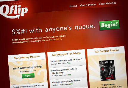
A problem most users have with Rails Rumble apps is that they arrive without any context about the app, often after clicking the link from a long list. These users have a problem: your app is pretty hard to explain, and they're not invested enough to read the explanatory text anyway. They're bored, they want to see how the site works, and they want to get straight to the fun part.


An attempt at explanation through structure.
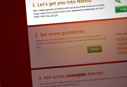
This is where you can consciously mix layout and text to explain yourself. On the Qflip homepage, we decided to explain the "match" process using three columns of actual matches. This way, we're using the most interesting content (user-generated matches) to create a narrative about the app. The "Get A Movie" page has a similar idea, showing the entire creation process as three simple steps, hinting at how quick the process is to complete.
But Do Some Talking Anyway
Like it or not, you're going to have to do some writing. Sure, every team member reworks headlines and thinks up error messages, but designers (like it or not) usually get first crack at laying out the text. Even if a client provides content, you might get stuck writing instructions for the trickiest parts of the site, so make sure you think about it carefully and let someone proofread (note: I did not, and you can tell in some spots on Qflip).
This can seem daunting, but it's really a natural extension of design. In order to create functional, attractive design, we already need to consider the audience and see our big, mysterious product from the perspective of a bewildered user. Writing goes hand-in-hand with this, because we're already in their mindset, trying to ask their questions: "What does this button do?" "Will I need a credit card?" "How do I go back?" Once you're focused on finding and answering questions, writing feels more natural and you can start to have fun with it.
Build In Waves
Style up your site not one detail at a time, but in big sweeps across multiple pages and elements—start broad and work your way down to specific. The advantages of this method: You keep a clear picture of how much work is left to do, you make sure no piece goes unfinished, and you run into those time-sucking layout problems a lot sooner in the process. Once you're in the final stretch, you're no longer racing to finish every last piece, and you can leisurely pick and choose which pieces to improve and which to leave behind. For example, on Qflip, I never went back to style up the vote tally bars or homepage buttons, but I used that saved time to come up with the jQuery homepage effect instead. Getting some aspects of the site to "good enough" in earlier stages allowed me to prioritize later, without worrying about running out of time.
All of these tips can be summarize in one piece of advice, both obvious and easily forgotten: fast work calls for highly practical design, and practical design means constantly gauging how much value your work is adding to the project and how to maximize that value. It doesn't mean making the product bland or utilitarian, but it requires a hard look at how your hours are being spent and what the results are.
