Take Something New and Make It Old
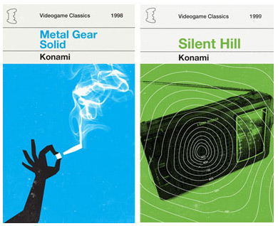
A design exercise that has been making the rounds lately, one I can't get enough of and have to share with anyone who'll listen, is the re-imagining of modern video games, movies, albums, and so on as worn out, classic book and album covers. It takes a product completely out of its element and reinterprets what makes it memorable in the first place. The result being that oftentimes these "remixes" are more elegant and precise solutions than their original designs. They're also just plain fun. The craze seems to have started earlier this year with Olly Moss's series of video games as book covers inspired by Penguin Classics covers and Saul Bass illustration. Just to show a couple:

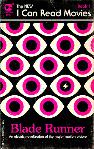
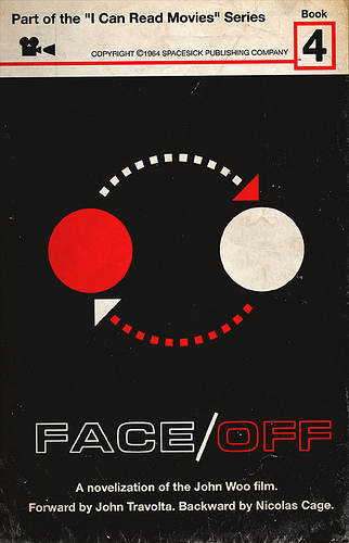
From there the idea spread to other designers, mostly through Flickr, and took on a life of its own. Soon more Penguin Classics versions of modern media popped up. The best of them all take a familiar piece of pop culture and embody it in the simplest, most memorable illustration possible. The classic, simple imagery of 60s and 70s book covers like Penguin's gives designers free reign to get abstract in their interpretations. The results not only present the content in a completely fresh way, but many of them are very clever and funny. One of my favorite examples is Mitch Ansara's I Can Read Movies series, covers for fake novelizations of famous movies. The covers are simple and graphic with iconic imagery, and often perfectly encapsulate the movie. Here are a couple typical examples:


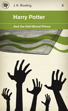
M.S. Corley's redesigns for the Harry Potter series are another perfect example of making a cover that's both abstracted but instantly recognizable for Potter fans:


It's also fun to see how this anachronistic approach has evolved in the past few months. Designs based on classic album sleeves, rather than book covers, are becoming the latest trend. Most recently Logan Walters took rap album covers and redesigned them in the style Blue Note Records jazz covers:

The potential combinations of something new as something old become seemingly endless. These remixes also breathe new life into seemingly dated styles that before I've always taken for granted. As a design exercise it's a fun challenge that forces you to think of your favorite movie or album in a different context, but can also challenge you to see how much story you can convey with as simple an illustration as possible. Even though it is designing in an old style, it is a great exercise for approaching a problem in a new way.
More Remixes:
