Styling the Button Element in IE
Rob Soule, Former Viget
Article Category:
Posted on
Updates
Please note that this fix DOES NOT work for buttons contained inside table elements.
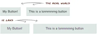
If you've ever attempted to style a button inside IE, you know that it can be a huge pain. On most of our projects, we've now started using the button element in place of traditional input buttons due to the ease of styling and consistency across browsers. One of the first things you might notice when you bring your nicely styled buttons up in IE is that, for reasons unknown to me, IE decides to stack the padding depending on the width of the content inside the element.

After spending some time adding a lot of extraneous CSS to the IE specific style sheets, I realized that two simple lines of code fixes the problem.
button {
  overflow: visible;
  width: auto;
}
Those two lines of code will save you countless hours. Go give your button elements some extra love.