Styling the Native File Upload Input Field

Eric Fuhrmann, Former Senior UI Developer
Article Categories:
Posted on
How to theme a file upload input field containing a unique button label and icon leveraging only HTML and CSS.
What we're making #
A themed file upload input field with a unique button label and icon leveraging only HTML and CSS.

Intro #
As the frontend landscape has matured over the years, frontend developers have some newfound freedom to stray away from reaching for third party libraries or packages in order to achieve a specific pattern or style. Form fields in particular have gone through a bit of a native renaissance in their own right, giving frontend developers far more control and styling capabilities that are relatively consistent across the modern browser spectrum.
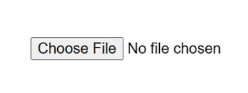
It’s deceptive just how customizable the file upload field can be, using nothing more than HTML and CSS. By default, a file form field will typically look something along the lines of this with some slight variations between browsers and operating systems:

While functional, rarely will it fit in with a website's overall theme or match the proper label a designer or client may want. Fortunately, modern browsers now include a special pseudo-element specific for this field type that allows us to target and style the specific button found within a file upload field. Enter ::file-selector-button.
Buildout #
The ::file-selector-button will work with any valid CSS property meaning that we can pass in any style or transition we want to match our sites design system. The file selector button exists inside of a shadow DOM node, and therefore won’t leak outside of the shadow root, meaning that there are some limitations around targeting children or modifying text within the button itself. Fortunately, we can work around these limitations with some creative pseudo-class building.
Let's begin by styling the selector button:
This gives us a nicely styled button with working hover and active states, but as mentioned earlier we aren’t able to modify the text within the button. Fortunately, there's a solution to this limitation by passing in ::before and ::after pseudo elements to the input[type="file"] element which allows us to then add the additional markup we need to achieve the stylized button we’re going for.
Let’s break this code down a bit.
First, we’re going to use background-image to render our file upload icon. One of the best ways to do this is to optimize the SVG inside of a data URI. Taylor Hunt has a terrific blog post on this method, as well as a link to an auto-generator Codepen which makes it as easy as copying and pasting a value in.
Next, we’re using the ::after pseudo class to set a new label by using the content prop and passing in whatever string we would like and then positioning it accordingly. Since the ::file-selector-button has no knowledge of the position of these pseudo classes or their sizes, we need to use fixed values to position the icon and label accordingly within it, and then update the width of the ::file-selector-button to account for whatever size our new icon and label is.
With our button styled and labeled the way we want; you may notice that our focus state is wrapping the entire input as opposed to just our custom ::file-selector-button.
Let's fix that:
input[type="file"] {
  position: relative;
  outline: none;
  padding: 4px;
  margin: -4px;
}

input[type="file"]:focus-within::file-selector-button,
input[type="file"]:focus::file-selector-button {
  outline: 2px solid #0964b0;
  outline-offset: 2px;
}| BEFORE | AFTER |
|---|---|
 |  |
There are two key takeaways here. First, our focus is now isolated solely around our ::file-selector-button rather than the entire input.
Second, our icon and label are now misaligned due to our negative margin on the input that we introduced. We’ll fix that by adjusting our fixed positioning values on the icon and label. The reason for this negative margin is so that our faux focus state can exist outside of the perceived container for the input, otherwise it would get clipped.
Cross Browser Considerations #
Support for this type of solution is pretty robust across modern browsers these days but, there still is some work that needs to be done for Firefox. As of version 110, Firefox still does not support ::before and ::after pseudo elements inside of an input[type="file"]. As such, this method currently results in a blank input button since we removed the type's color, but fortunately there is an easy fix for our friends on Firefox!
@supports (-moz-appearance: none) {
  input[type="file"]::file-selector-button {
    color: #0964b0;
  }
}
Simply adding color back to the ::file-selector-button will render the default label. Unfortunately, this does mean that they will lose out on the custom label and icon that we made, but better to fallback gracefully rather than have a poor experience for those users. As always, with any type of solution like this, it’s highly recommended that you test it across different types of browsers and devices, and make sure that the output is what you are looking for.
Putting it all together #
With a little bit of work and pseudo element play, you can really go far with styling the native file upload input. The final product is a design forward native input field, that doesn’t sacrifice your project's theme or branding.