Speaking the Same Language: Design Systems

Tyler Berg, Former Senior Product Designer
Article Categories:
Posted on
How to Get Your Team on the Same Page with Design Systems
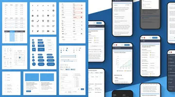
At Viget we work with dozens of different clients across a broad set of industries and challenges — which means design systems are often crucial to our engagements. A design system is a set of reusable components and patterns, and the principles for using them, which help us manage designs at scale. Sometimes as designers we’re focused on creating a system for the first time; sometimes a design system or a UI Kit is an output of a broader effort; and sometimes we get to work from an existing system. (You can see some of our design system work here.)
We’ve come to see clients’ teams as the crux of the challenges and opportunities that go along with a design system. Creating the circumstances where people can get on the same page and thrive is crucial. But there is no single way of getting teams on board with a design system — there are many.
Design systems improve efficiency
No one likes busy work, or doing the same thing twice. It’s a waste of time for designers to re-create buttons, forms, or other content blocks because there were inconsistencies in the software ecosystem. Or to fix slightly similar shades of the same color or streamline size variations in type scale during QA. Why, then, do organizations let small amounts of friction during software production undermine their efficiency?

From nice idea to real workflow
It’s tempting to think inaction has zero cost, but if every part of your project has the added burden of working through different versions of your component library, it actively functions against your organization’s best interests. Even as your needs change, you may as well make your system work for you, rather than against you.
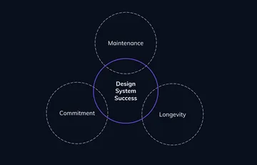
There are a few important aspects of bringing a system to life and making sure it ends up cemented as a legitimate part of the organization long-term: a commitment to maintenance, and to longevity.

We are not just making websites and products – we are making the tools that make those websites and products.
Maintenance
Maintenance is an unglorified part of the design process that allows our work to evolve as our use cases do, too. It’s just as important as creating something new. Maintenance may be the hardest phase of a design system, but it’s the phase that can be most beneficial, increasing both the quality of work and speed of production even as your website or product continues to evolve and improve over time.
Longevity
The ability to scale is a direct result of the type of framework that was put in place beforehand – we can save ourselves a lot of time and stress with a commitment to overseeing existing work that could one day support other work.
There are a lot of parallels outside of design that follow a similar pattern – parts of society whose existence is critical to certain day to day operations for many people. Think about public infrastructure. Subways, bridges, sports stadiums — all of these things require attention over time to ensure they can keep living up to our expectations, and have the same value far into the future.
We should apply this same mindset to our design systems. When these three things align – when a company makes a commitment to the maintenance and longevity of their system – is where we see the most success.
How do we get there?
There are four key steps that can help a team move from getting everyone on board with the idea of a design system to implementing it efficiently and ensuring the system lives up to its full potential. They are: shifting mentality, organizational buy-in, cross-team collaboration, and embracing creativity.
It starts with a shift in mentality
It’s important to understand that a system is not a project with a definite end. It’s the very beginning of an evolving product that eventually can serve other products. We are not just making websites and products – we are making the tools that make those websites and products.
At an agency, this point is particularly important for us to emphasize, since we often are not working on projects long enough to see the system completely mature. In this sense, we find ourselves to be temporary custodians of the system, and have to set things up in a maintainable way that allows for it to evolve long after we’re gone.
Recently, we worked with a large financial institution to help them systematize their disjointed branding and user experiences across their entire portfolio. Since we were only working with them for less than 6 months, we had to come up with a set of guidelines that transcended constraints, and allowed them to keep improving the system.
This is easier said than done. Six months was hardly enough time, so the next step was to prepare dozens of their in-house teams to successfully implement the system by creating training materials and in-person instruction. This ensured the system could be executed consistently and grow over time.
Organizational buy-in
Shifting a team’s mentality around a system’s potential can only get you so far without organizational buy-in. The system has to have an available advocate for the system to champion its success — someone that isn’t just thinking about the system now, but how it might morph into something different a few months or years from now. Advocating for the system can be considered an entirely separate job in itself, and can be difficult to add onto another position’s existing priorities. The more people advocating for the system that you have over the course of its development, the greater its chances of long-term success.
Cross-team collaboration
This is why cross-team collaboration and working with interdisciplinary teams can be so effective. Over the past few years, cloud-based, collaborative design tools like Figma, Sketch, and Adobe XD have begun to permeate the design landscape, and for good reason. The collaboration they allow designers to have, not only with other designers, but with developers, product managers, researchers, clients, and everyone in-between, has completely changed how teams view the design process. I’d go as far to say that the development of cloud-based design software is directly responsible for the growth of design systems to the extent we’ve seen.
One of the biggest advances with collaborative design software is that it allows key team members to increase efficiency working together at the same pace when collaborating on a design system. We see this in four key areas: design, development, product management, and research.
Obviously, the design team kick-starts the process with producing software components. More importantly than just producing assets, the designer is responsible for documenting the components and various interactions to keep developers and product management informed – oftentimes prototyping different flows for either clients or moderated research sessions.
The developer/designer collaboration is really where we start to see the increased efficiency for teams. Whether it’s front-end devs collaborating with designers on component assembly or back-end devs collaborating with designers on data models or user flows, being able to work in the file together in real-time allows everyone to make better work, faster.
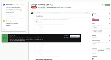
Product managers and designers work hand-in-hand to ensure we’re not missing any edge cases as we map out core features and functionality, and then as we get more detailed during QA. There’s a continuous feedback and changelog loop that happens between Figma comments, documentation headers to update status of components and screens in Figma, and the development ticket itself. Internally and externally, there’s no “big reveals” – the transparency in the production software promotes an environment of collaboration that wasn’t possible a few years ago.

Lastly, research teams and designers benefit from a more collaborative relationship when producing design systems as well. Once a designer produces the components of the system, the researcher can jump directly in the software to work with the designer in creating pages for specific prototypes for both moderated and unmoderated research sessions.
With these separate yet unified variations of workstreams, a clear improvement of design tools has been the empowerment of different teams to have their own autonomy and governance over their workflow.
Embracing creativity in your design system
There’s a misconception out there that working within a design system inhibits a team’s creativity — that using it boxes you into a limited palette of solutions in your design work.
Quite the opposite is true: design systems streamline the most mundane tasks of production, like text fields scaling across breakpoints, swapping out typefaces, or making color updates in your entire file. They free up your brainpower so that you can focus most of your energy on the areas that require the most thought and effort.
Advancements in design tools that allow us to automate more granular tasks are letting us move from spending most of our time thinking about production, to thinking more strategically about how best to display complex information, convey more meaningful motion in our work, and positively impact our users.
A final thought
Getting your team on the same page with a system starts with committing to long-term maintenance and collaboration. The more transparency you have around your production process, the more people you will have advocating for the system over the course of its development, which will lead to better chances of achieving a system’s true goal: building better, more impactful software.